


Cyprus Public Transport
How we turned Cyprus Public Transport’s overloaded website into a clearer, more user-friendly service platform by simplifying key passenger flows and restructuring the experience without rebuilding the system.


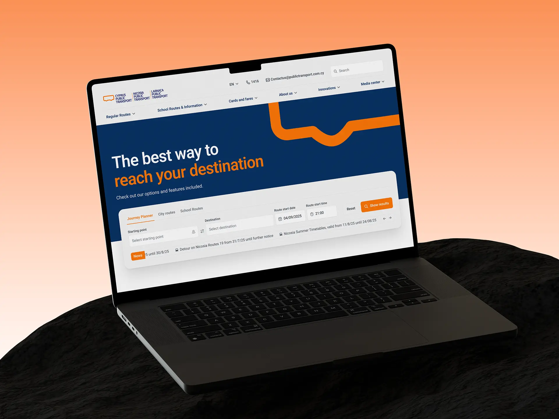
Cyprus Public Transport is a bus service operating in Larnaca and Nicosia. Its website was the main digital touchpoint for passengers: people used it to plan routes, check schedules, find school transportation information, apply for and top up transit cards, track service updates, and read important announcements.
At first, the project looked like a fairly standard website redesign: refresh the visual language, improve the user experience, and make the interface feel more modern and easier to use, especially on mobile. But it became clear pretty quickly that the visual layer was only part of the problem. The site already offered almost all of the functionality users needed, yet over time it had grown into a dense, overloaded system where important user flows were buried inside an increasingly complex structure.
So in practice, this project was less about giving the site a fresh look and more about reorganizing an existing digital service. The challenge was to make the experience clearer and easier to use without breaking its foundation: the existing backend, CMS, and page set all had to remain in place. That constraint shaped the direction of the work from day one.
Why this was more than an outdated UI problem
Once we got into the project, one thing became clear almost immediately: the outdated interface was part of the problem, but it was not the main one. What mattered more was how the site was structured underneath. All of the core features people actually needed were already there:
- route planning;
- information about city and school lines;
- transit card services;
- announcements and news;
- corporate and partner pages.
So the site was not lacking functionality. If anything, it had accumulated a lot of it. And that was exactly where the problem started. The main issues looked like this:
- navigation was overloaded and not always intuitive;
- important actions were buried too deep;
- some pages existed more because the structure had grown that way than because users actually needed them;
- passenger service tasks were mixed together with corporate, partner, and operational information;
- many pages lacked context, so users could see the interface but did not always understand how to use it;
- all of this became even more frustrating on mobile, where people usually do not have time to figure out a complicated structure.
For a transportation service, that is a serious problem. People do not come to a site like this for inspiration or brand discovery. Most of the time, they are trying to get one specific thing done quickly: plan a route, check for changes, find the right stop, top up a card, or understand a school route. When the path to those actions becomes too heavy, the fact that the feature exists stops being helpful.
That is why this project could not be approached as a simple visual refresh. Before anything else, the site needed its internal logic back - and only then could a new interface be built on top of it.
What the employer got: a clear definition of the real problem - not just an outdated look, but accumulated structural complexity that was getting in the way of key user flows.
Starting with architecture, not screens
First, we needed to understand the system
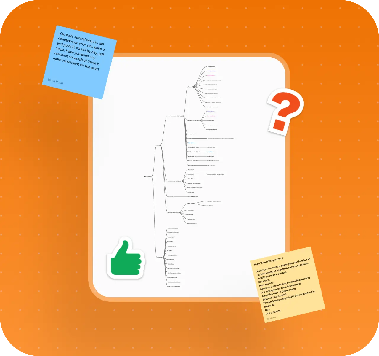
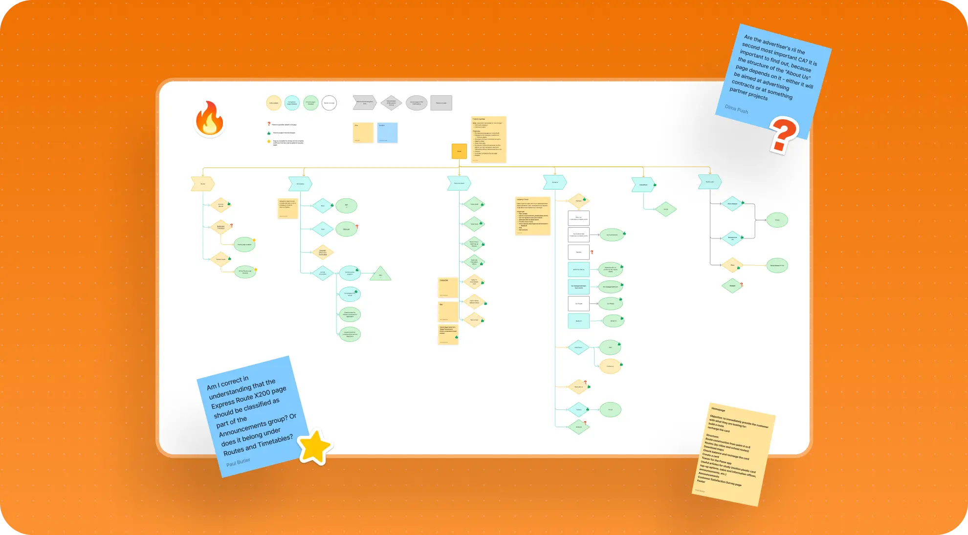
We did not start with homepage design or visual direction. First, we had to understand the system we were actually working with. To do that, we mapped almost the entire site structure, documented the pages, grouped them by type, and built a full map of the platform. That made it possible to see not just the scale of the project, but how its functionality, user flows, and content were really distributed.
That exercise quickly showed that the site was made up of layers with very different levels of importance. It included unique pages that needed individual treatment, key user flows, navigation pages, dynamic content sections, and a whole layer of secondary entities that mattered for the completeness of the platform but did not define its day-to-day value for passengers.
Architecture as a decision-making tool
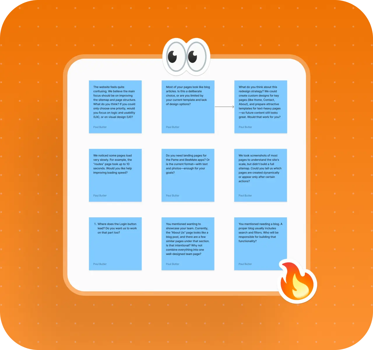
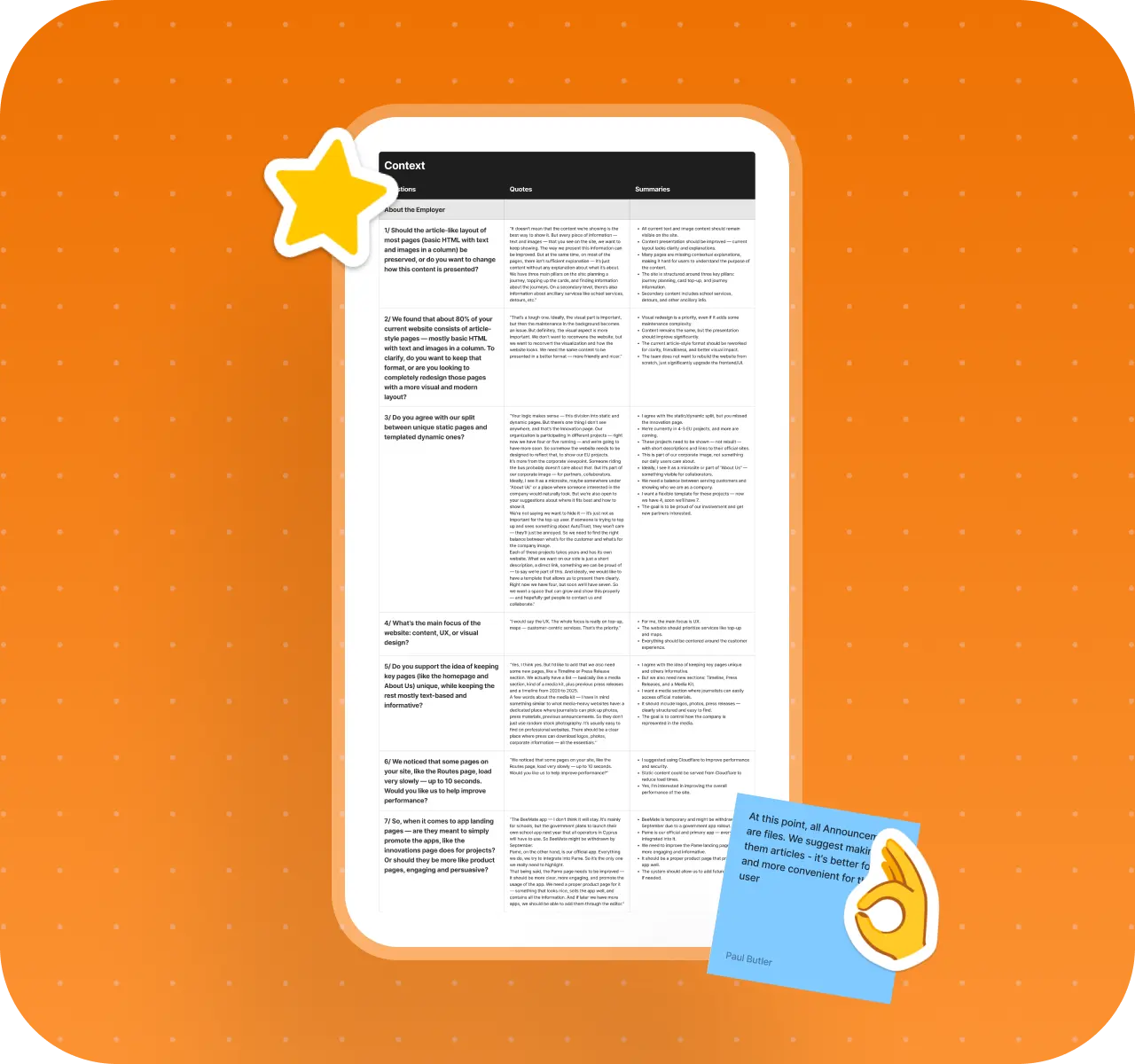
This phase mattered not just as analysis, but as a way to make better decisions. It helped us identify which flows were actually shaping the user experience, what needed to move into the foreground, and what should stay in a supporting layer. At the same time, we worked with the employer to clarify how routes, cards, school transportation, the mobile app, and required service sections functioned in practice.
A lot of decisions could not be made by looking at screens alone. We had to understand the logic of a living system and the constraints we would be working within. That was the point when it became clear that the real challenge was not to create a "new website," but to turn an already existing, overgrown platform into something clearer and easier to manage.
What the employer got: an architectural foundation for decision-making - a clear understanding of the site's structure, page types, key flows, and the points where redesign work would have the greatest impact.
Rebuilding the site around passenger priorities
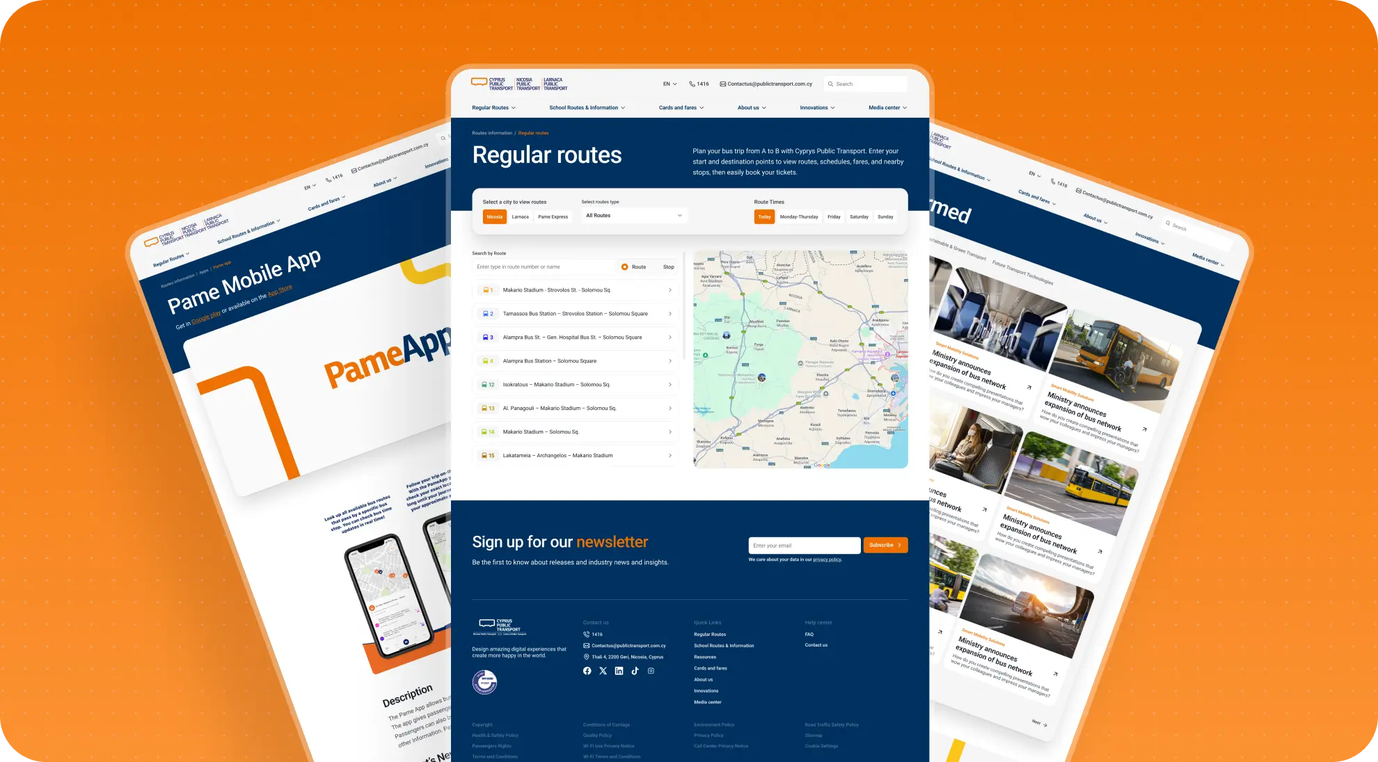
One of the most important observations was that the site was serving several audiences at once, but was not distinguishing their needs by urgency or importance. It was used by passengers, parents of schoolchildren, partners, media, job candidates, and the company's internal team. That in itself is completely normal for a large public service. The problem started when all of those layers began competing with one another inside the same structure.
As a result, the site worked worst for the audience it was primarily supposed to serve: passengers. So one of the key decisions was to reset the priority system. The new logic was built around a simple idea:
- first, the site should help passengers;
- next, it should quickly direct parents to school transportation information during the times of year when that matters most;
- only after that should it support secondary flows such as corporate content, hiring, the media section, partner-related information, and other supporting areas.
This did not mean the secondary audiences had become less important. Quite the opposite - we worked to give them a clearer and more appropriate place within the overall system. But they were no longer competing with core service tasks on the first screen or at the main entry points.
That shift influenced the entire structure: the hierarchy of the homepage, the navigation, the composition of core blocks, the distribution of attention across sections, and the depth of work put into individual flows.
From that point on, the site stopped being organized around a list of pages and started being rebuilt around real usage priorities.
What the employer got: a more accurate priority system in which the site addresses passenger needs first, then supports secondary audiences and corporate flows.
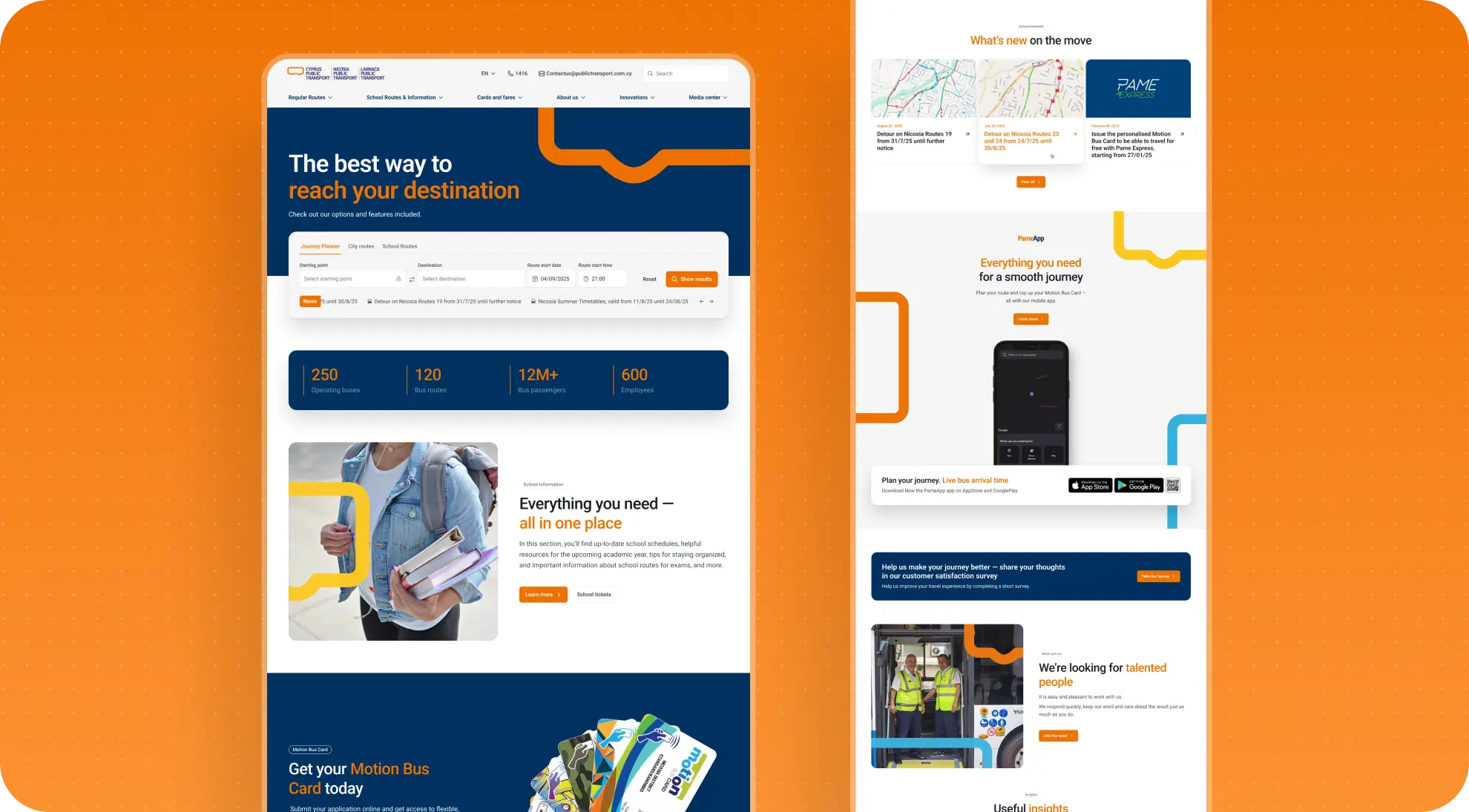
Turning the homepage into a true service entry point
This logic became especially clear in the redesign of the homepage. In the old version, it did not give users a strong enough answer to the question they were coming with: what do I do next if I need to solve a specific transportation task? The necessary actions existed, but they were not brought together into one clear starting point.
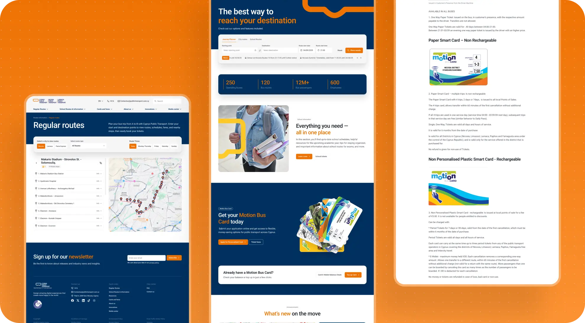
In the new structure, the homepage stopped being a broad overview of everything and became the entry point into the service. In the top section of the homepage, we brought forward the core user actions:
- quick route planning;
- access to city and school lines;
- transit card-related actions.
We also reconsidered how important information was handled. The site already had a format for urgent announcements, but in the new version it was given a more logical place in the page structure - close to the service tasks, where users actually expect to see critical updates about routes, changes, and disruptions.
The remaining blocks - the mobile app, additional services, corporate information, hiring - stayed part of the site, but were arranged in a clearer hierarchy. The homepage stopped trying to promote every direction equally at once. Instead, it started working as a navigation hub that helps passengers get into the right flow as quickly as possible.
That change became one of the most important moves in the entire project. We did not just redesign the homepage layout - we changed its role inside the system.
What the employer got: a homepage that works as a real entry point into the service and gets users to the main actions faster.
Simplifying the key flows
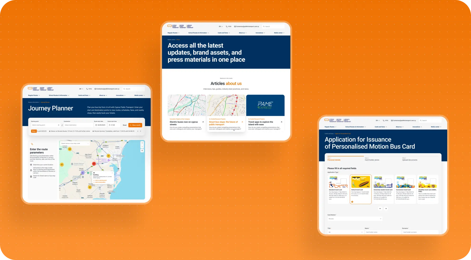
Once the new architectural logic was in place, the focus shifted to the key user flows. This is where most of the UX work happened. We focused most heavily on the route planner, the city and school lines sections, and the flows related to transit cards.
Route planning
The route planner already existed on the current site, but the issue was not missing functionality - it was a lack of clarity. Users were not always sure:
- how route building actually worked;
- where the flow began and ended;
- what happened after search;
- why a route sometimes failed to appear;
- where to find the details.
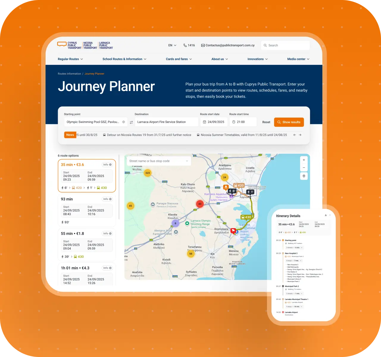
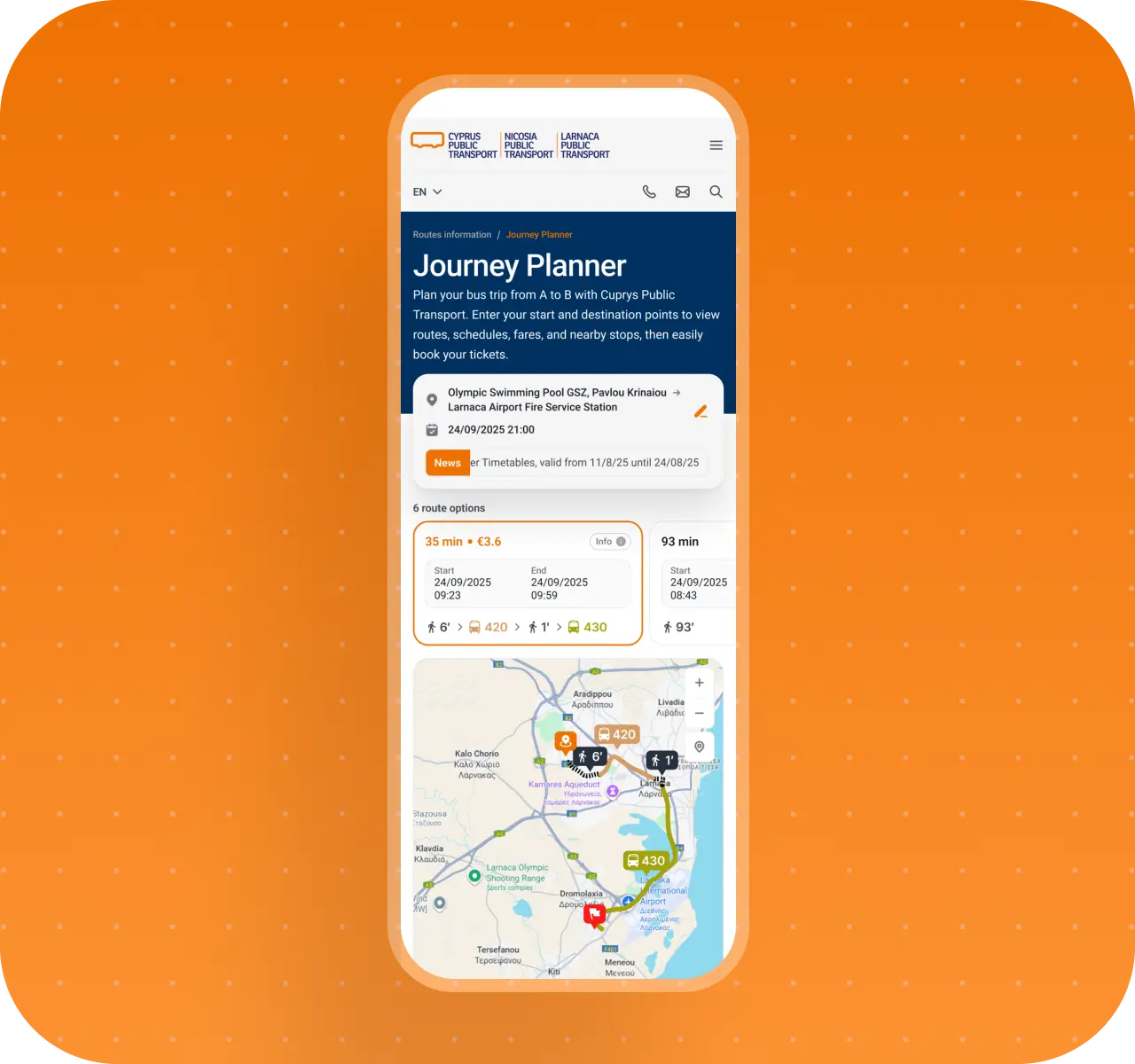
We started by breaking the existing flow down step by step, from entering addresses to reviewing the result. That helped us spot friction points that were easy to miss, but were clearly affecting real use. In the new version, we improved the logic of the starting state, the clarity of the result, the visibility of the route on the map, access to details, and the handling of empty states and route-not-found scenarios.
So we were not reinventing the feature itself. We were making it clearer, more predictable, and less frustrating to use.
City and school routes
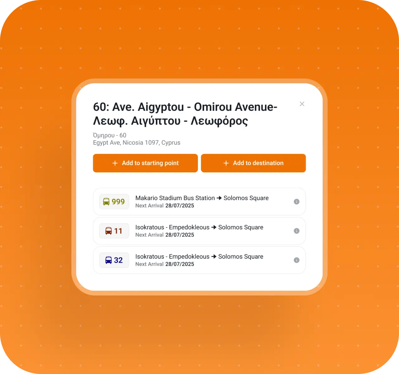
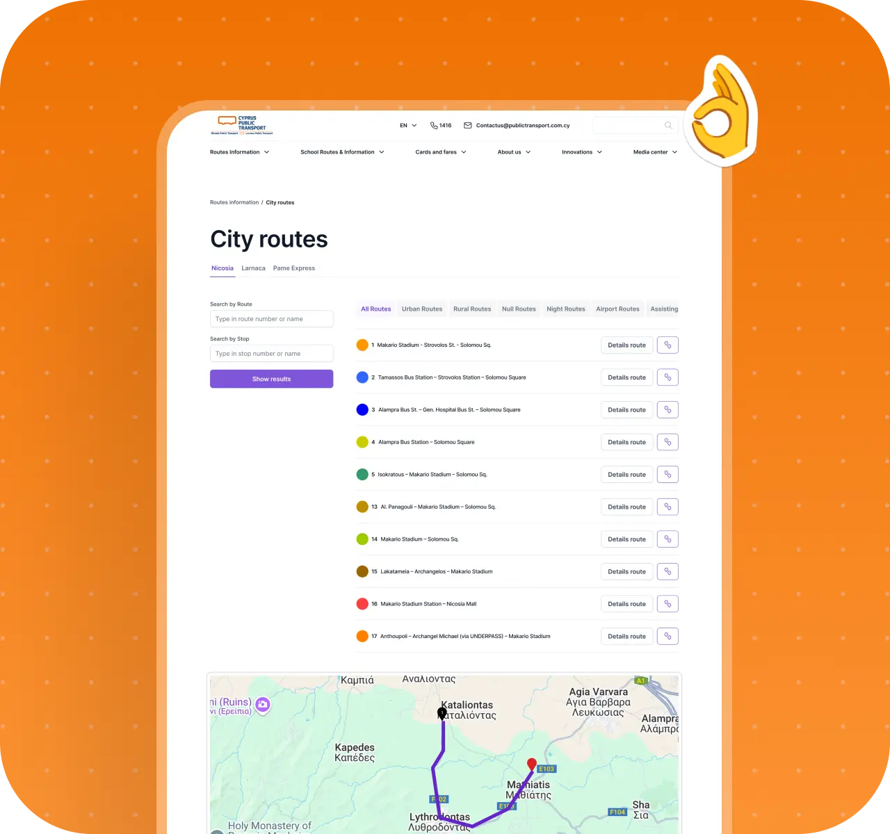
A similar issue existed in the city and school routes sections. There, the problem showed up as excessive fragmentation: information about routes, stops, transfers, and route details was spread across too many levels of interaction, forcing users to move between screens and keep too much context in mind.
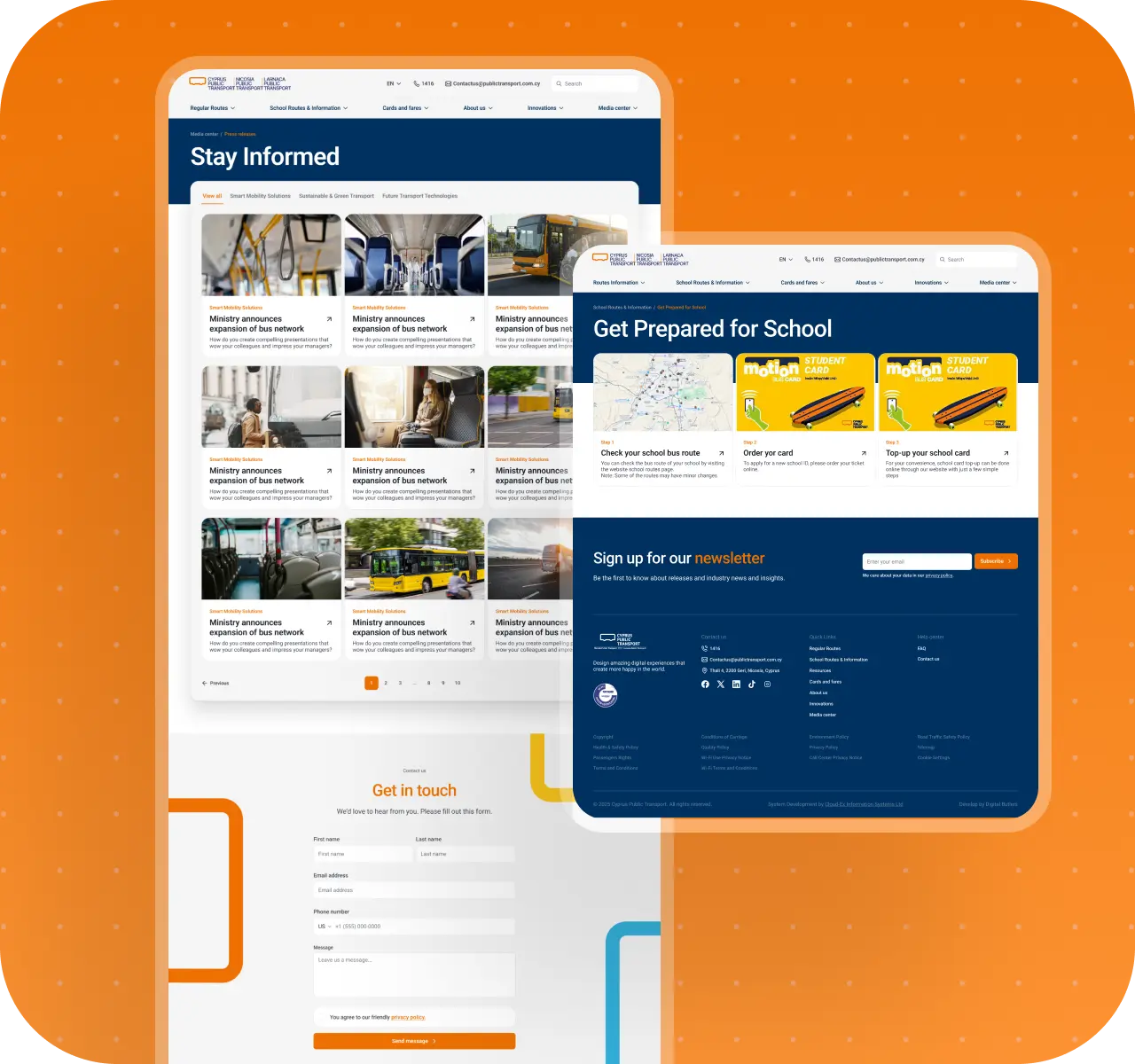
We rebuilt those flows so that key route and stop information became easier to read, the map appeared at the right moment, and details were revealed on demand instead of overloading the interface from the start.
This was especially important for school routes, where users are usually not trying to "explore the system" - they just want to quickly understand how a specific route works and where to find the relevant information.
Transit cards
A separate part of the work focused on card-related flows: applying, topping up, checking balance, and managing the card. These were some of the most frequently used actions on the site, so they needed a more obvious entry point and a more consistent internal structure.
Here too, the goal was not to invent a new logic from scratch. It was to simplify the existing one: reduce unnecessary visual and cognitive noise, group information more effectively, and make multi-step actions easier to follow.
A shared principle across all flows
Across all of these flows, the project was guided by one shared goal: reduce the effort required from the user. Not add more interface, but make key actions clearer, shorter, and calmer to use.
Using hallway testing to quickly validate ideas
To check whether these decisions were actually making the flows easier, we did not rely only on the team's internal logic. Some of the hypotheses were also tested through hallway testing - a fast method that helps reveal how understandable a flow is to someone with no deep familiarity with the project.
We showed key screens and user flows to people who were not directly involved in the work and watched how they interpreted the interface, where they clicked first, what they understood correctly, and where they started to hesitate. This kind of testing does not replace full user research, but it works really well during the design phase when the goal is to quickly see whether a solution is genuinely clearer than before.
In this project, hallway testing was especially useful for validating the navigation logic, the clarity of the homepage, and early versions of key flows. It helped us identify less obvious places where the structure still needed simplification and gave us stronger support for decisions before moving into final design.
What the employer got: clearer, more predictable user flows in the parts of the site that define its day-to-day value for passengers.
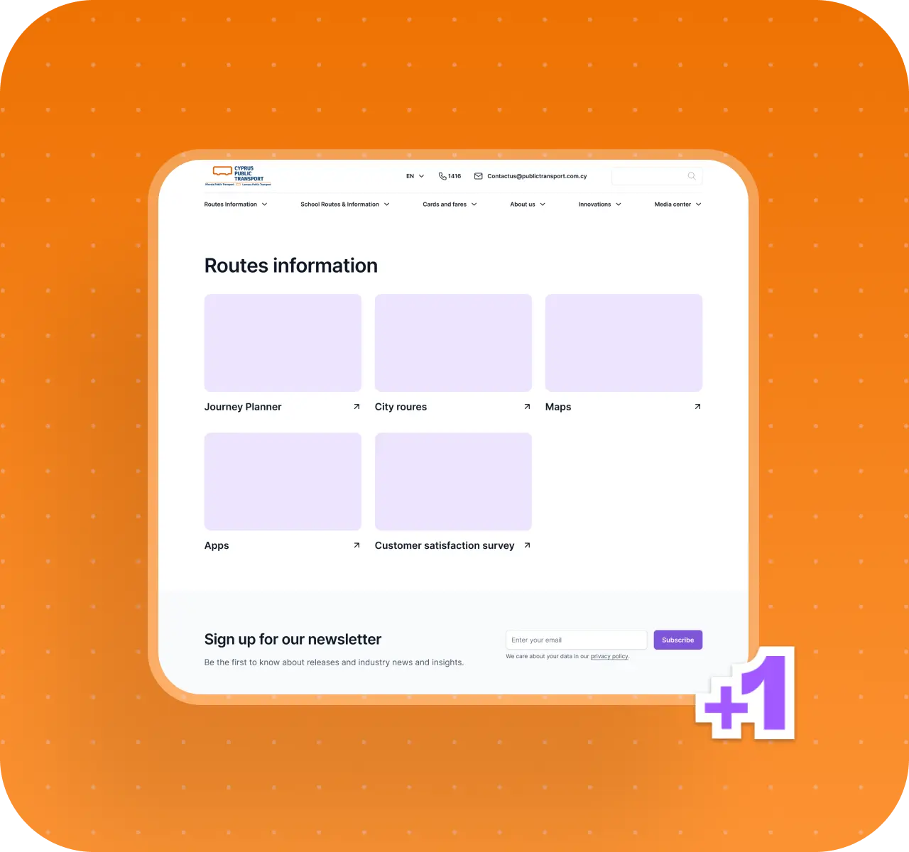
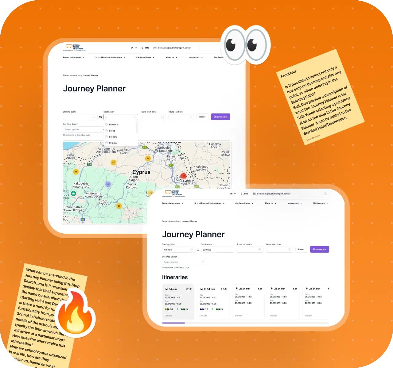
Designing around a "one screen, one workspace" principle
One of the strongest decisions in the project took shape during the design stage. As we worked through the core flows, it became clear that for a transportation service, what matters is not only clear architecture, but also reducing the amount of movement inside the interface. Users need to see the connection between their action and the result as quickly as possible, without losing context along the way.
That is how we arrived at the principle we called "one screen - one workspace." In the most important flows, we aimed to bring controls, results, and the map together in one visual space. Users no longer had to move through a chain of disconnected screens, scroll through long pages, or go back just to piece information together.
Instead, the main logic of the flow was visible right away, while secondary details were only revealed when they were actually needed.
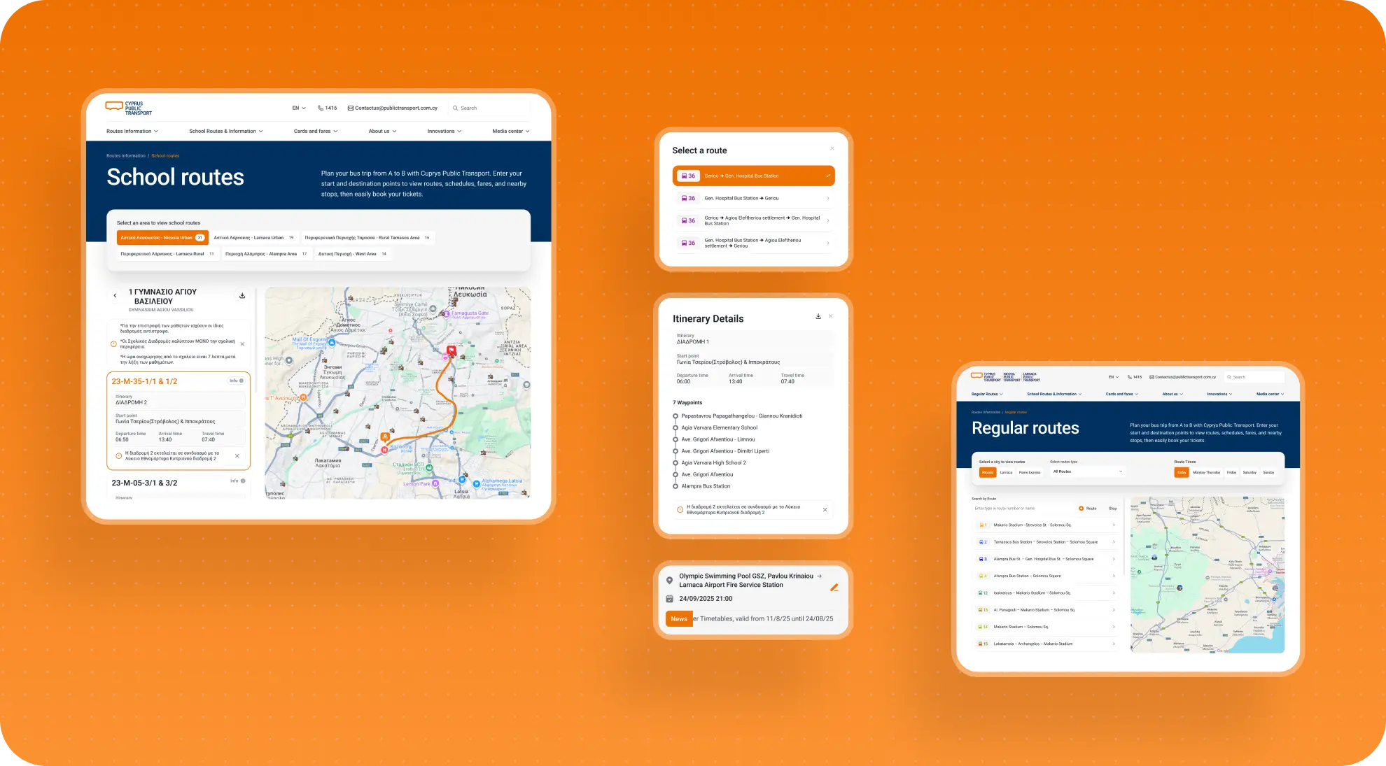
This worked especially well in route-related flows. Rather than spreading important information across multiple states and separate pages, we brought the workspace together on one screen:
- the map on one side;
- controls, results, and details on the other;
- secondary elements available on demand.
This approach brought several immediate benefits:
- it reduced unnecessary scrolling;
- users understood the connection between actions and results more clearly;
- comparing routes and reviewing stops became easier;
- the interface felt less tiring to use.
For a public transportation service, that matters a lot. Users are often in a hurry, in transit, distracted, or on mobile. In those situations, clarity is not just an aesthetic quality - it is a practical advantage.
That is exactly why design here was not just about making prototypes look polished. At this stage, the team was still solving a UX problem: how to help people spend less effort interacting with the site and get what they need faster.
What the employer got: a more effective interface logic for key flows, where users see results faster and spend less effort navigating within the screen.
Building a scalable template system for the rest of the site
Once the key user flows had been defined and deeply worked through, it became obvious that the rest of the site needed a different kind of approach. The project included many pages, but not every page deserved a heavy, fully custom redesign process.
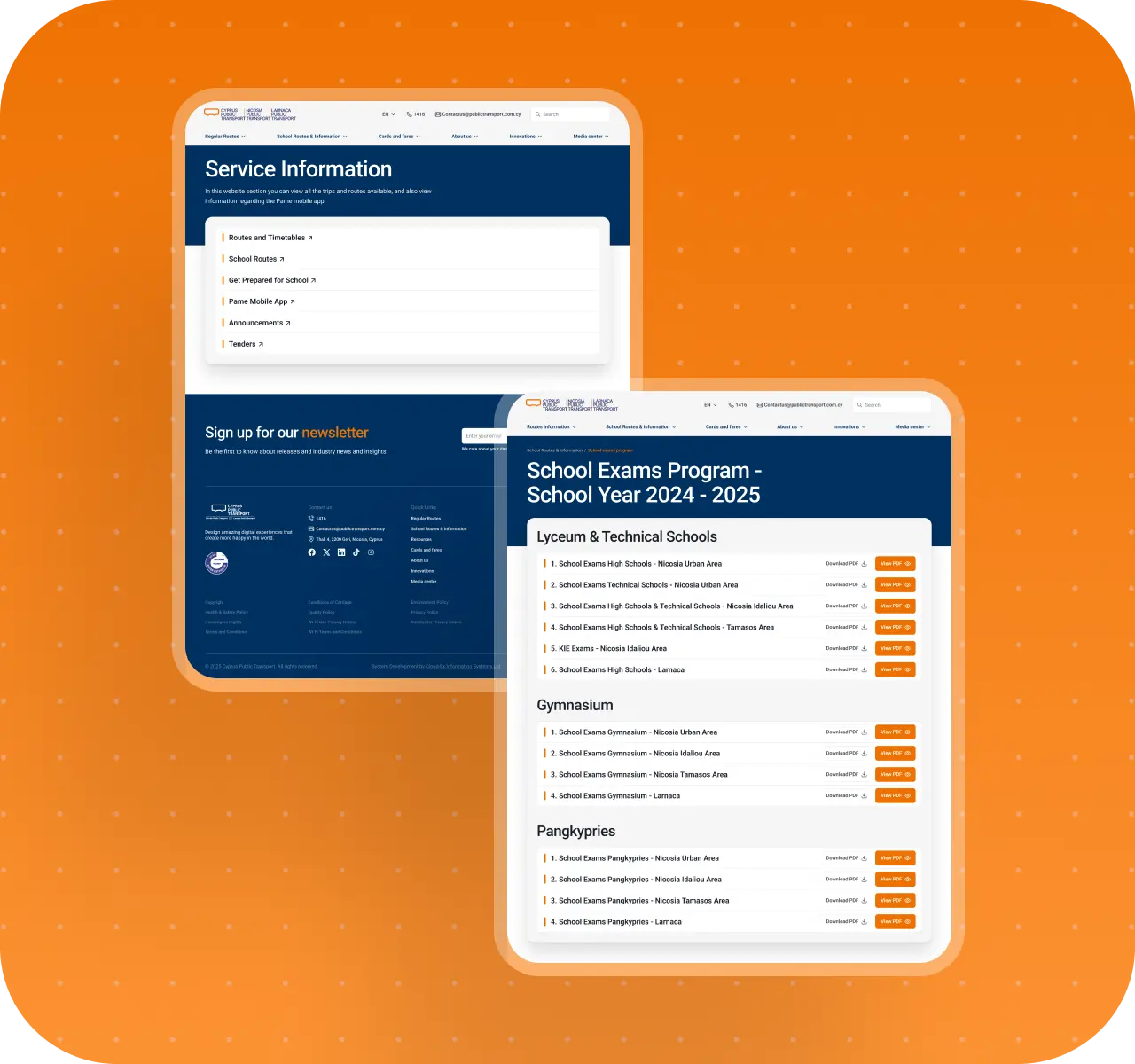
A large part of the site played a supporting role: organizing navigation, displaying CMS-driven content, or acting as an intermediate layer between the main flows.
If we had tried to design every one of those pages as a fully unique screen, the project would have quickly expanded in time and budget without creating meaningful value for users. So we divided the work into two levels:
- deep UX/UI design for key flows and unique pages;
- a system-driven template approach for navigation and dynamic pages.
That decision brought several advantages. First, the site became visually more cohesive: even secondary pages started speaking the same language as the main flows. Second, the production process became much faster and simpler, because there was no need to reinvent a new screen every time standard content appeared.
Third, the employer's internal team got a more practical system for continuing to grow the site. Once the template logic was in place, adding new pages stopped feeling like a mini redesign and became a much more manageable CMS task.
What the employer got: a template system that made the site easier to scale, made the interface more cohesive, and lowered the cost of future changes.
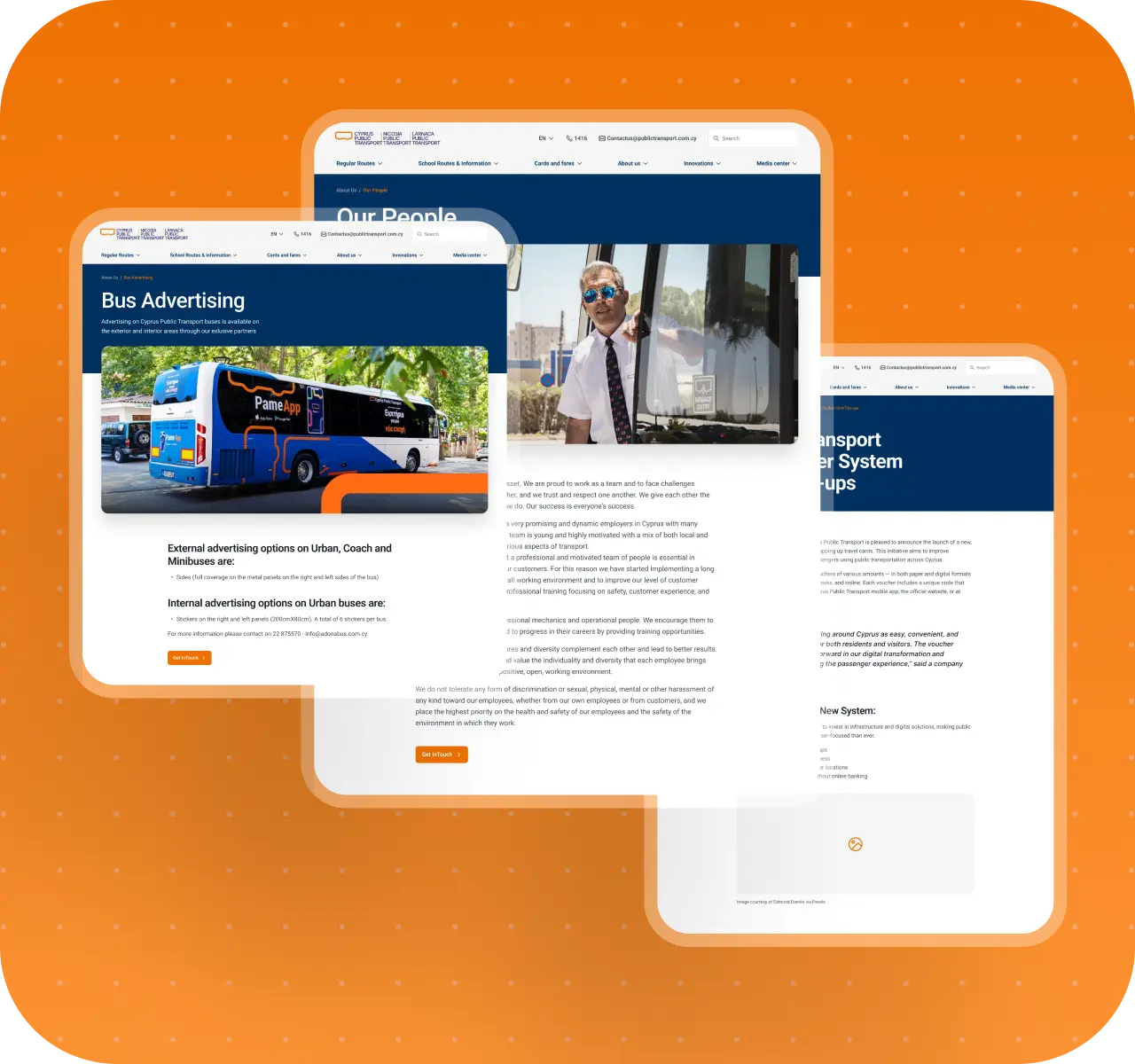
Results for Cyprus Public Transport
After the redesign, Cyprus Public Transport received:
- a clearer, more modern service website without a full rebuild of the existing system;
- an updated architecture built around passenger priorities rather than a fragmented collection of pages;
- a homepage that works as a true entry point into the key user flows;
- simplified flows for route planning, city and school lines, and transit card tasks;
- clearer navigation and a more predictable interaction structure across mobile and desktop;
- interface logic in which the map, results, and controls are more tightly connected;
- a scalable template set for content, navigation, and dynamic pages;
- a stronger foundation for future development within the existing technical constraints.
The employer can now:
- guide users to the core transportation flows faster without unnecessary navigation overload;
- handle passengers' everyday needs more effectively through a clearer, more focused interface;
- continue developing the site without having to redesign every new page or section from scratch;
- maintain a more cohesive digital system where service and informational sections no longer compete with one another;
- make better use of the existing platform without starting an expensive and risky full product rebuild.
Conclusion
This project is a strong example of how digital products do not always become complex because they are missing features. More often, the opposite happens: there are too many features, pages, and flows, and the system gradually loses its internal clarity.
That is exactly what happened with the Cyprus Public Transport website. It was already a useful service, but over time it became too layered to stay truly convenient. So the real redesign challenge was not just to refresh the visual layer, but to reset priorities, simplify the key flows, and build a more sustainable structure for the platform as a whole.
For us, this project was especially valuable because it required more than a surface-level interface update. It called for deeper design thinking: the ability to understand a complex system, identify what matters most, preserve what already works, and make the product noticeably clearer without rebuilding it from scratch. Those are exactly the kinds of challenges where our approach tends to be strongest - when the goal is not just to create a new UI, but to bring order to an existing service so it becomes easier for users and more manageable for the business.
Awards
About Digital Butlers
We’re Digital Butlers — a design-led team of 27 senior specialists building digital products since 2016. By choosing us, you’re getting results that are way different from what you already have — with the same commitment to your goals that Alfred has for Batman.
If you need a website, web service, or mobile app that pays off, reach out to us — we do it well.
Digital Butlers — a mature team with mature processes that deliver consistent results.


Let’s discuss your next website.
My name is Alex, and I’ll help you define the right next step.


.webp)


.webp)


.webp)