


inVision U. Applicant Portal
An applicant portal for inVision U designed to support admissions with multi-step applications, document workflows, team roles, and status-based processing.


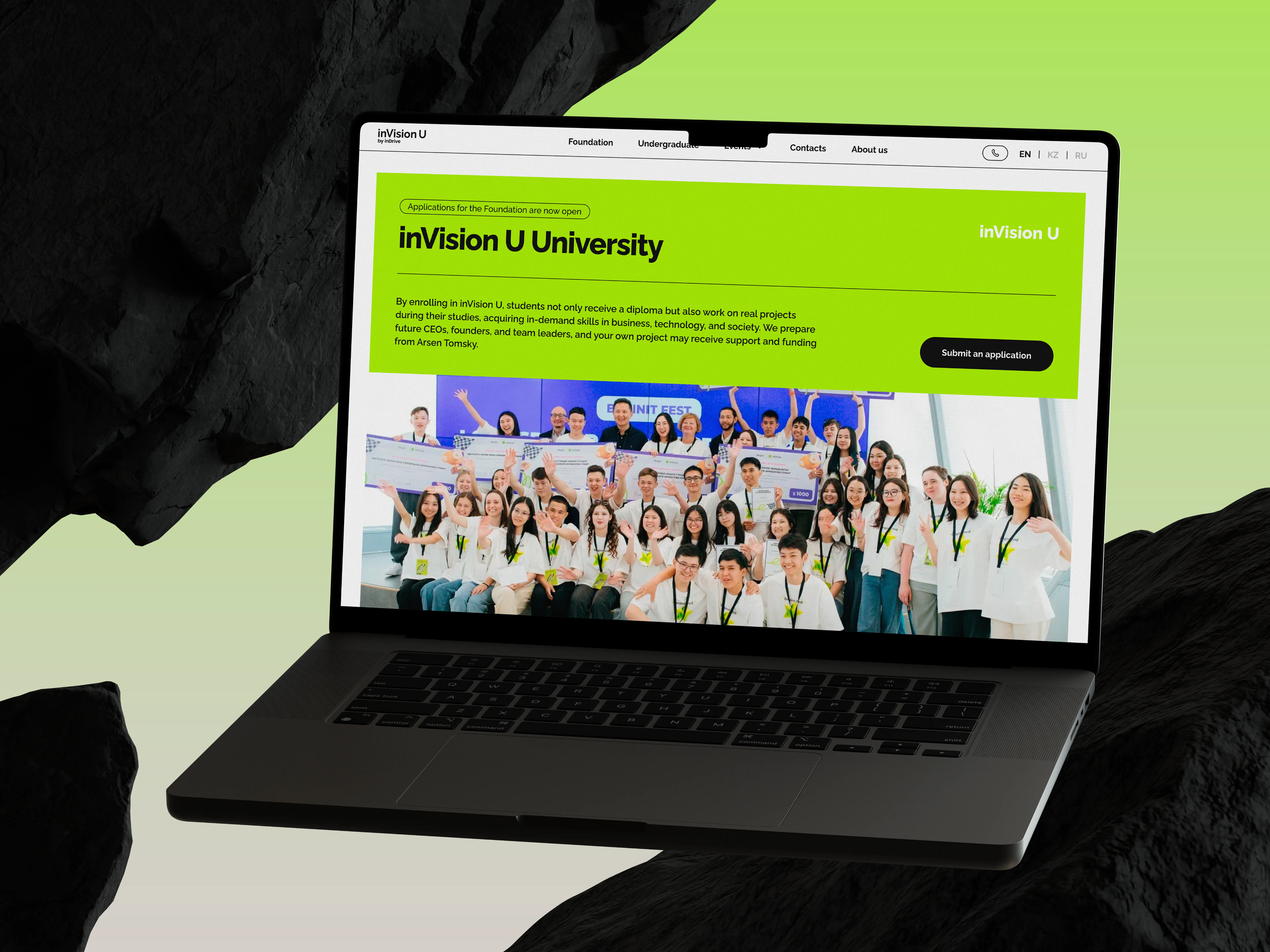
Case: inVision U. Applicant Portal
The InDrive team reached out to us again — our longtime employer, with whom we had already worked on the development of their education initiative. Previously, we had created a website for the project. This time, the task was different: to build a platform for collecting and processing applications.
At the time the website launched, this idea was still taking shape and had not yet been validated by the market. But over time, it became clear that the project was truly in demand: interest from applicants showed that the initiative had strong potential for further growth.
To prepare for a growing number of applications and build a convenient process for handling them, the InDrive team needed a separate platform — not just an application form, but a system where an applicant could go through the entire journey online, while the university’s internal team could work with applications in a convenient way. That platform is exactly what this case study is about.
When an admissions platform turns out to be more complex than it seems
At the start, the employer already had a general understanding of how the service should work. The main steps had been outlined: registration, application form, documents, application review, interview, decision. That was enough to see the big picture, but not enough to jump straight into building the product without additional questions.
As soon as we started breaking all of this down into actual screens and user actions, it became clear that there were a lot of important nuances inside. Which documents were required and which were not. Which ones could be uploaded later. What depended on the country. What depended on the program. Who exactly reviewed an application. Who evaluated it. What happens if something in the form was wrong. What statuses the application should even have at each stage.
This is a normal situation for products like this. As long as the process exists as a general scheme, it looks fairly linear. But the moment you start turning it into a real platform, actual dependencies appear — and without them, you cannot move forward.
That is why our first major task was not to “get to design as quickly as possible,” but to turn the general idea into working logic that design and development could already rely on.
What the employer got: quite early on, the project stopped being just a collection of wishes and started turning into a clear system. That helped reveal weak spots in advance instead of dragging them further into development.
How the work on the platform started
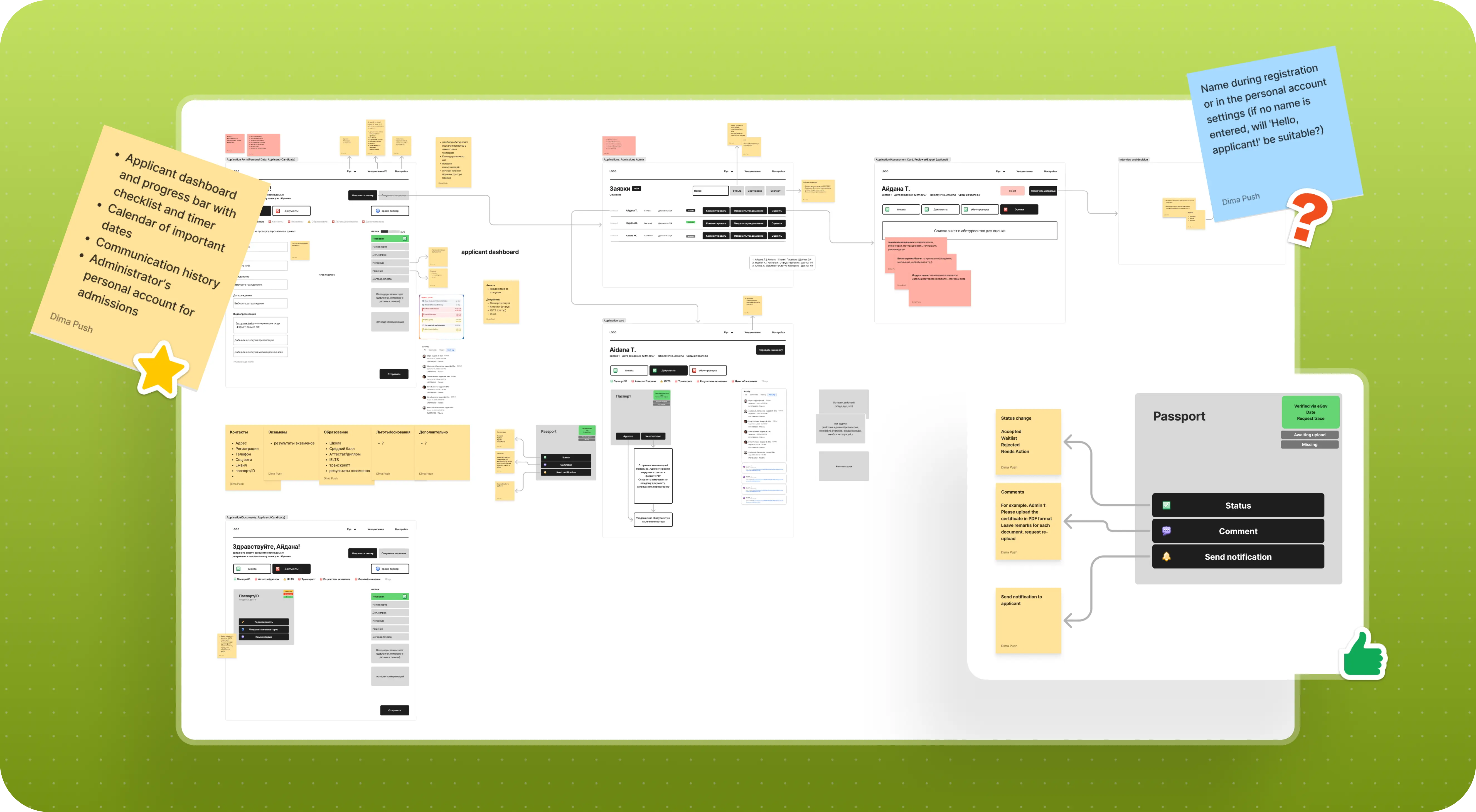
We did not start with final screens, but with very rough wireframes. It was a convenient way to quickly test what the user journey could look like in general and move the discussion from abstraction into something more concrete.
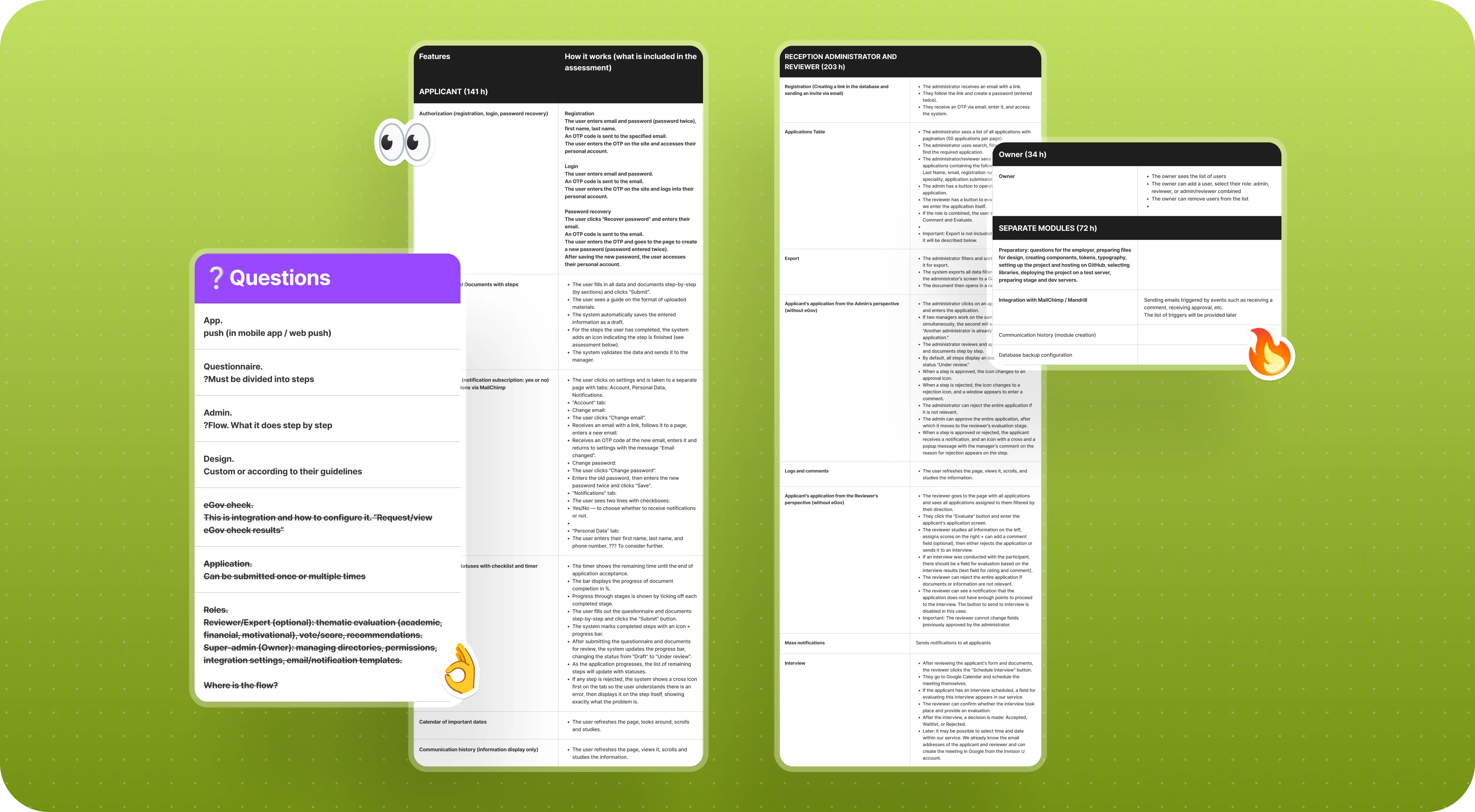
As soon as the first drafts appeared, it became much easier to ask precise questions. After that, we started describing each flow in writing and put together a working table where, step by step, we documented user actions, statuses, questions, and all the gray areas that needed clarification together with the employer.
Pretty quickly, it became clear that this volume of nuance could not be sorted out in a single meeting. So the work moved into several iterations: some things were discussed on calls, others were clarified directly in working files where the inVision U team responded to our comments. Gradually, the original idea started taking shape not just as an “admissions form,” but as a real system with roles, statuses, checks, and transitions.
At the same time, we also kept the MVP scope in mind. In projects like this, it is very easy to want to do everything at once: chat, smart reminders, complex integrations, a lot of additional scenarios. But the first version of the platform first and foremost had to solve the core task, not try to include every possible feature.
What the employer got: instead of a vague spec, they got a working product map that gave us a confident foundation for moving into design and development.
How we built the applicant journey inside the platform
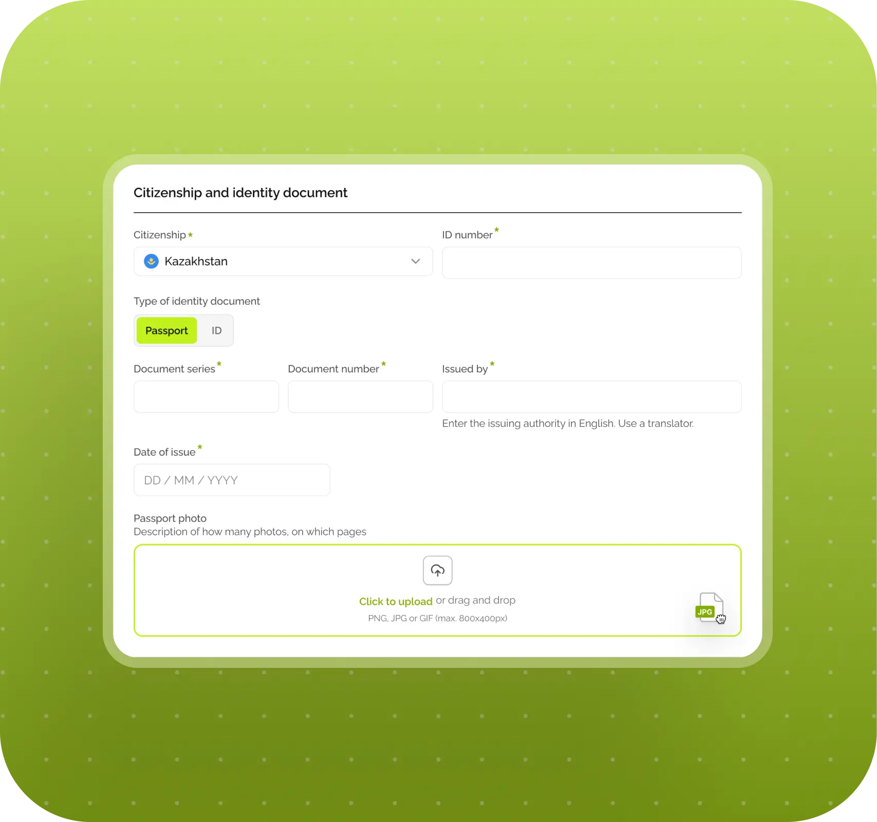
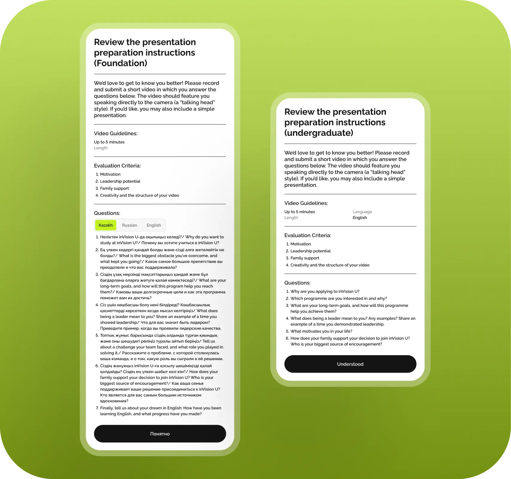
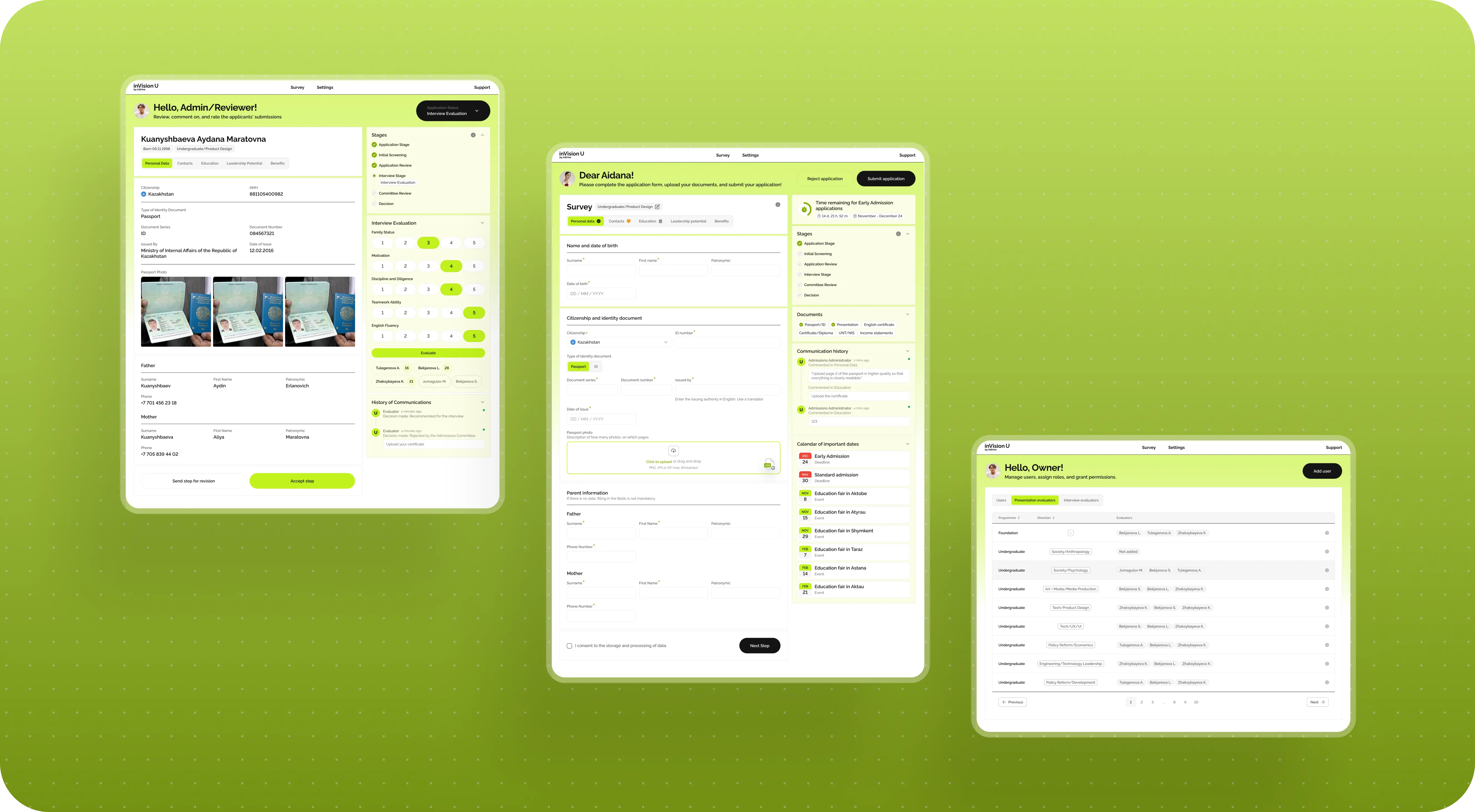
On the applicant side, the platform was built as a step-by-step process made up of several stages. The user registers, enters the system, and fills out the application form in blocks. This was important because the admissions process is already stressful on its own, and overwhelming someone with one endless form from the very beginning would have been a bad idea.
So we split the application into several parts: personal details, contact information, education background, leadership potential, benefits, and other related sections. That makes it easier for the person to understand where they are and what exactly is needed from them at that moment.
But it was important to us not only how the user filled out the form, but also what happened afterward. That is why the platform did not end with a Submit button. The applicant still had a personal account where they could see the current stage of their application, a list of documents, comments from reviewers, and in general understand what stage of the process they were at.
This is a pretty important thing. In education services, it is usually not enough for a person to simply submit something. They want to understand what comes next, whether the application has been accepted, whether something needs to be fixed, whether they should expect an interview, and so on.
What the employer got: instead of a regular application form, they got a full interaction system for applicants, where the person’s journey feels more transparent and less stressful.
Why the application form could not be the same for everyone
One of the main challenges of the project was that the form could not be universal. At first glance, it looked like a standard admission flow, but inside it had quite a few conditions that depended on the specific user.
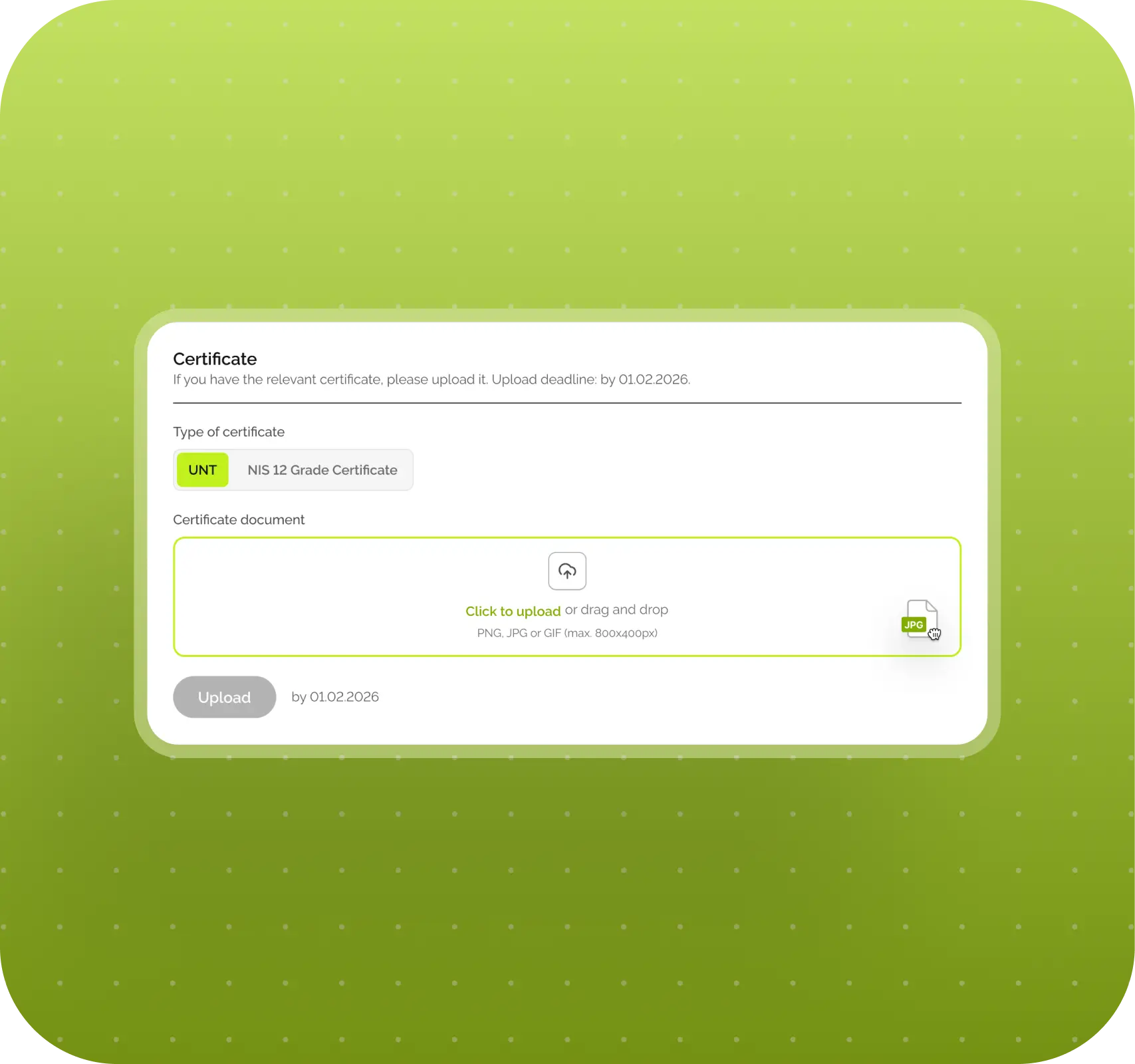
Part of the logic was tied to citizenship. For example, the UNT certificate was required only for applicants from Kazakhstan. If a person selected another country, that field simply should not appear. There was no single universal logic for English either. Depending on the country and scenario, IELTS or TOEFL might work, and in some cases Duolingo as well.
Another part depended on the academic program. The requirements for Foundation and Bachelor were different. In some cases, an English certificate was required; in others, it was not. In some cases, additional documents from parents were needed; in others, they were not. So the application really changed depending on what exactly the person was applying for.
Then another practical issue came up. Not everyone has all documents on hand at the moment they fill out the application. Some certificates are received later, while the admissions deadline may already be close. So the platform had to be able not only to accept documents inside the form, but also allow some of them to be uploaded later.
This is exactly the kind of thing that makes a product truly complex. From the outside, it looks like “just a form, documents, and a submit button,” but inside, that form turns out to have pretty dynamic and branching logic.
What the employer got: a flexible application form that adapts to real admissions rules and does not force every user through the same exact path.
What happens to an application after submission
Once the application form is submitted, the second major part of the platform begins — the internal one. And here, the product logic is also very important, because the application does not just “drop somewhere into the system,” but moves forward through a clear process.
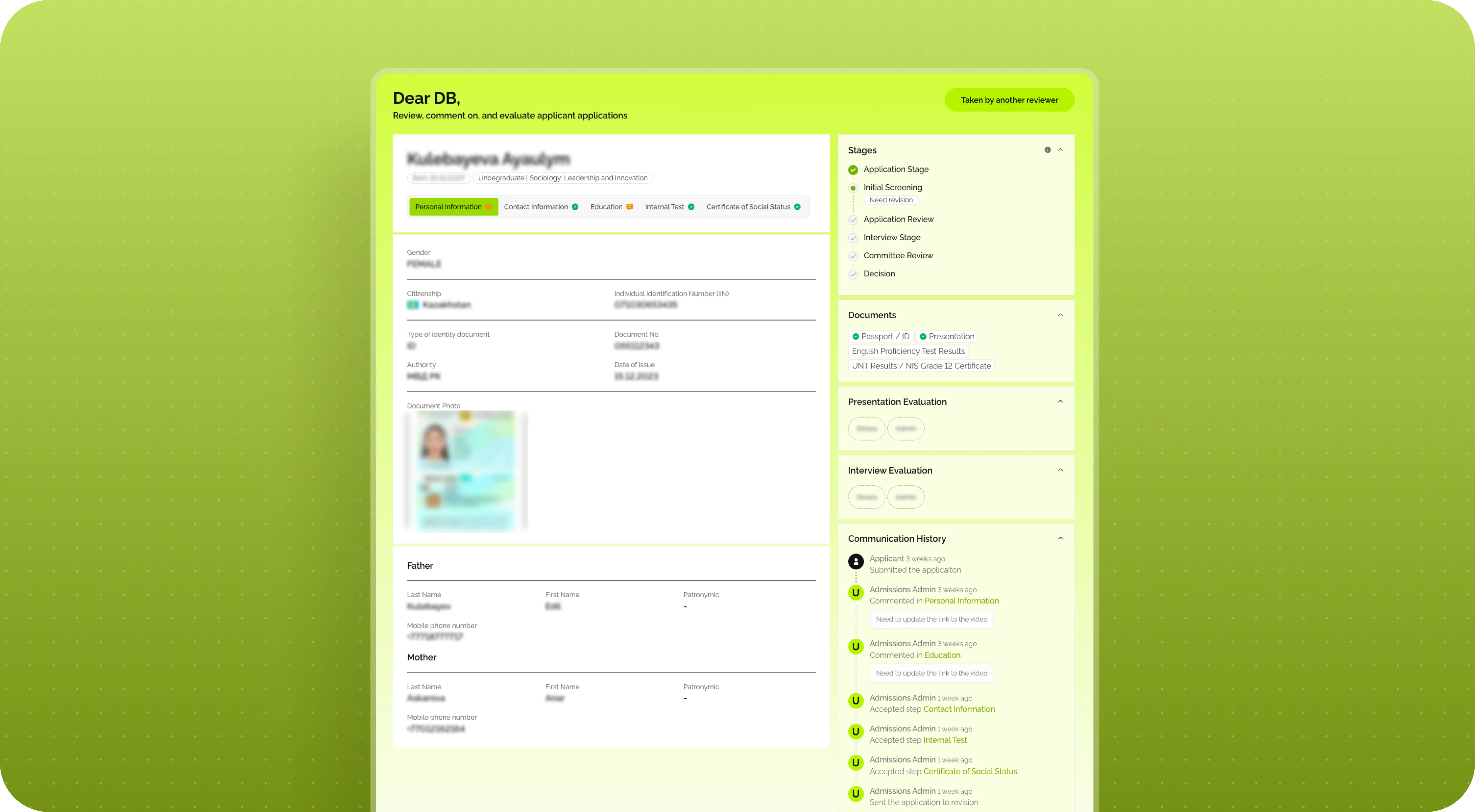
The first stage is a correctness check. In other words, a university staff member looks at whether everything has been filled out properly, whether all required documents are present, whether the files can be opened, and whether there are any obvious mistakes. This is not an evaluation of the candidate as such yet — it is specifically a check that the application is ready for review at all.
If something is wrong, the application can be sent back for revision. The applicant receives an email, logs into the system, and sees a comment explaining exactly what needs to be fixed. We intentionally did not build a full chat here. For the first version of the platform, that would have added unnecessary complexity both for development and for the employer’s own team. Any chat quickly turns into a separate communication stream that someone has to constantly manage.
So the logic here was simpler and more useful: the reviewer leaves a comment, the applicant makes the edits, resubmits the application, and the process moves on.
What the employer got: a convenient revision workflow that lets applications be returned for updates without creating extra communication overhead inside the team.
How the university team’s internal workflow was structured
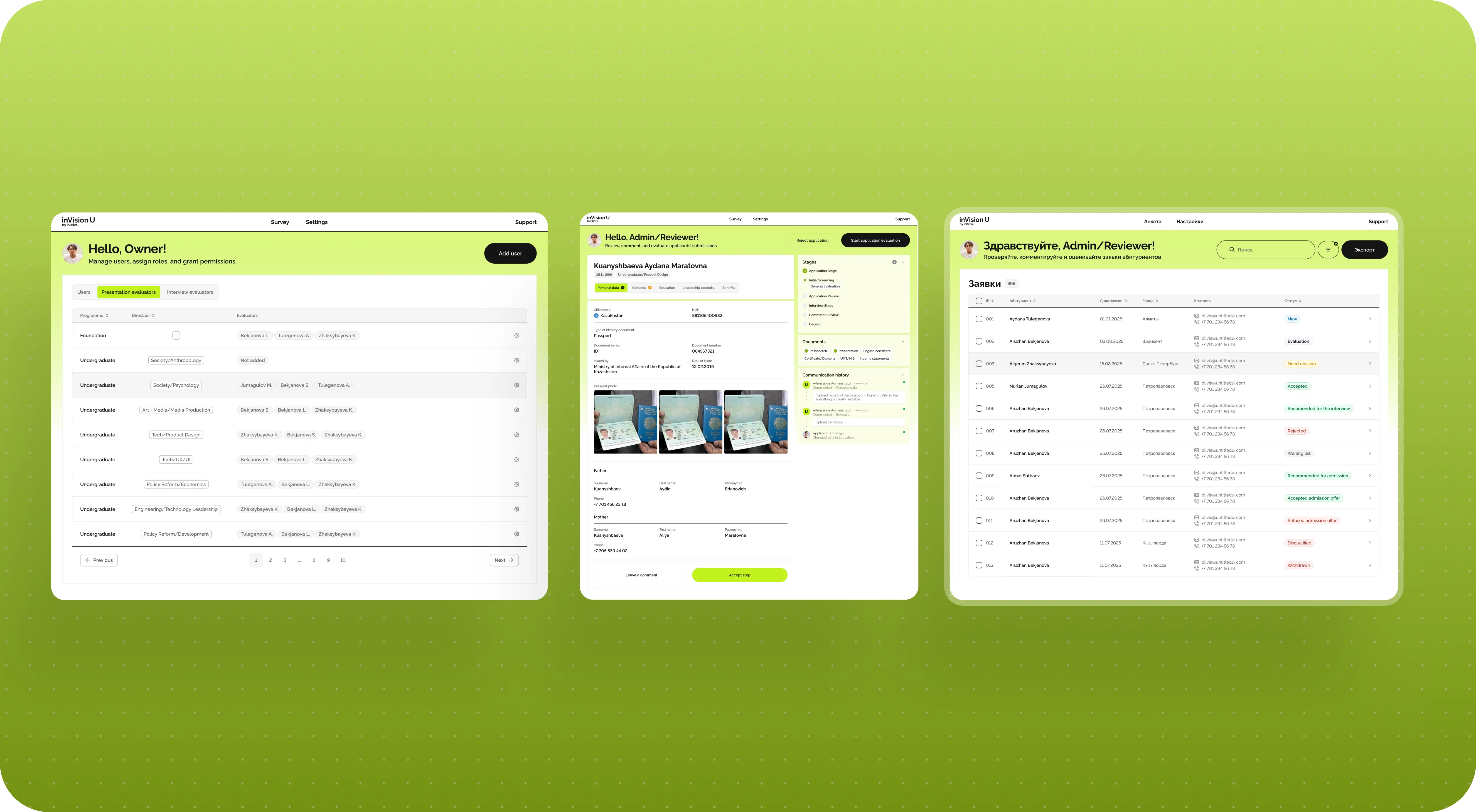
To make all of this work not only for applicants, but also for the university team, we built in several roles.
Roles inside the platform
At the top level is the super admin. This is the person who manages the internal structure of the platform: adds staff members, assigns roles, and determines who is responsible for which programs.
The next layer is admissions administrators. They handle the initial review of applications: checking data for accuracy, returning forms for revision when needed, and moving valid applications forward.
And then there are evaluators. They join in once the application has passed the basic review and it is time to assess the substantive part: presentations, interviews, and other things directly related to selection.
At the same time, the same person in the system could combine several roles. For example, someone could be both a reviewer and an evaluator for their program. It was also important that each person only saw their own part of the process: their own programs, their own applications, their own actions. Otherwise, the system would quickly become overloaded and inconvenient.
What the employer got: a clear internal application handling structure where roles are separated, access does not overlap unnecessarily, and the process does not rely only on manual coordination.
Why evaluating candidates required separate logic
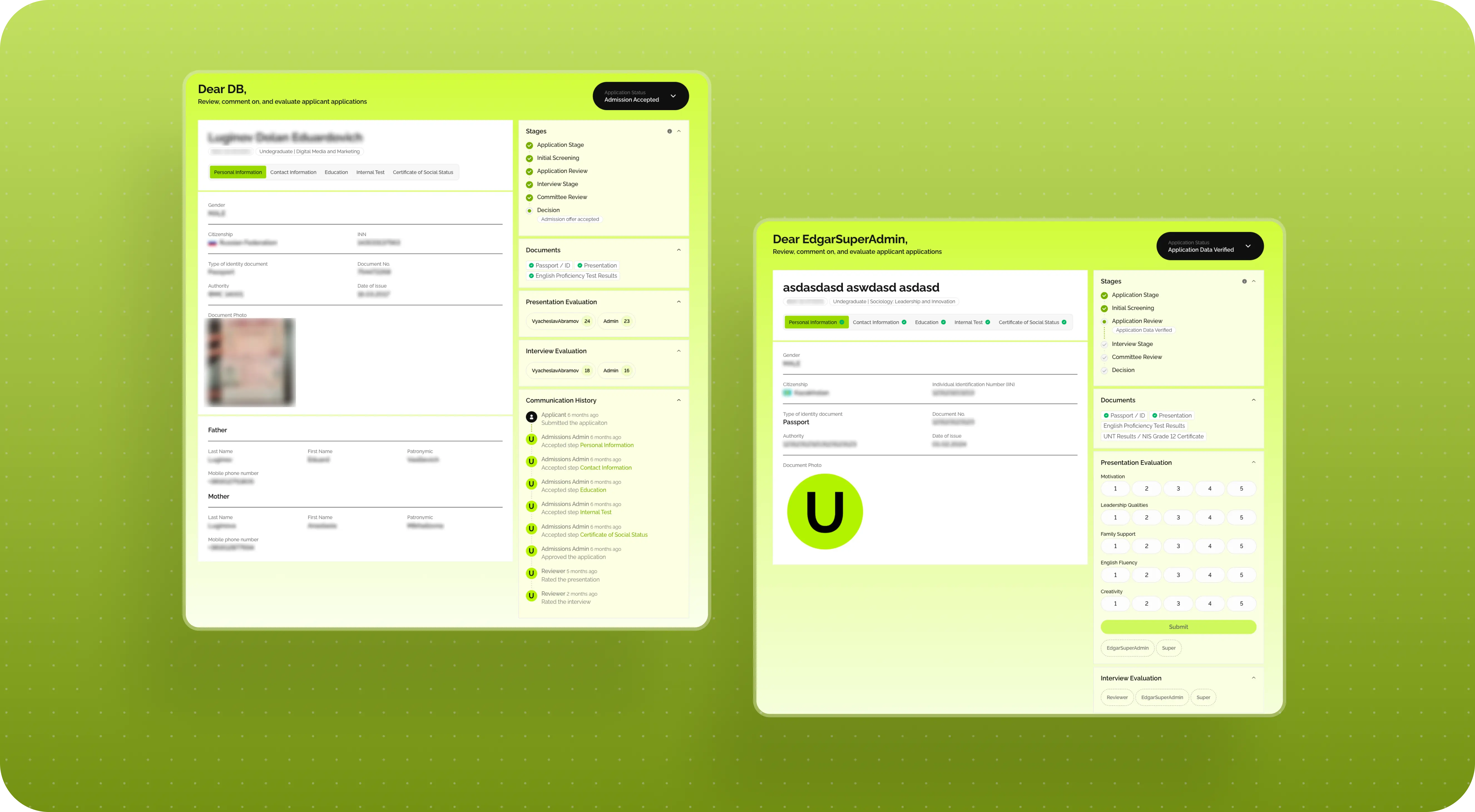
A separate layer of logic was tied to candidate evaluation. Early on, this seemed simpler. But as the work progressed, it became clear that in the real process, one application could be evaluated by several people, and at different stages.
For example, one person might evaluate the presentation, while another only joins in at the interview stage. That immediately changes how the system needs to work. It is no longer enough to simply store one final score. You need to understand which evaluators have already completed their part, which have not, how the scores are combined, and at what point the system can actually allow the application to move forward.
To support this, we created a separate evaluation interface where a staff member opens an application, works through the criteria, and assigns scores. At that moment, the platform is not just saving numbers — it is maintaining the full process logic: when the evaluation is complete, when a status can be changed, and when it still has to wait for other participants.
This is a good example of how a “small clarification” in the process can lead to a fairly substantial product update.
What the employer got: a more realistic evaluation system that matches the real admissions process rather than a simplified one-evaluator-per-candidate model.
How statuses became the foundation of the entire platform
Another important part of the platform was statuses. And here, they were needed not for visual polish, but to make the entire admissions process understandable and manageable at all.
For the applicant, statuses answer a simple question: what is happening with my application right now? In progress, under review, substantive review, interview, decision. This makes the process much less stressful and much less opaque.
For the internal team, the status logic was of course more detailed. There were new applications, revisions, resubmissions, evaluation stages, interview recommendations, final decisions, and so on. We also refined this system as the work progressed. The statuses had to be convenient for the team, understandable to the user, and at the same time fit properly into the backend logic.
So here, a status is not just a label on the screen. It is a working part of the system that helps every participant in the process understand exactly where an application stands and what can be done with it next.
What the employer got: a transparent status-driven process for both the internal team and the applicants themselves.
How we approached the platform design
Once the logic was more or less assembled, we moved into design. This phase went fairly smoothly. The visual direction was approved quickly, and after that the work moved forward without major swings.
A big reason for that was that design here had a very clear job to do. The goal was not to “wow” anyone with the interface, but to make the platform easy to navigate. So applicants would not get lost, and the internal team could work calmly with the flow of applications.
We also approached it through a component system right away. The designer laid the foundation: key screens, core patterns, interface logic, and then some of the simpler pages were assembled later in development based on that system and React components. This helped us avoid spending extra time on repetitive states and focus on the scenarios that really mattered.
For products like this, that is usually the most sensible approach: not to manually design every single thing, but to first build a strong foundation that can then be scaled.
What the employer got: a cohesive interface with clear logic and a solid base the platform can continue to grow from.
How we built the notification system
As soon as a platform includes comments, revision requests, and status changes, it becomes clear that without emails, all of this will work worse. The user should not have to guess when it is time to log into the system.
So we mapped out the main communication points in advance: registration confirmation, code emails, notification that an application had been submitted, emails about comments, status change notifications, and other basic scenarios. Even if the employer’s text content was not ready yet, the logic itself still had to be built in.
We put together a list of all the main system emails, handed it over to the employer, and then set up automations through Mailchimp once they had the actual templates ready.
What the employer got: a working notification system that supports the applicant journey and helps ensure important process stages are not missed.
Why the platform was launched before the main admissions cycle
One of the good decisions in this project was launching the platform before the main admissions cycle. The fall admissions window essentially became a real-life test run for the system ahead of the larger spring wave.
This helped a lot, because no matter how well a team tests a product internally, real users will still find scenarios that are not always obvious in advance. Some people act in unexpected ways, some fill out the application over several sessions, some are missing a document at the moment of submission — and it is in moments like these that you see where the platform needs to be strengthened.
After that fall launch, we collected the first round of feedback, fixed some bugs, and made a few useful improvements before the main flow of applications began. One of those improvements was the ability to upload some certificates after the application had already been submitted.
What the employer got: not a theoretical MVP, but a working platform that was tested in a real process and made more stable before the main admissions cycle.
What the launch showed on real users
After release, things surfaced that are not always visible during the design stage. One good example is the scenario where a user does not complete the application in one sitting.
Initially, the logic was fairly straightforward: a person goes through the form and submits it as a complete package. For an admissions process, that sounded reasonable. But in real life, people do not always behave that way. Some start on one device and continue on another, some come back to the application in the evening, some get interrupted and return later.
At launch, part of the intermediate state was stored in localStorage, and that was enough for the basic scenario. But real feedback quickly showed that users needed a more convenient and reliable way to save their progress. After that, we improved the corresponding logic.
This is a good example of how a product starts becoming more mature after launch. Not because it was bad before, but because real people always bring a slightly more complicated truth than any whiteboard diagram can.
What the employer got: a platform that gradually adapts not only to the formal process rules, but also to the real behavior of applicants.
Technical foundation of the platform
From a technical standpoint, inVision U is not a website with a form, but a full-fledged platform with roles, statuses, internal logic, and two workspaces: one for applicants and one for the university team.
Technology stack
On the frontend, we used React. On the backend, we used Nest.js, TypeORM, PostgreSQL, TypeScript, Swagger, Node.js, and Redis.
This stack gave the product a solid foundation that can continue to grow and become more complex without feeling like everything is held together by fragile connections.
What the employer got: a working technical foundation the platform can be supported and developed on further.
Results for inVision U
After the launch of inVision U, the employer received:
- a full admissions platform instead of fragmented manual workflows
- a multi-step application form with logic depending on program, citizenship, and document type
- an applicant account with statuses, comments, and process stages
- an internal role system for super admins, reviewers, and evaluators
- evaluation logic where multiple staff members can work on one application
- an email notification system built into the core user journey
- an MVP that was tested before the main admissions wave and improved based on real-life use
- a stable technical foundation for further product development
According to the employer’s team, the platform has already handled around 1,500 applications. For a project like this, that is a good sign that the system did not stay at the concept stage, but is actually being used in the admissions process.
The employer can now:
- collect and process applications in one system
- distribute work across different roles and programs
- identify issues in data and documents more quickly
- communicate with applicants more transparently through statuses and notifications
- scale the admissions process without returning to a manual and fragmented workflow
- continue developing the platform on top of an already working product
Conclusion
inVision U is a good example of a project that looks simpler from the outside than it actually is on the inside. At the idea level, it is “a platform for admissions.” In practice, it is a system where the user journey, real admissions rules, internal team roles, documents, statuses, evaluation, and room for future growth all have to come together.
That is why the main value here was not only in creating convenient screens, but in building a working structure out of a process that was very much alive and changing in places. For the employer, this resulted not just in a new digital tool, but in a clearer and more manageable way to run admissions. And in projects like this, that is probably the most important thing.
Awards
About Digital Butlers
We’re Digital Butlers — a design-led team of 27 senior specialists building digital products since 2016. By choosing us, you’re getting results that are way different from what you already have — with the same commitment to your goals that Alfred has for Batman.
If you need a website, web service, or mobile app that pays off, reach out to us — we do it well.
Digital Butlers — a mature team with mature processes that deliver consistent results.


Let's discuss your project.
My name is Alex and I am your potential Digital Butler