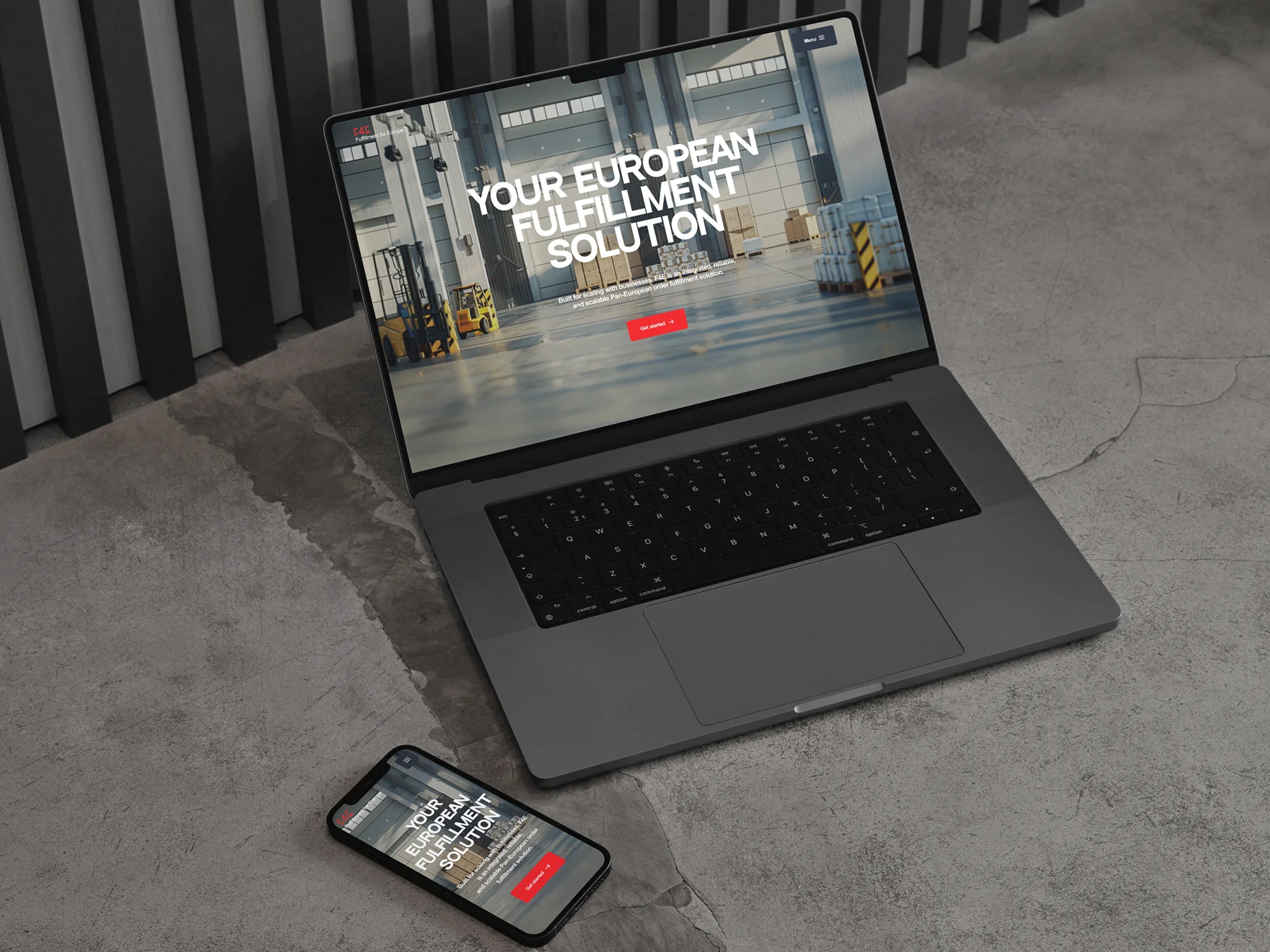
Cyclize
The German startup Cyclize is focused on deep processing of complex industrial waste to produce synthesis gas.


The German startup Cyclize is focused on deep processing of complex industrial waste to produce synthesis gas. It’s a heavy engineering technology with a multi‑stage plant that’s hard to explain in a regular conversation.
Before the project started, the team barely had a “proper” website. And Cyclize was just entering the stage where they needed to start selling the technology to the market — to investors, partners, and industrial clients. At this point, the website becomes the showcase for the company and the plant: it has to not only look top‑tier, but also clearly show how exactly the waste‑processing flow works and why it’s valuable.
Branding and design for the new website were created by the agency Serious Business, which handed over detailed Figma layouts to us. Our task was to use Webflow to turn those layouts into a live, fast, modern corporate website with animations and interactivity — one that clearly explains Cyclize’s technology and strengthens the company’s image as a serious industrial player.
.webp)
A New Experience for Visitors: How to Explain a Complex Technology Through the Interface
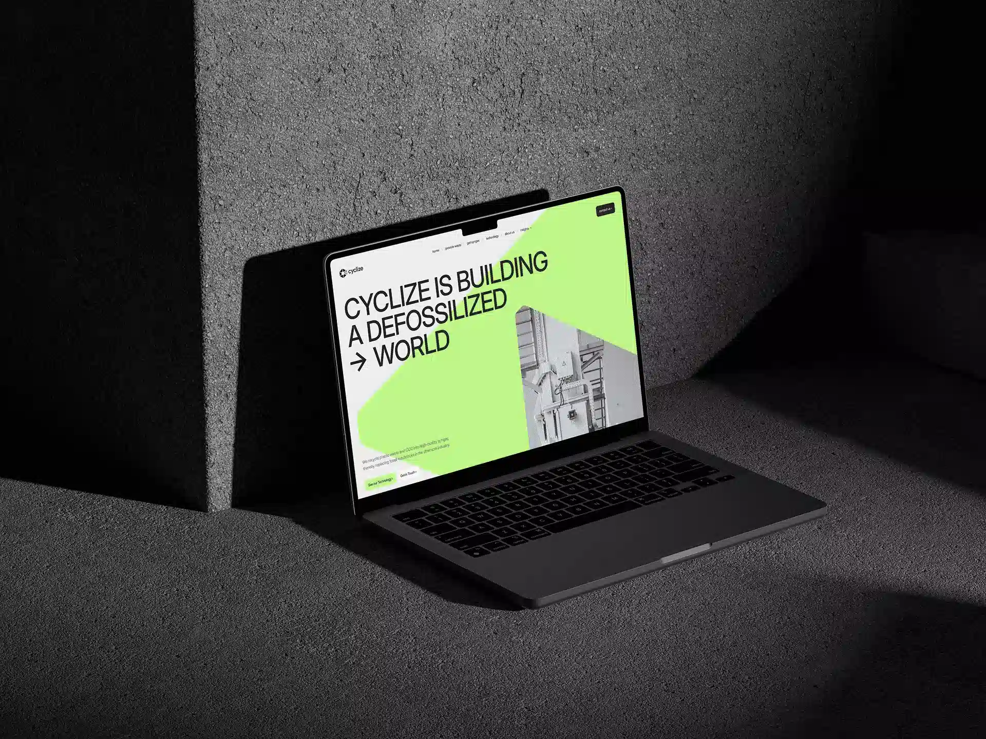
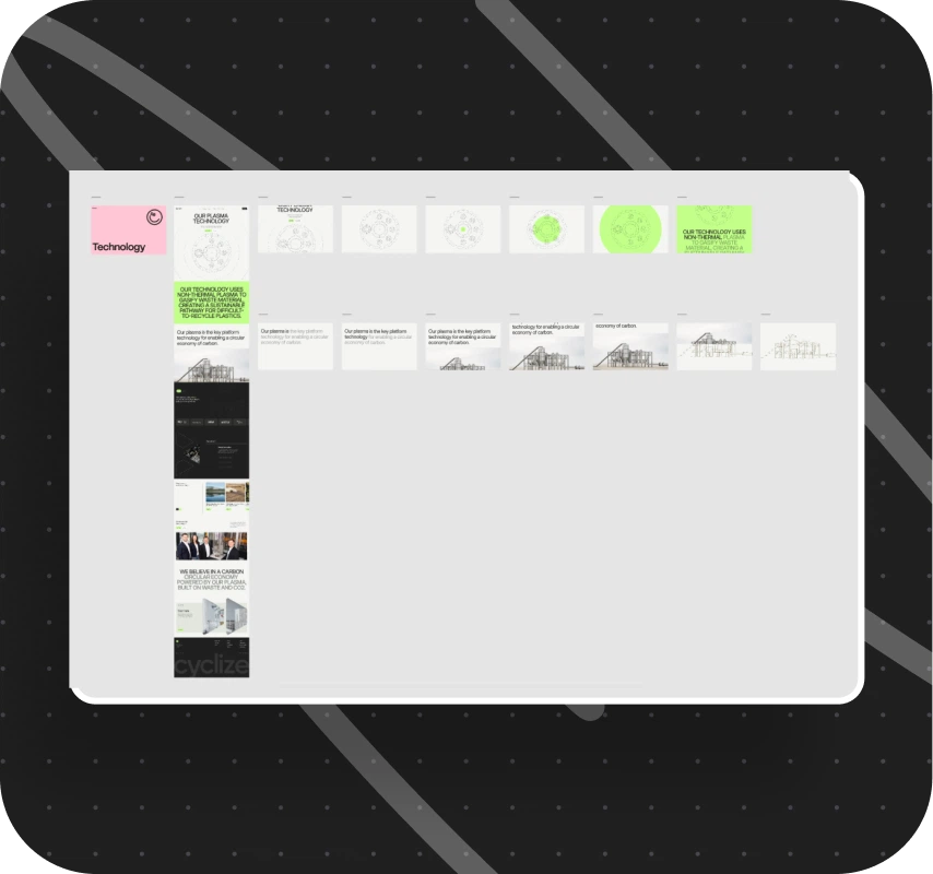
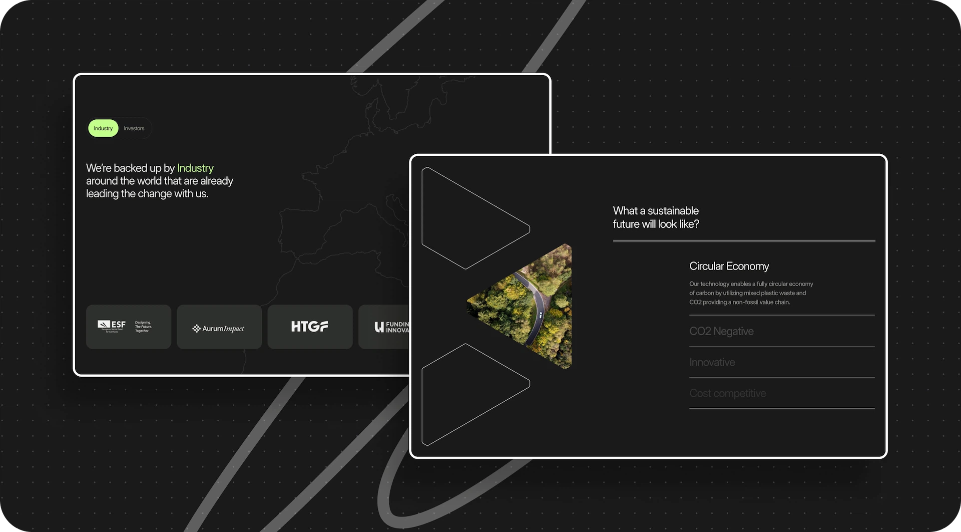
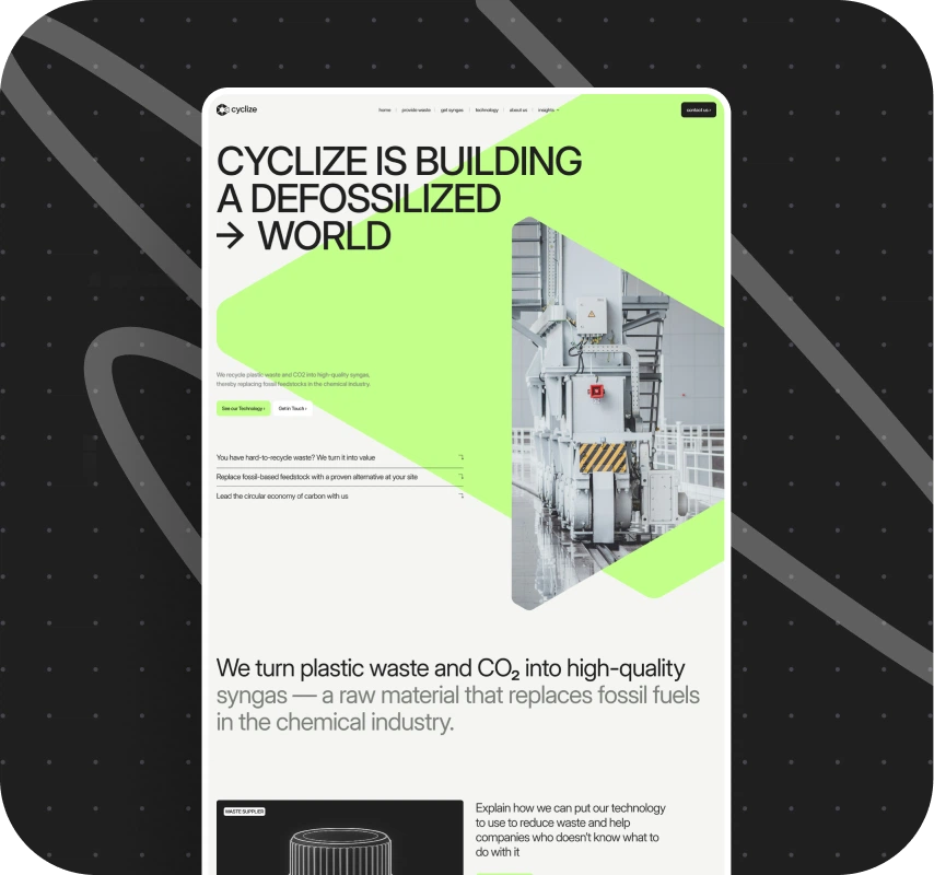
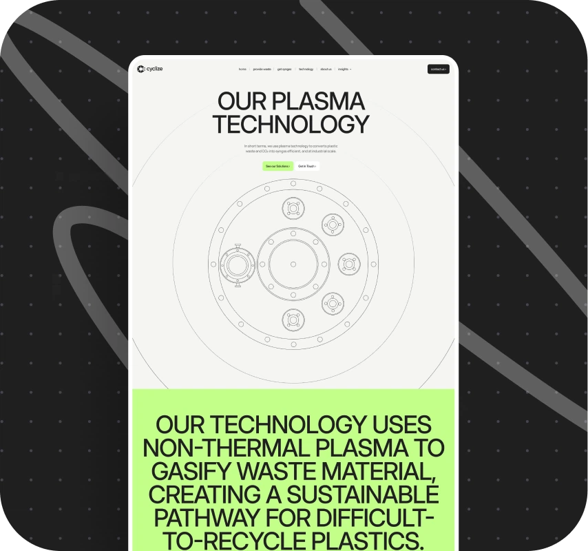
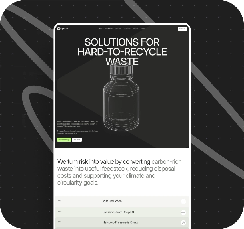
The main goal of the Cyclize website is to explain a complex technological waste‑processing cycle in a simple, visual way. That’s why the key pages aren’t marketing “hero screens,” but sequential stories.
The sections about the technology and the plant show how the installation actually works. Instead of long technical texts, they use animated diagrams and blocks that guide the user through the entire process step by step. A key part of this storytelling is the interactive elements that react to scroll and user actions, highlighting the important stages.
The “Get syngas” page deserves a special mention. As you scroll, a wide horizontal illustration smoothly “shrinks” and slides to the right, freeing up space for a text block and a call to action. This isn’t an off‑the‑shelf library animation: our developer implemented it from scratch, specifically for the scenario and composition of this page.
What the employer got: the site stopped being just a “business card with text” and turned into a visual tool. Potential partners and investors now don’t just hear about the technology — they literally see how it works, from waste to synthesis gas. Cyclize is perceived as a serious tech player with a well‑thought‑out engineering system, not as an abstract “green” startup.
From Design to Development: A Rare Case of a Perfect Handoff
The design and brand identity for Cyclize were created by the agency Serious Business — and that heavily influenced the development process. In Figma, their team didn’t just draw beautiful screens; they broke down complex animations into individual states and steps, adding clear annotations on what should move, when, and how.
Thanks to this, even with a large number of animations, the developer almost never had to ask additional questions. Instead of spending time clarifying “how exactly is this supposed to move?” and “what is that block synced with?”, we immediately focused on clean technical implementation and code quality.
What the employer got: animations and interface behavior in production match the designers’ original vision. There was no “gap” between the layouts and the live site, and approvals moved quickly: both teams spoke the same language, and the project progressed without constant rework.
Implementation On Webflow And CMS Setup
The technical foundation of the project is Webflow. It powers the site structure and content management; no separate backend layer was needed.
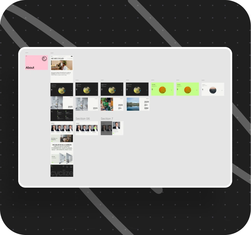
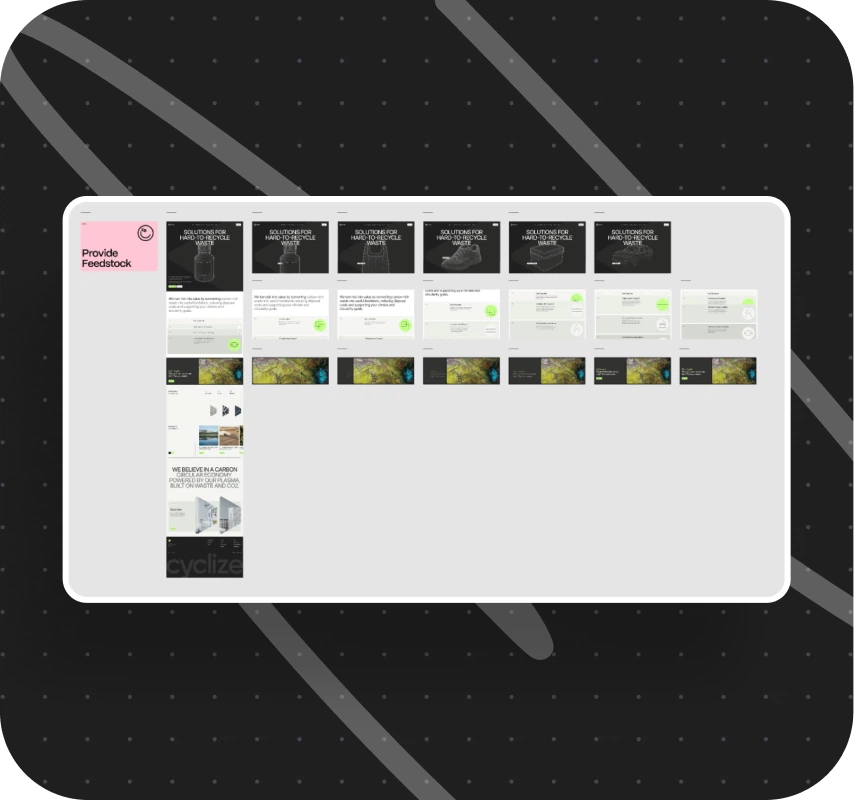
We started with the homepage: we moved it from Figma to Webflow, immediately taking both desktop and mobile states into account. After that, we gradually built out the remaining sections — about the company, the technology, the plant, the solutions, plus the resources section and the blog. The workflow was simple: desktop version first, then mobile adaptation, and in parallel we implemented all the described animations and micro‑interactions.
We paid special attention to the CMS. In Webflow, we set up collections for the blog and other dynamic sections and thought through the structure of fields and relationships. During acceptance, Cyclize asked several times to make specific sections more flexible — so they could, for example, change images and texts through the CMS instead of touching the code. We baked these requests into the architecture.
What the employer got: instead of a static promo site, they now have a living corporate resource that the team can update on their own. They can add new articles and materials, update project and solution data without touching the animations and without pulling in developers for every small edit.
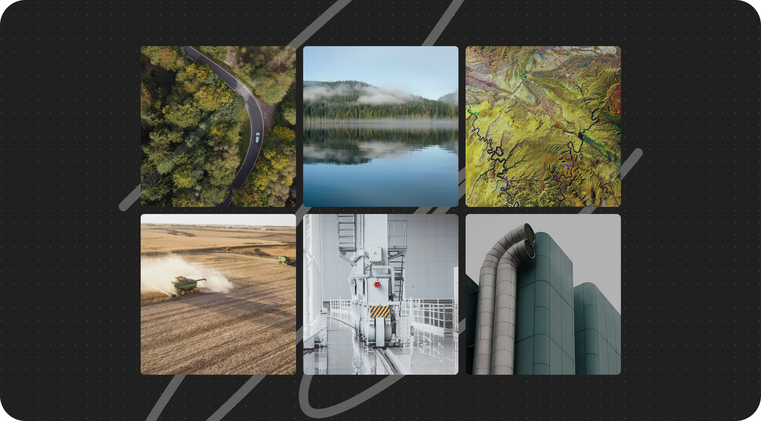
Visual Quality: Enhancing Images With AI
Some of the original images the project started with didn’t visually match the intended level of the site: you could see a lack of detail or occasional artifacts. Against the backdrop of a neat interface, they stood out.
To avoid slowing down the project by redrawing everything from scratch, we used modern AI services to improve image quality. This helped us boost the detail and remove noticeable artifacts while preserving the overall brand style and composition defined in the design layouts.
What the employer got: a cohesive visual line with no “weak links.” The site looks clean and polished: there’s never a sense that the interface was done carefully while the images were thrown in “as is.” After launch, the Cyclize team later replaced some visuals with new ones, but many of the images we improved remained in the final version.
Technical Level And Internal Components
- Platform and content: the site structure and content management are implemented on Webflow.
- Frontend logic: TypeScript is used for logic and complex scenarios.
- Styles and basic effects: styling and simple animations are implemented with CSS.
- Animations: controlled animations are built with GSAP (GreenSock Animation Platform).
- Scroll: smooth, “velvety” scrolling is powered by the Lenis library.
- Interactive elements: Swiper.js powers sliders, and A11y Dialog handles accessible modals with proper keyboard navigation and screen reader support.
- Internal UI components: accordions, tabs, marquees, and other elements come from our internal library and form the basis for many interface patterns on the site.
What the employer got: behind the striking visual layer is a predictable, maintainable architecture; complex animations don’t hurt performance or responsiveness, and the site is ready for further development and new interactive scenarios.
Challenges And How We Solved Them
Incomplete design and content at the start
By the time development needed to start, not all pages and animations had been fully worked out. This was especially true for blocks that had to explain in detail how the plant operates. Some texts and visual materials were still being refined by the employer and the designers.
Solution: we deliberately started with what was already ready and locked in — the homepage, the UI kit, and the basic animation principles. The remaining sections and texts were developed in parallel, and we came back to the most complex plant‑ and technology‑related blocks closer to the end, once Cyclize had more complete materials on their side.
What the employer got: the project didn’t “stall” waiting for every section to be perfectly ready. Development moved forward in stages, and the complex parts were carefully built out as soon as the employer had the necessary data.
Engineering visualizations of the plant and lack of data
The sections about the plant and the technological cycle were initially envisioned as even more detailed and “engineering‑accurate.” For that level of detail, it’s critical to have comprehensive diagrams, blueprints, and clearly described process stages. In practice, some of this data arrived late or in incomplete form.
Solution: wherever we didn’t have enough source data, we deliberately simplified the animations or dropped the originally planned depth. Instead of dragging out timelines and trying to reproduce what we didn’t actually have, we created versions that stayed clear, functional, and visually cohesive.
What the employer got: a stable, finished site with no “stuck” or half‑baked technical diagrams. At the same time, the Cyclize team now has a clear understanding of exactly what data they’ll need if they decide to enhance the engineering visualizations in the future.
Approvals and designer changes on the employer side
During the project, the employer switched designers responsible for its several times. This sometimes led to delays in approving layouts and repeating the same approval cycles within their team.
Solution: we structured the process, so these delays had minimal impact on development. We worked with what was already approved and didn’t jump into redoing large portions of completed layouts unless it was really necessary.
What the employer got: despite internal reshuffles on their side, Cyclize ended up with a project that kept moving forward and was brought to completion without dramatic rollbacks or rebuilding the site “from scratch.”
Results For Cyclize
After launching the new website, Cyclize got:
- a modern corporate website that matches the visual and technical level of a high‑tech startup;
- a clear, visual explanation of a complex waste‑processing technology through animations, interactive blocks, and precise visualizations — not just text descriptions;
- a convenient Webflow CMS structure that lets the team manage the blog, materials, and key sections of the site on their own;
- a consistent visual layer where the interface and imagery together support a strong, stable brand image;
- a technically robust frontend built on proven libraries and our internal components, ready for further development and scaling.
Now the employer сan:
- confidently present the plant and the waste‑processing flow to investors and partners in a convenient, modern format;
- keep the site up to date with their own team, without running into development bottlenecks every time;
- build Cyclize’s image as a serious technology player in the waste‑processing space, not just a “future‑oriented” eco project.
Conclusion
The Cyclize project is an example of how you can go from an almost non‑existent digital showcase to a full‑fledged product that helps a company explain complex engineering technology to the market.
We didn’t just “build a site on Webflow.” On this project, we dove deep into the challenge of explaining complex engineering through an interface, refined the Webflow + custom frontend logic + rich GSAP animation stack, and tuned the collaboration process with an external branding agency into a streamlined workflow.
That’s why in projects where you need to combine complex content, animations, and high implementation standards on Webflow, we feel confident and can anticipate potential bottlenecks — and address them before they become a problem for the employer.
Awards
About Digital Butlers
We’re Digital Butlers — a design-led team of 27 senior specialists building digital products since 2016. By choosing us, you’re getting results that are way different from what you already have — with the same commitment to your goals that Alfred has for Batman.
If you need a website, web service, or mobile app that pays off, reach out to us — we do it well.
Digital Butlers — a mature team with mature processes that deliver consistent results.


Let's discuss your project.
My name is Alex and I am your potential Digital Butler


.webp)