Unite 2030
A case study about how we designed a digital product for a startup in a stage of uncertainty and why even strong product and design work does not always guarantee a launch.


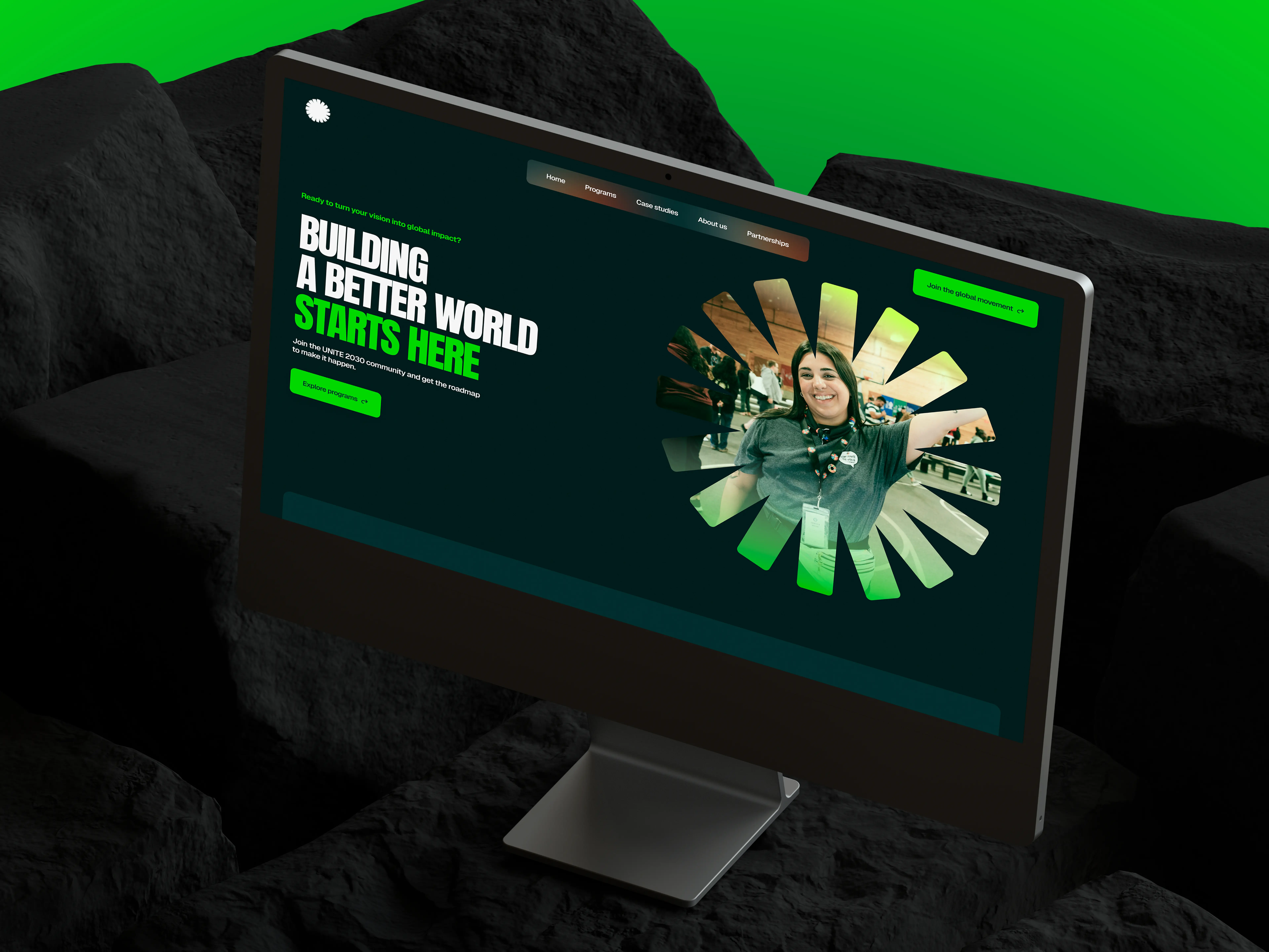
Unite was built around a simple but ambitious idea: helping people from around the world turn bold ideas into real change. Through in person and online programs, as well as hackathons, anyone could apply with a solution to a meaningful challenge. Whether it was finding a better way to filter polluted water, restoring green spaces in desert regions, or tackling poverty in their local community, every idea started with the same opportunity.
Within the project, these participants were known as Changemakers, and the entire experience revolved around them. Over the course of several weeks, they worked alongside mentors, industry experts, and potential investors to transform promising ideas into real projects.
The ecosystem extended beyond Changemakers. It also included investors looking to fund impactful initiatives, as well as donors. These were people whose own ideas were already making a difference but who were not yet ready to become full scale investors. Instead, they supported the project through recurring contributions.
Our employer came to us with two objectives: redesign the website to generate more leads and build an internal application management platform that would simplify workflows consuming a significant amount of the team's time and resources.
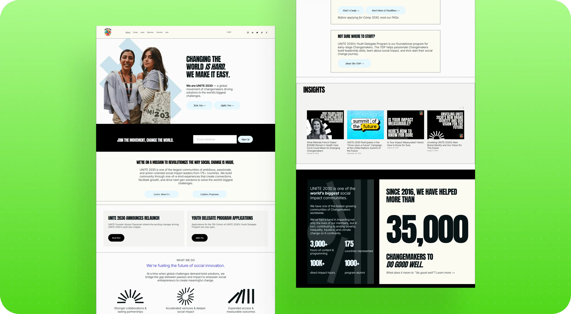
The employer came to us with a clear vision
Unlike many discovery projects, Unite did not start with a vague brief. The employer had already defined the website structure and prepared detailed content. Every page had a clear purpose, every section had a reason to exist, and even during the estimation phase it was obvious that the website would include both static pages, such as the Homepage and About Us, and dynamic program pages where each hackathon or program would have its own landing page.
As we dug deeper, however, it became clear that the website itself was not the most challenging part of the project.
The real complexity began after someone clicked Apply.
From the very beginning, we focused on understanding not only what each page was supposed to accomplish, but also what happened to an application once it entered the employer's internal workflow. That understanding became the foundation for every design and technical decision that followed.
Starting with the workflow, not the interface
Clicking Apply looked simple.
Behind that button was an entire operational workflow involving multiple services, manual reviews, different business rules for different programs, and a team that carried most of the process logic in their heads. Designing a participant dashboard before understanding that workflow would have made little sense. The interface would simply have become a polished layer on top of a process that was never fully documented.
Instead, we started by learning how everything actually worked. We reviewed walkthrough videos recorded by the employer, analyzed the Airtable structure, mapped different scenarios during working sessions, and documented every question that came up along the way. Which documents were mandatory? Which could be submitted later? Which requirements depended on the participant's country? Which varied by program? Who reviewed each application? What happened when information was missing or incomplete?
What the employer got: a clearly documented workflow broken down by scenarios, user roles, and business rules. It became a solid foundation that both the design and development teams could build on.
Inside the application workflow
Unite programs were offered both online and in person, with most in person events taking place in the United States. Applications, however, came from all over the world, including India, Iran, China, and dozens of other countries. Many participants required U.S. visas, which added another layer of operational complexity. The team also had to help accepted participants arrange visas, travel, and accommodations.
The application workflow looked like this.
A participant completed a third party application form embedded on a program page. Their information was then sent to Airtable, where a manager manually reviewed submissions and filtered out applicants who did not meet the requirements for a specific program.
Once the manual review was complete, the application received a tag. Zapier used that tag to trigger the next step, while Mailchimp automatically sent an email letting the participant know whether they had been accepted. The payment stage came next, followed by another round of emails. Finally, participants were invited to Circle.io, where they could access learning materials, watch videos, and communicate with the community.
A single application passed through multiple independent services that were not connected by a shared workflow. Instead, the entire process relied on a series of manual and semi automated handoffs between disconnected tools.
What the employer got: a complete map of every step an application went through, from the website form to Airtable, Zapier, Mailchimp, and Circle.io, along with a clear picture of exactly where the team was spending time on manual work. Previously, that workflow existed only in managers' heads. Now it was documented as a single process that everyone could rely on.
.webp)
One hub instead of fifteen disconnected tools
After mapping the entire workflow, we proposed a different approach.
Instead of moving application data through a chain of disconnected services, we suggested introducing a central microservice that would become the single source of truth. Applications submitted through the website or individual program pages would first enter this central service. From there, the data would be automatically distributed to Airtable, Mailchimp, and Circle.io.
The goal was not to replace the tools the employer already relied on. The team would continue working in Airtable, which had become their primary operational workspace over the years. The goal was to eliminate the fragmented chain of disconnected services and replace it with a single orchestration layer that connected everything together and automated work that had previously depended on manual intervention.
The idea resonated with the employer from the very first meeting. They asked us to walk through the workflow in greater detail so we could refine the solution together and make sure it reflected how their team actually worked.
What the employer got: a solution that immediately addressed the biggest architectural challenge without requiring the team to abandon Airtable. The concept was approved during the first meeting, allowing us to move straight into collaborative solution design with the Unite team.
From a concept to a working architecture
As we revisited the workflow in greater detail, we realized the actual system was far more complex than it had seemed during the first discovery session. There were more transitions, more decision points, and more places where an application could branch into different paths. We mapped the entire lifecycle, starting with the moment an application was submitted and ending when a participant reached the final acceptance list.
From the beginning, we separated the solution into two states. The first was what the product needed to launch successfully. We called this Point A. It represented the MVP, where the core functionality was in place, even if some parts still relied on practical compromises. The second was Point B, the complete long term vision of the platform.
Our process always started with Point B. We presented the complete vision to the employer, collected feedback, and then identified which of those ideas could realistically be incorporated into Point A. That approach ensured the MVP would support the product's long term direction instead of becoming something that would later need to be rebuilt.
By the second workshop, we had also refined the website architecture itself. We defined user flows for each audience, including Changemakers, investors, and donors. We structured the homepage and designed a searchable directory of every Changemaker who had participated in the program, allowing visitors to open an individual profile and explore the initiative each person had worked on.
What the employer got: a production ready architecture that development could begin implementing immediately. It included complete user flow
s for Changemakers, investors, and donors, a structured homepage, a directory covering every participant in the organization's history, and a clear separation between the MVP and the full product vision.

Automation without disrupting ten years of history
The project came with a substantial amount of historical data stored in Airtable, some of it dating back to 2015. Preserving that data quickly became one of the project's biggest constraints.
As a social impact initiative, Unite regularly relied on historical program data when organizations such as the United Nations wanted to understand where successful Changemakers were coming from. That meant deleting or fundamentally restructuring historical records was never an option. We had to improve the workflow while leaving years of accumulated data intact.
The operational challenge itself was significant. A single event could include as many as eight different application statuses, while the underlying information was spread across multiple related Airtable tables. Our goal was to present all of that complexity in a way that made sense to both participants and managers, without requiring either of them to understand Airtable's internal structure.
What we automated
We streamlined and partially automated the infrastructure the employer had built over the years. Some checks that managers previously performed manually, such as filtering out applicants who did not meet a program's eligibility requirements, became automated before an application ever reached human review.
Participants did not need to see every internal status change. Instead, they received notifications only when something meaningful happened, giving them clear visibility into their application without requiring them to contact support for updates.
We also reduced the team's reliance on several third party services. Payment links and other supporting resources that managers previously sent by hand were generated automatically. Because the workflow involved numerous connected tables and a large number of business exceptions, this part of the project required especially thorough testing. Every automation had to preserve existing data while ensuring that no application status could be updated incorrectly.
What the employer got: the same Airtable workspace their team already knew, but with significantly less manual work, automated participant status updates, and no risk to nearly a decade of historical data.
Building on Airtable instead of replacing it
Starting from scratch was never on the table.
Airtable was already deeply embedded in the employer's day to day operations. The team had spent years building their workflows around it, and it contained application records dating back to 2015. Those records were more than historical data. Organizations such as the United Nations relied on them to analyze where successful Changemakers were coming from and how programs had evolved over time. Migrating everything to a brand new platform would have introduced unnecessary risk to a system that had been supporting the organization for years.
Instead, we designed our central microservice as an additional layer on top of Airtable rather than a replacement for it. The microservice accepted applications submitted through the website and program pages, distributed data across the necessary services, and synchronized everything needed for automation. Airtable remained exactly what it had always been: the team's primary operational workspace.
What the employer got: a way to modernize the entire application process without risking historical data or interrupting active programs while the team adjusted to an entirely new platform.
The participant dashboard
While one part of the team focused on the platform architecture, our UX designer worked on the participant dashboard. This was the space where every applicant would continue their journey after submitting an application, including completing registration, tracking the review process, making a deposit payment, and moving through each subsequent stage.
Every step was designed individually because no two programs worked exactly the same way. Different camps required different deposit amounts, different downloadable documents, and different timelines. Some deadlines were measured in days, while others gave participants only a few hours to complete the next action. In one scenario, a participant had 15 hours to respond. In another, only 7.
Designing the participant journey
The dashboard was designed to give participants everything they needed in one place. They could check the current status of their application, download or upload required documents, review comments from application reviewers if revisions were requested, and clearly understand what would happen next.
For someone waiting weeks for a decision from another country, that visibility removed one of the biggest sources of uncertainty. Instead of contacting support to ask for updates, participants could simply log in and see exactly where they stood.
Together with the employer, we also mapped the business logic far beyond the application itself. We planned the participant journey for up to twelve months after the event, documenting every stage from application review and acceptance decisions to the different paths participants would follow depending on whether they were accepted or not. We also developed a mobile concept for the platform alongside the desktop experience.
What the employer got: a thoroughly designed participant journey that reflected the reality of Unite's programs, where every camp had its own requirements, payment rules, and timelines instead of relying on a single standardized flow.
Designing for launch without sacrificing the long term vision
Projects like this make it tempting to build everything at once. Complete automation, every possible program exception, advanced analytics, and every future feature can quickly find their way into the initial scope. The downside is obvious: the launch becomes significantly more complex and much harder to deliver.
That is why we deliberately approached the project in two stages. Once the overall architecture had been defined, we used Point A as a framework for deciding what had to be included in the initial release and what could be introduced later without compromising the product's long term direction.
Rather than treating the MVP as a stripped down version of the platform, we treated it as the first stage of the final product. Every feature we postponed was postponed intentionally, making sure future development could build on the same foundation instead of replacing it.
What the employer got: a realistic launch strategy that prioritized the most important user journeys without delaying the project until every feature had been completed, while preserving a solid architectural foundation for future development.
Making the website simpler without losing the message
As the project evolved, it became clear that the platform required a larger share of the budget than the website itself. Part of the budget originally allocated to the website had to be redirected toward platform development.
That meant rethinking the original website structure without changing its message. The employer had already invested significant effort in developing the site's content. Our job was to preserve that content while presenting it across fewer pages in a more focused format.
Together with the employer, we divided the website into unique pages and reusable templates. Pages such as Home, Product, About Us, and the Donations page remained unique because each served a specific purpose. Program pages, on the other hand, followed the same overall structure, allowing a single template to support dozens of different programs.
Our copywriter then reworked the employer's original content by shortening, reorganizing, and adapting it for the website while preserving its meaning and narrative.
What the employer got: a website that retained the original vision and messaging while becoming significantly more compact, easier to manage, and easier to scale without sacrificing the information the employer wanted to communicate.
A solution that became part of our design system
The employer needed a wide variety of content pages. While they served different purposes, many of them shared a similar structure. These included insights, solution portfolios, case studies, Changemaker profiles, and initiative pages.
Instead of designing each page from scratch, we created two reusable templates.
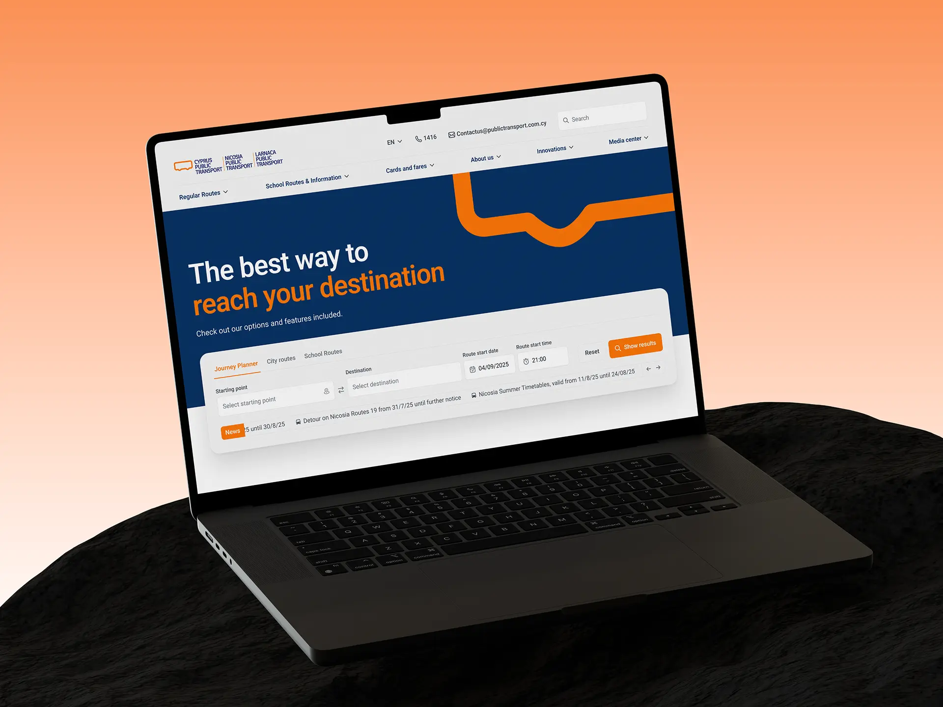
Navigational Style Page was designed as a flexible directory template. The same layout could power a Changemaker directory, a portfolio of initiatives, or virtually any other navigation driven section of the website. Only the title, content, and page elements needed to change.
Article Style Page was built around long form content without the typical elements of a blog. It omitted publication dates, author names, and other editorial metadata, leaving only the content itself. That made it equally suitable for presenting an initiative, documenting a project, or telling the story of an individual Changemaker.
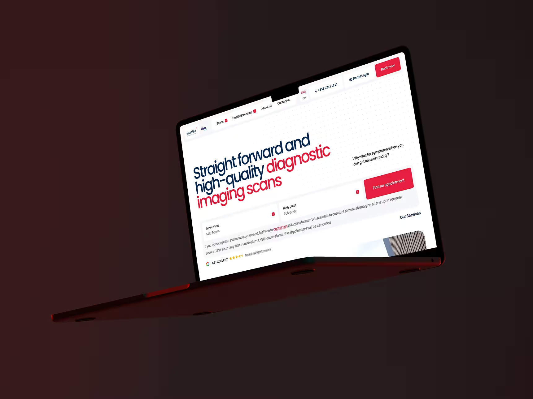
We developed this approach specifically for Unite. Since then, these templates have become part of our own design toolkit and have been reused in other projects, including Cyprus Public Transport.
What the employer got: a flexible page system that supported a wide range of website sections using just two reusable templates instead of dozens of custom page layouts.
Building a visual language around the Unite brand
Some of the visual materials the employer provided were not strong enough to become the foundation of the website's design. Rather than filling the interface with unrelated imagery, our designer looked for ways to build a distinctive visual language around Unite's existing identity.
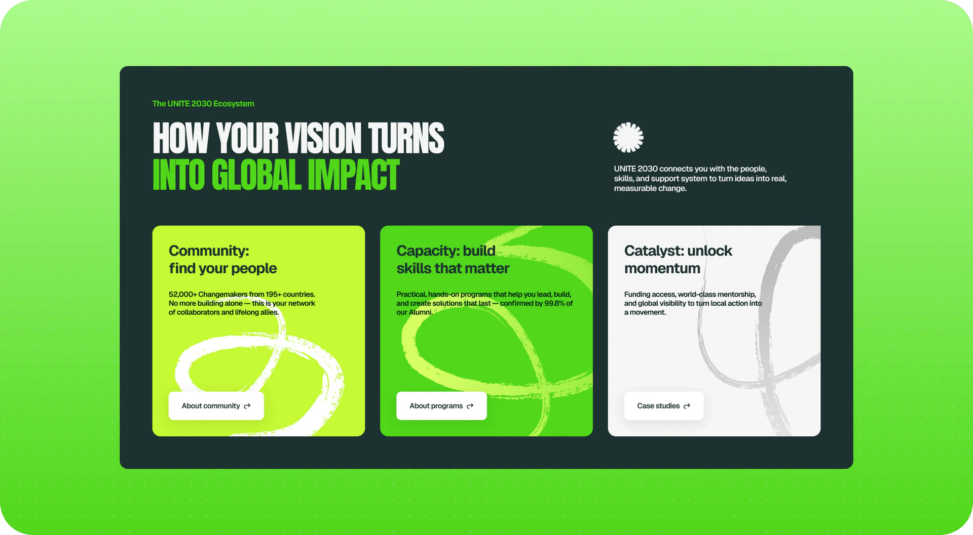
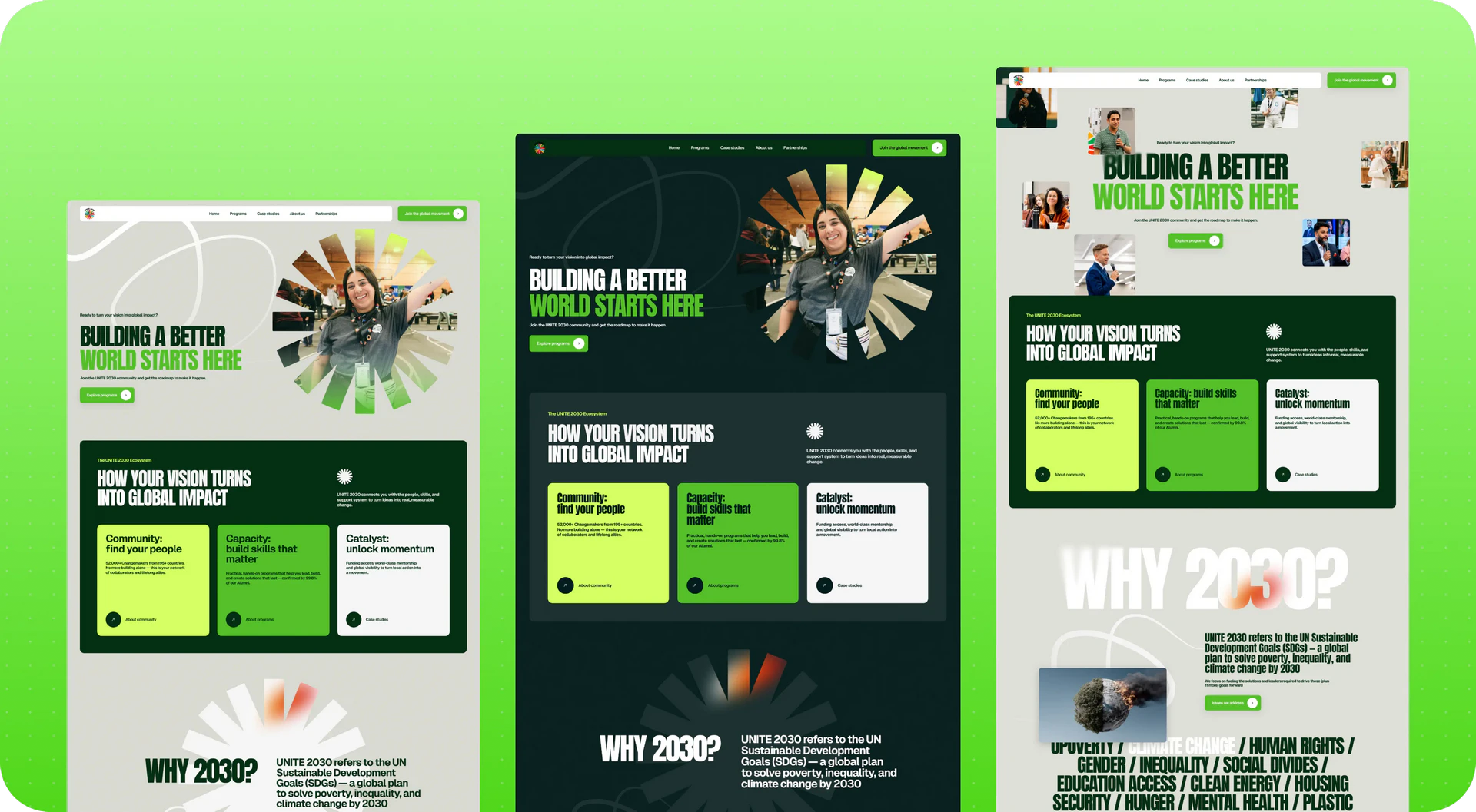
One element from the Unite logo became a recurring graphic pattern that appeared throughout the website, creating visual consistency across different sections.
We also introduced a brushstroke graphic that framed photographs and illustrations, giving the visuals a more dynamic and less conventional look.
Designing the homepage
The homepage itself was organized around the product journey. It introduced the next generation of Changemakers, helped visitors find the right program, explained why people choose Unite, guided them through the steps required to get started, and ended with several clear paths depending on who the visitor was: a future Changemaker, a partner, or someone interested in supporting the project through a donation.
One interaction, in particular, stood out to the employer. As users scrolled down the page, an animation gradually revealed part of the visual composition, adding a sense of movement without distracting from the content.
What the employer got: a visual language rooted in Unite's own brand identity instead of generic imagery, along with several distinctive design elements that the employer specifically highlighted as some of their favorite parts of the project.
Results for Unite 2030
The project never reached the development and launch stage. The employer was unable to secure the next round of funding, so our collaboration concluded after the architecture and design concept had been completed.
By the time the project was paused, the employer had received:
- a fully documented application workflow, covering the entire participant journey from submitting an application through program participation and ongoing community engagement;
- a centralized service architecture that connected the website, Airtable, email communications, and payments, replacing a fragmented chain of independent services;
- a fully designed participant dashboard with detailed user flows, application statuses, document management, and reviewer feedback;
- a clearly defined separation between the MVP and the complete product vision, ready for development;
- a redesigned website structure built around unique pages and reusable templates;
- the Navigational Style Page and Article Style Page system, which has since become part of our design process for other projects;
- streamlined website copy adapted to the new structure while preserving the employer's original messaging.
Even without completing development, the employer now has:
- a documented workflow that allows development to resume at any time without revisiting the fundamental question of how the platform should work;
- an architecture that modernizes the process without replacing Airtable or putting years of historical data at risk;
- a realistic MVP roadmap that can move directly into development without redefining the product from scratch;
- a scalable website structure and reusable page templates that make future content expansion straightforward.
We’re Digital Butlers — a design-led team of 27 senior specialists building digital products since 2016. By choosing us, you’re getting results that are way different
from what you already have — with the same commitment to your goals that Alfred has for Batman.
If you need a website, web service, or mobile app that pays off, reach out to us — we do it well.
Digital Butlers — a mature team with mature processes that deliver consistent results.
Conclusion
Unite is a good example of how a request that initially sounds simple, "we need a website redesign and an application platform," can actually involve a mature organization with a decade of historical data, multiple user groups, complex operational workflows, and business logic that cannot simply be discarded.
The value of our work was never limited to designing attractive screens. It came from carefully untangling a complex system, preserving everything that mattered to the employer, and building a simpler, more sustainable architecture around it. The website, the application platform, and the application workflow became parts of a single, connected system designed to support Unite as it continued to grow.
Awards
About Digital Butlers
We’re Digital Butlers — a design-led team of 27 senior specialists building digital products since 2016. By choosing us, you’re getting results that are way different from what you already have — with the same commitment to your goals that Alfred has for Batman.
If you need a website, web service, or mobile app that pays off, reach out to us — we do it well.
Digital Butlers — a mature team with mature processes that deliver consistent results.


Let’s discuss your next website.
My name is Alex, and I’ll help you define the right next step.


.webp)


.webp)


.webp)