Salient PR
What started as a structure and SEO project became a broader rethink of Salient PR’s website as a trust-building, brand-led digital system for high-expectation tech audiences.




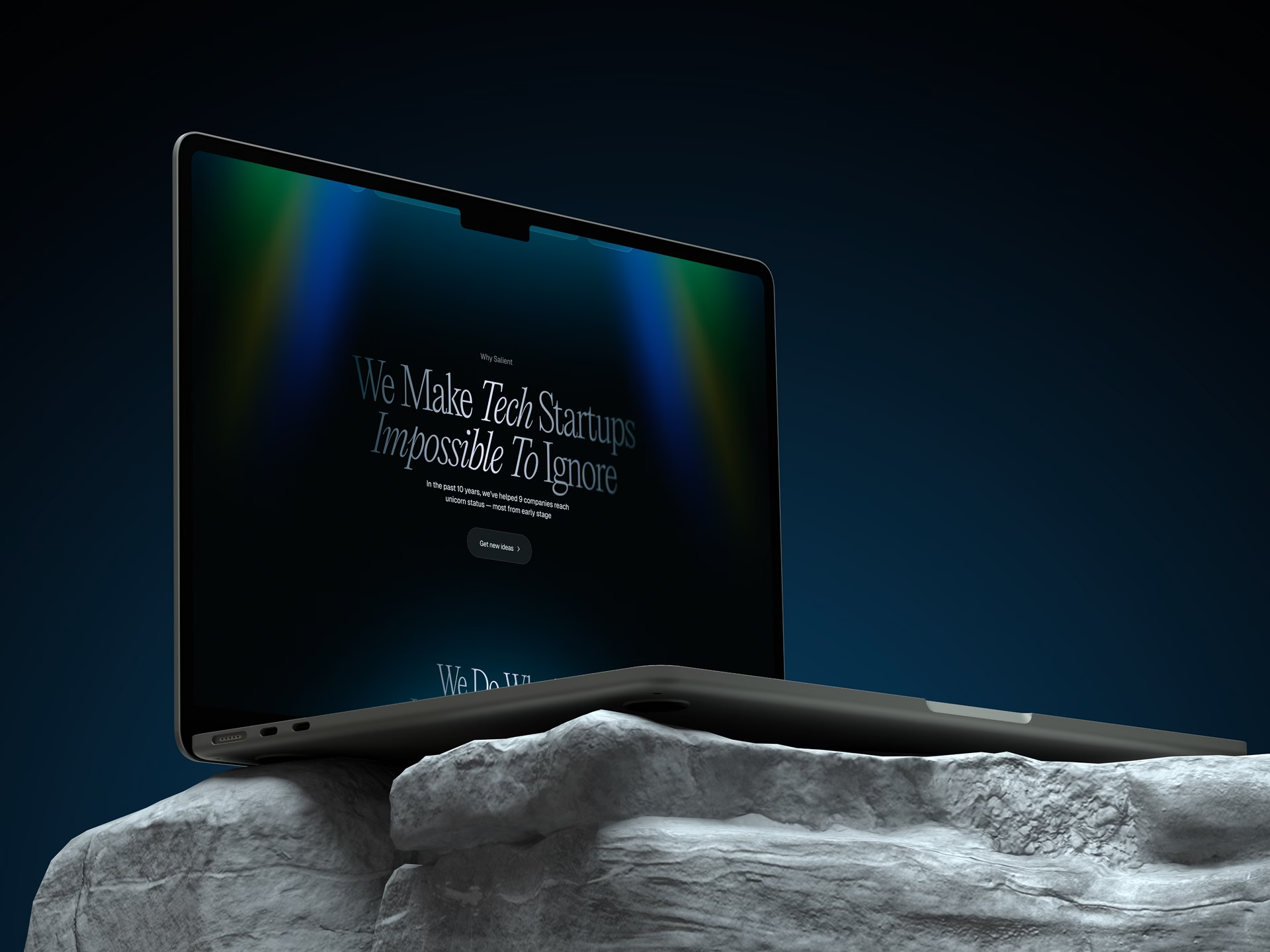
Salient PR is an independent PR agency that specializes in B2B PR for technology startups. They work with companies across AI, crypto, cybersecurity, IoT, SaaS, fintech, software, and other tech verticals, where expectations are high and trust in a partner forms very quickly.
At the start, the request was fairly straightforward: improve the structure, strengthen SEO, simplify navigation, add industry pages for key verticals, and overall build a site that would support growth more effectively. It was also important to preserve and expand long-tail SEO, because for Salient, organic traffic from niche technology searches is not just an extra channel, but a normal part of attracting the right audience.
At the same time, the existing site could not be called weak. It already did a decent job of communicating the brand’s level, used client logos effectively, and overall looked fairly confident. But if you looked deeper, the limitations became obvious pretty quickly: overloaded internal pages, less-than-ideal navigation, weak CTAs, and the constraints of Squarespace, which were already getting in the way of the site’s ability to evolve properly.
And it became clear fairly quickly that the task here was broader than simply making a more user-friendly B2B site. Salient works with tech startups, from early teams after seed rounds to more mature VC-backed companies. Which meant the site could not just do a better job of explaining services. It had to match the level of the clients themselves, build trust, communicate expertise, and immediately make it clear that this was not just another agency trying to be everything to everyone, but a more focused and mature team with its own point of view. More on that shift here.
Before we touched structure or design, we had to understand the audience
One of the first important parts of this project had nothing to do with visuals at all. Before building the structure and design, we had to understand who exactly was coming to the Salient site and what state those people were in.
Formally, the target audience looked fairly broad: technology companies, primarily startups, that need PR. But behind that broad description were several very different scenarios. There were companies only just starting to think about PR, for example around a launch, a funding announcement, a new product, or a more systematic effort to grow awareness. And there were others who had already worked with an agency, were dissatisfied, and were now looking for a replacement.
That second scenario turned out to be especially important. People who had already dealt with traditional PR agencies were not arriving with zero context. They already knew what the market looked like, had already experienced poor communication, team turnover, and the gap between promises and actual execution. Their skepticism was higher, the cost of a bad decision was higher, and their expectation that a new agency should look and sound more convincing was higher too.
For Salient, one especially important audience was the group that came through referrals, professional networks, or word of mouth. And within that group were people who had already worked with another PR agency and were now looking for a replacement. These usually were not random visitors. They already understood how the market worked, had already run into common agency problems, and had a good sense of the cost of making the same mistake twice.
That led to an important conclusion: the site should not speak to everyone in the same way. It had to work especially well at the moment when someone was already comparing agencies, hesitating, and looking for someone more reliable and more credible.
What the employer got: a clearer understanding of who the site is really speaking to, where that audience is in the decision-making process, and what kind of trust the site needs to help build.
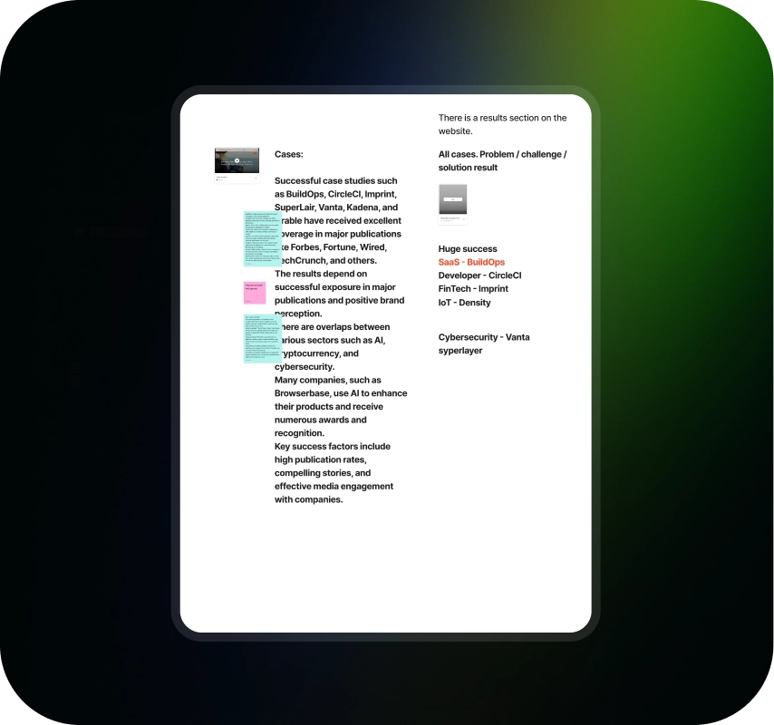
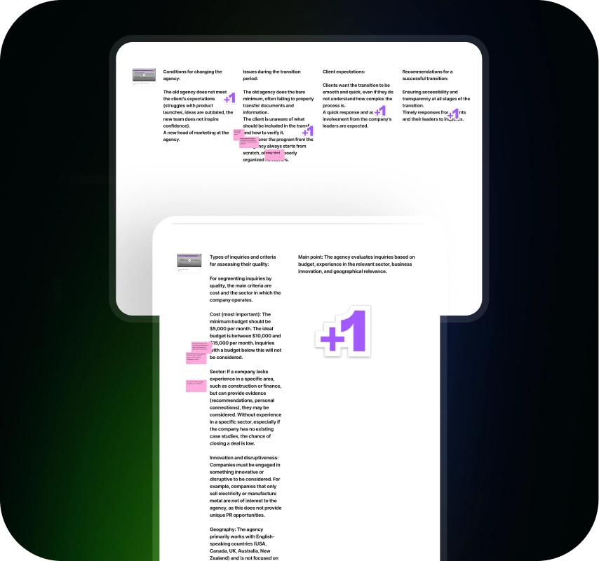
Research showed that this was not just about demand for PR, but about trust in the category
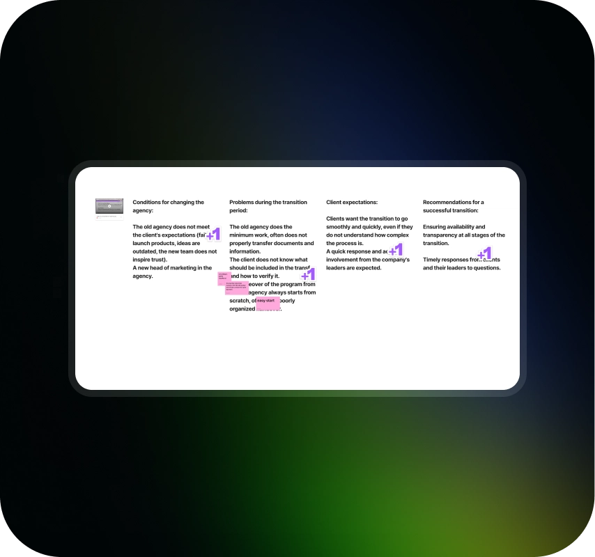
To avoid building all of this on assumptions, we went into research: interviews with the employer, conversations with the audience, competitor analysis, and working tables where we collected observations, patterns, repeated phrases, and points of friction. From that, Jobs to Be Done began to take shape, along with a more practical picture of how people actually choose a PR partner.
The main point of the research was not just to list customer pain points. What mattered more was understanding why technology companies start looking for a new PR agency in the first place, what exactly disappoints them in their current partners, and why trust in this category is so fragile.
Very quickly, the same themes started repeating. People were not just looking for an agency that knows PR. They wanted to avoid the problems they had already seen before: turnover at larger agencies, weak involvement, poor team availability, lack of transparency, the feeling that the project was being handed off to junior staff, and quality that did not match the price.
Against that backdrop, Salient’s model became especially valuable: a small, flexible team, deeper involvement, strong senior-level experience, and a more honest, strategic approach.
The research helped reveal one more important thing: in this project, the site was not supposed to simply talk about services. It had to address very specific doubts and rebuild trust for people with very real negative past experiences.
What the employer got: a clearer understanding of the client’s decision logic, why companies go looking for a new PR partner, what disappoints them in more typical agencies, and which Salient strengths truly needed to be brought forward on the site.
The first strong version of the site came out of research and organized everything into one rational story
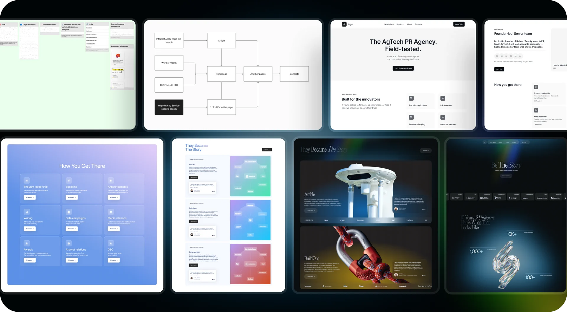
Once it became clear what needed to be explained and to whom, we translated the research findings into a more practical system: epics, stories, content structure, a sequence of questions and answers, and then wireframes. So this was not just about arranging blocks on a screen, but about building a coherent decision-making story.
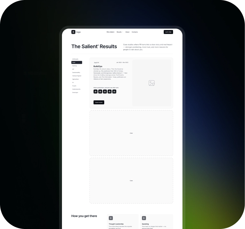
At this stage, the homepage was noticeably denser. It carried almost all of the main argumentation: who Salient is, why their model works differently, how their process is structured, what makes them a more reliable choice, and why technology startups should even consider speaking with them in the first place.
This was a genuinely strong version of the site. Especially since one of the original goals was to improve conversion, structure, and SEO. For that kind of request, a rational and content-dense homepage was a completely logical solution.
And this is important: the first version was not a failed one. It solved the problem the project originally set out to address quite well. It just became clear later that for Salient, this was no longer enough.
What the employer got: a thoughtful site foundation where the homepage was already working as a clear decision-making path, introducing the agency, explaining its approach, easing doubts, and supporting conversion.

At some point, it became clear that performance alone was not enough for Salient
One of the most important moments in the project did not happen in design, but in a reassessment of the goal. Gradually, it became clear that a simply effective site with solid structure, SEO logic, and strong argumentation was no longer the end goal.
Salient works with ambitious technology companies, including startups with strong venture backing and serious expectations of their partners. In that environment, the site needed to do more than explain services. It needed to immediately create the right impression: expertise, confidence, maturity, and a less conventional approach.
This was not a turn toward making it more creative, but toward building a site that, in itself, matched the brand and the kind of clients the agency wanted to work with.
At that point, the project stopped being just about improving conversion. It became a task of strengthening the brand's digital positioning. We go into that turn in more detail here.
What the employer got: a more precise goal for the site, not just to explain services well and support conversion, but also to immediately communicate the brand’s level, maturity, and confidence.
To make the site work harder, we had to spread its logic across multiple pages
Once the goal changed, it became obvious that the old homepage logic no longer worked. If the site needed to make a strong first impression, it could not also try to cram in all the argumentation, SEO logic, process details, objections, proof points, FAQ answers, and everything else at the same time.
So the next step was to rebuild the architecture. The homepage became lighter. Its role shifted toward atmosphere, trust, overall positioning, and a strong first impression. That did not mean the rational layer disappeared. On the contrary, it simply moved to places where it would be easier to engage with.
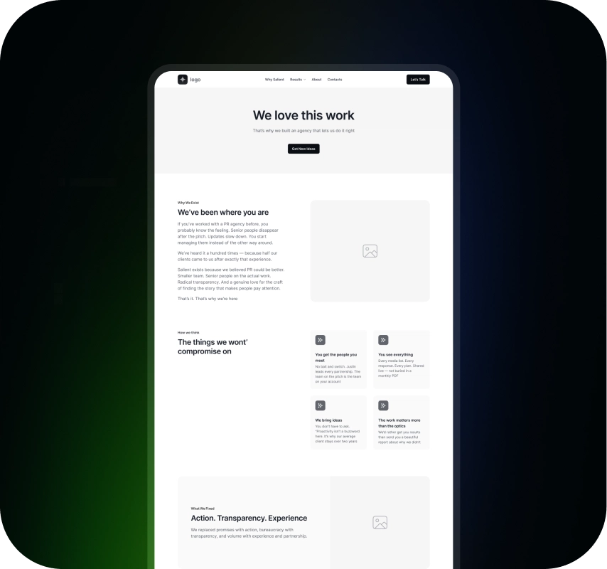
That led to a clearer internal page structure. Why Salient became the place for denser argumentation: approach, process, objections, working model, proof, FAQ, articles, and everything else that helps someone dig deeper before reaching out. About became a more human and editorial page where the brand could be expressed not just through talking points, but through people, tone, and the overall feel of the company.
At the same time, this architecture also solved the SEO side better. It created more room for industry pages targeting key verticals, and overall the site became more logical and deeper as a system, rather than one overloaded homepage.
This was a very important moment in the project’s maturity. We did not abandon strategy for the sake of visuals. We simply stopped forcing every function to live in the same place.
What the employer got: a stronger site structure where first impression, trust, detailed argumentation, and SEO do not compete with one another, but work together as one connected system.
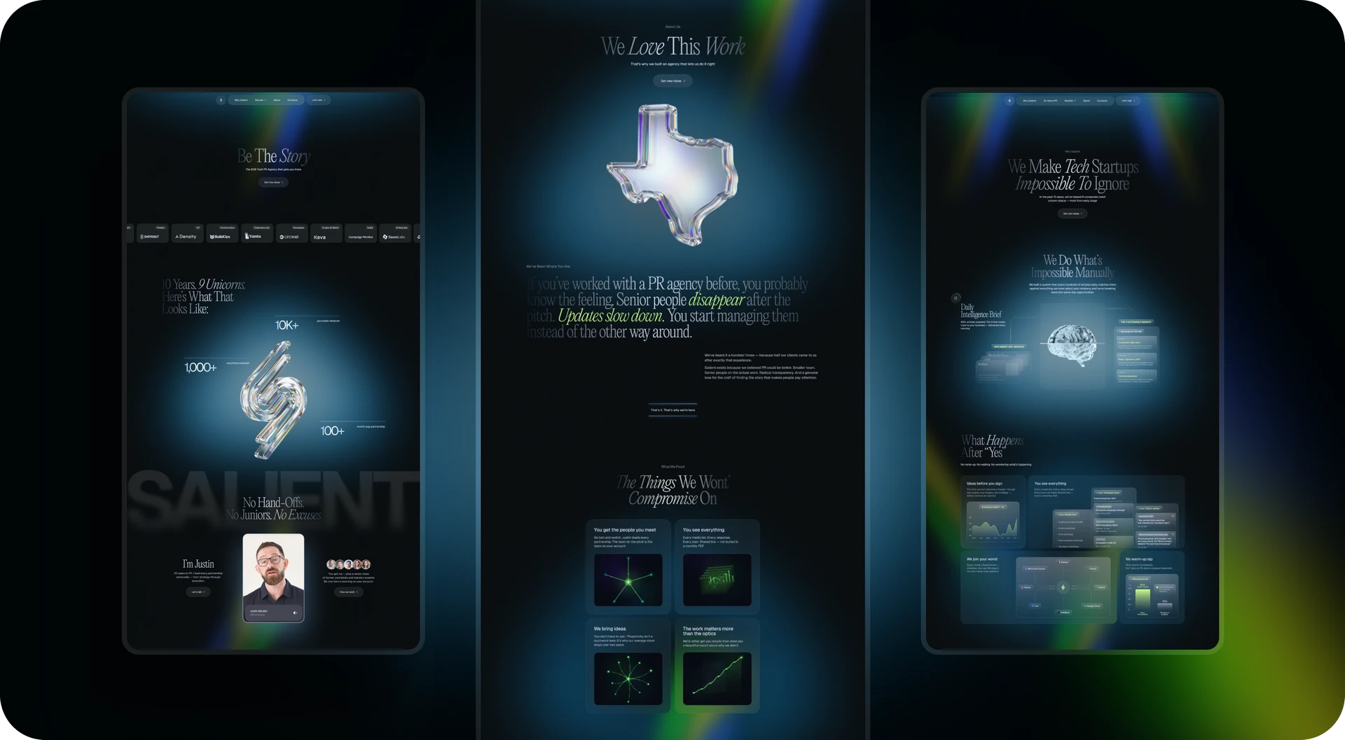
The site needed more than good design. It needed a voice of its own
After the structure was rebuilt, the next major turning point happened in the visual direction. We had already gone through references, do’s and don’ts, early concepts, and several strong intermediate directions. But then it became clear that simply having a polished, contemporary design still was not enough.
The site needed a stronger sense of character. Not just the feeling that it was well made, but the feeling that it had its own voice. That was especially important for a brand that sells not a mass-market service package, but a more experienced, individual, and non-standard approach to PR for tech startups.
To reach that level, we had to remove some of the earlier constraints. At the beginning, they had been useful: they helped keep the system cohesive and prevented it from becoming too loose. But later, those same constraints began to stop the project from becoming truly its own thing, rather than just a neat B2B site.
This was not a move toward decoration for decoration’s sake. It was more of a shift toward a bolder visual language with its own voice and internal logic.
What the employer got: a design that did a better job of expressing the brand’s character and more clearly distinguishing Salient from the familiar B2B sites in its category.
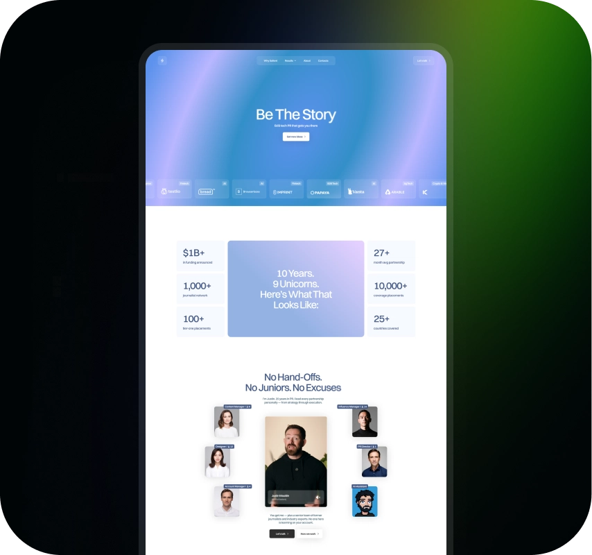
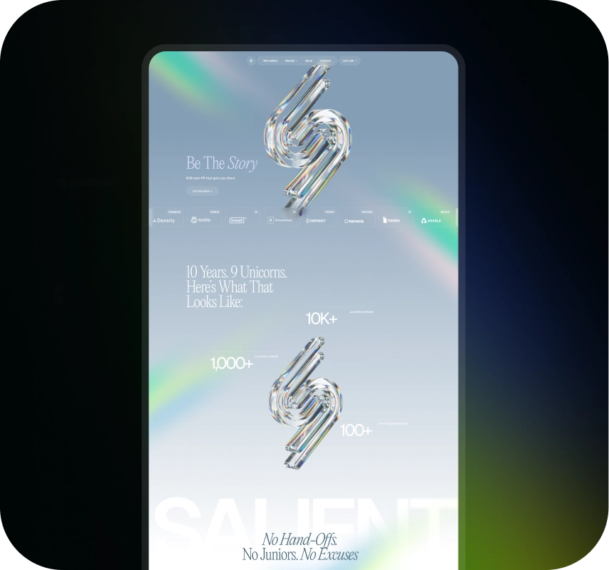
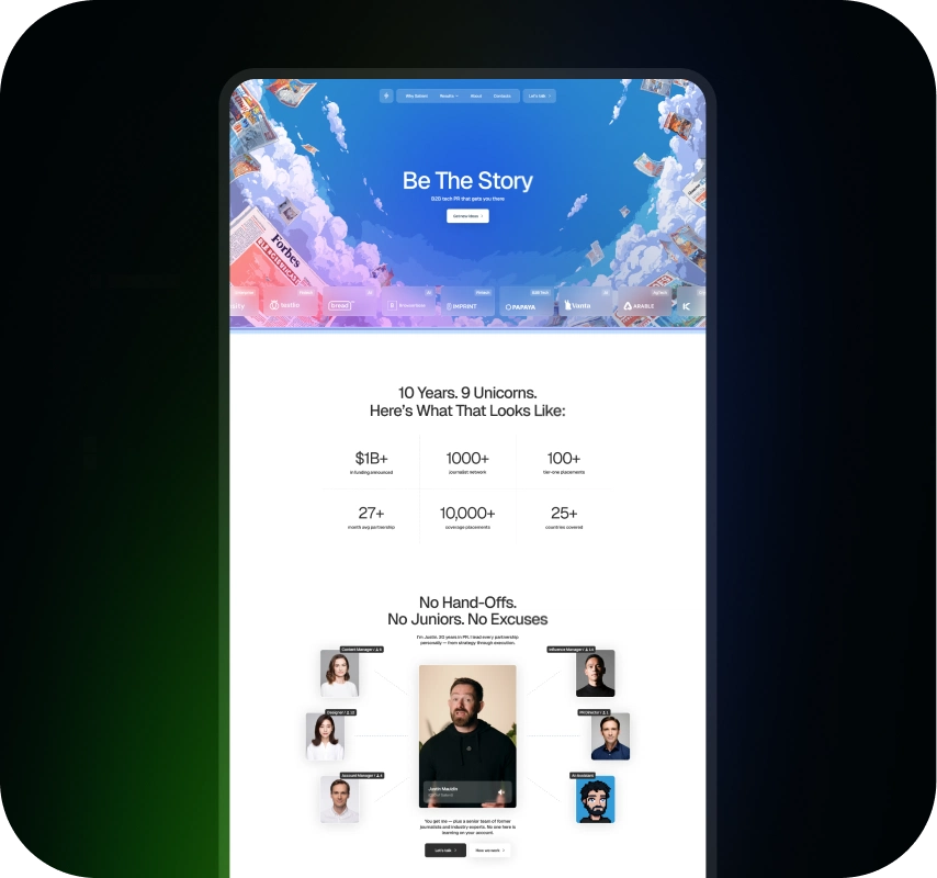
The breakthrough came with the idea of visibility
The strongest version of the project appeared at the moment when it found not just a style, but a central idea: visibility. Light, emergence, presence, stepping out of the dark, all of that fit very naturally with what Salient essentially does for its clients.
That is where the dark version of the site came from. Not because a dark interface automatically looks more premium, but because in this logic it truly worked as a stage for light, emphasis, and the feeling of becoming visible. At that point, the idea of visibility stopped being just words in the copy. It started to be felt directly in the interface itself.
This was especially interesting because the employer was not originally a fan of dark websites. But here, the concept turned out to be so precise that it worked better than any initial preferences.
In the end, the site got more than just a beautiful shell. It got a visual language that directly supported the brand idea. The story behind that idea is here.
What the employer got: a concept in which the visual solution was not decoration, but part of how the site communicates Salient’s value and character.
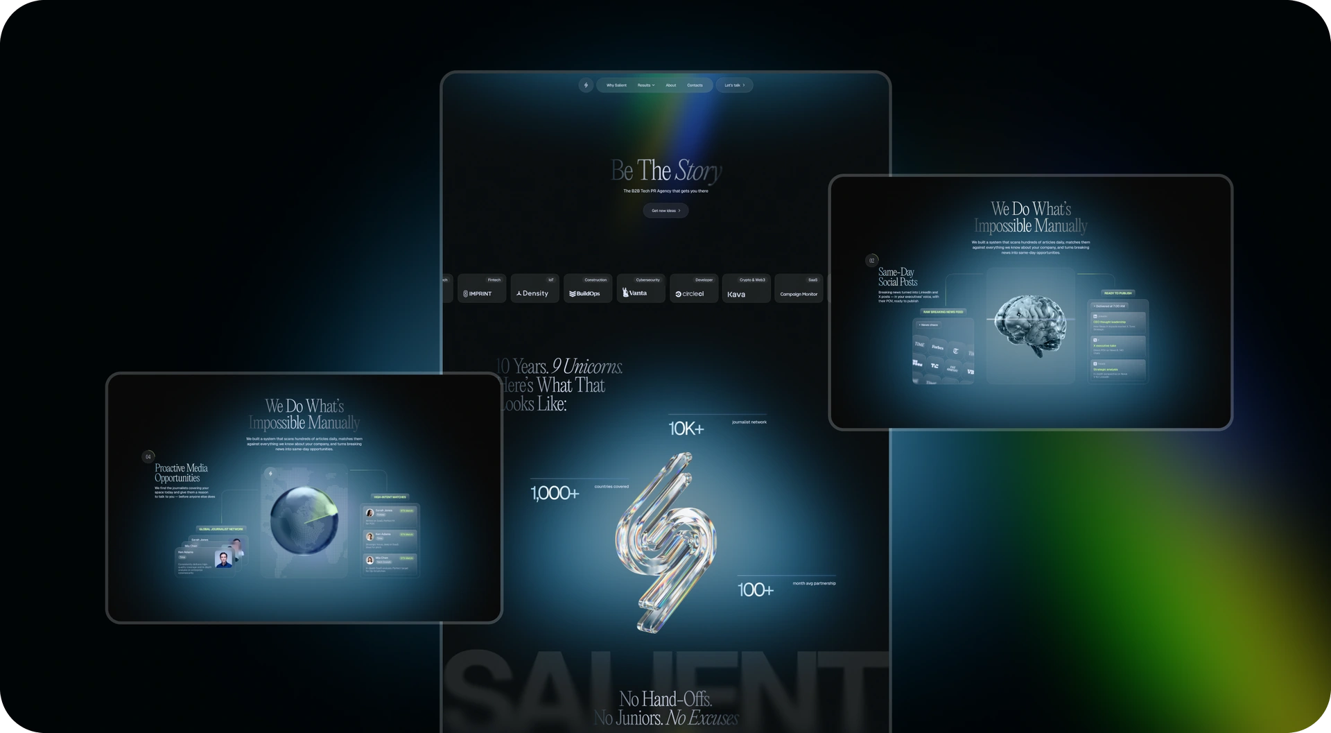
The homepage started working through impression, rhythm, and trust
Once that visual logic came together, the role of the homepage changed too. It stopped being the place where the site tried to prove everything right away, and became the place where it first creates the right feeling and only then leads the person deeper.
Rhythm, pauses, emphasis, and the way information was paced all played a major role here. The 3D logo object, the presentation of the case studies, the metrics, the founder section, the overall page dynamics, all of this became part of one controlled impression. Not through a blunt look how strong we are, but through a calmer sense of composure, expertise, and level.
As a result, the homepage stopped feeling overloaded. It no longer tried to be a landing page, presentation, FAQ, and argumentation page all at once. Instead, it became a strong entry point into the brand.
What the employer got: a homepage that captures attention, is more memorable, builds trust, and does not try to solve every task at once.
The rational layer needed a home of its own. That is how Why Salient came to be
As soon as the homepage stopped being overloaded, it became clear that the entire rational layer needed its own home. That is how Why Salient emerged, one of the key pages in the whole system.
It became the place for everything that requires calmer reading and more attention: objections, process, working details, proof points, explanation of the approach, supporting materials, and the questions that help someone make a more confident decision.
This is especially important for an audience that is already interested in the brand, but is not ready to make a decision based on the homepage alone. If someone has already worked with another agency and been burned by turnover, weak communication, or low involvement, they need more than good visuals. They need to see how the work is structured, why this model is more reliable, and what actually makes the agency different from the broader market.
This is also where Salient’s key strengths came through especially well: senior-level project leadership, team stability, flexibility, transparency, access to niche experts, and a more strategic view of PR rather than just service-based delivery.
At the same time, the page’s job was not to simply dump all the arguments at once. It needed rhythm too. Air, shifts in pace, visual pauses, and careful presentation helped make even dense argumentation easier to read.
What the employer got: space for a calmer and more convincing conversation with the audience, where Salient’s approach could be explained in depth, distrust could be reduced, and the decision could be supported.
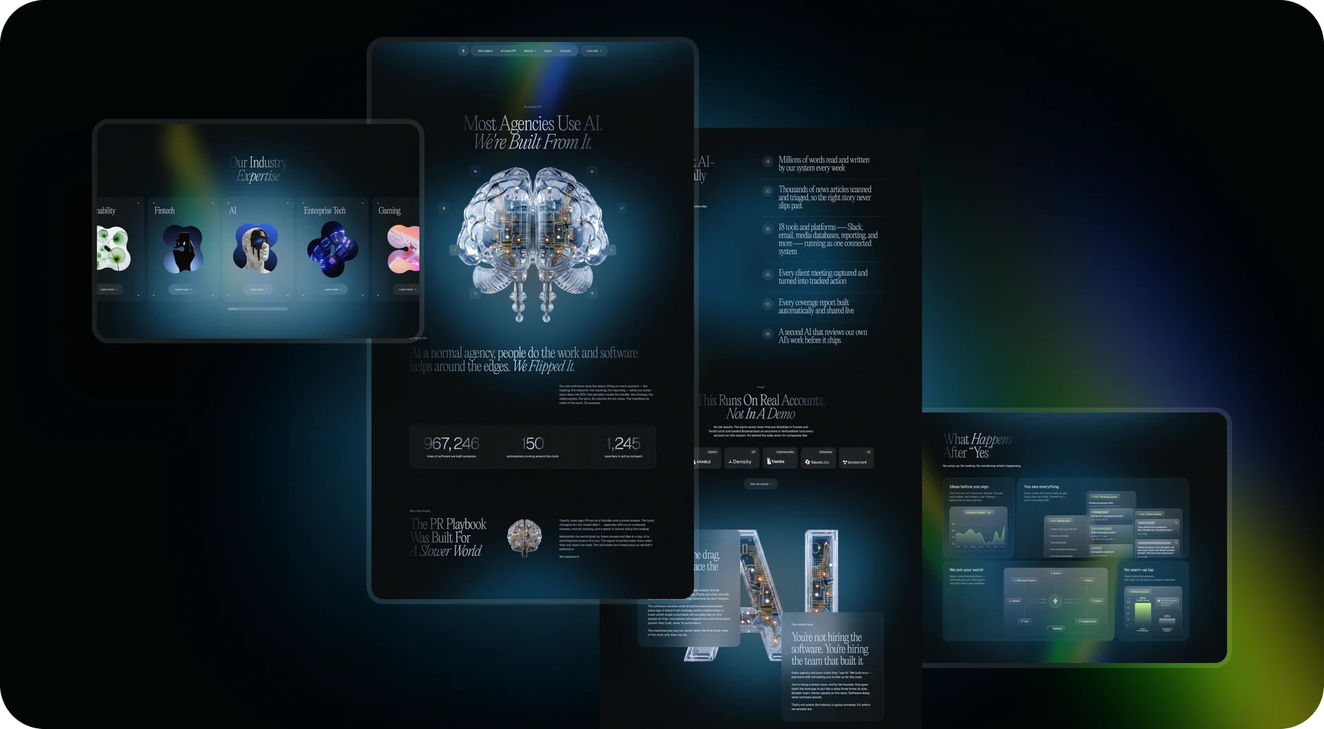
About helped make the brand feel more human
About had a different role. If Why Salient was responsible for the rational layer, About helped show who actually stands behind the brand and why this is an agency people can trust not just as a vendor, but as people.
For Salient, that was especially important because one of the brand’s core strengths is not scale for scale’s sake, but a more personal, experienced, and stable way of working.
That is why About took on a calmer, more open, and at times almost editorial tone: real photography, a more human voice, and a sense of actual people being present rather than a generic corporate team block.
It was also important to integrate the AI topic carefully there, not as an attempt to look trendy, but as part of a modern internal workflow where technology enhances expertise rather than replacing it.
In the end, About did not duplicate the homepage and did not repeat Why Salient. It covered a third, very important layer of trust: the human one.
What the employer got: another important layer of trust, a page that helps people see Salient not only as an agency with a strong approach, but also as a team they actually want to work with.
Despite several major shifts, the project never lost its shape
Another strong point of this case is that the project changed noticeably several times without falling apart along the way. It started with one task framework: structure, SEO, conversion. Then it became clear that a stronger brand effect was needed. After that, the architecture was rebuilt. Then the level of visual ambition increased. At the same time, we had to account for technical constraints, SEO requirements, and future industry pages.
In many projects, that combination of changes easily turns into chaos. But that did not happen here. In large part because each next phase did not erase the previous one.
The research did not disappear after design started. The first logic did not vanish after the structure was rebuilt. Early visual directions were not thrown away. They helped us better understand where the project actually needed to grow.
It is also important that the employer’s high level of involvement here was not a problem, but an advantage. Instead of creating endless turbulence, it gave the project more precision. Decisions were not made in a vacuum. They were shaped through real feedback and gradually became stronger.
As a result, the final site matters not only on its own, but also as an example of a process that withstood several serious re-evaluations without losing coherence.
What the employer got: a resilient system that absorbed several major changes and only became stronger because of them.
Results for Salient
After launch, Salient got:
- a site that more accurately reflects the brand’s character, specialization, and level
- a stronger homepage that works through impression and trust
- separate internal pages for argumentation, SEO, and a deeper introduction to the agency
- a clear foundation for industry pages targeting key technology verticals
- a cohesive visual system built around the idea of visibility and emergence
- a stronger presentation of the founder, the approach, and the brand’s overall character
The employer can now:
- convert warm audiences from referrals, contacts, and organic traffic more effectively
- appear more convincing at the moment of comparison with other PR agencies
- build trust step by step instead of trying to prove everything on the first screen
- communicate its difference from more typical market players more clearly
- grow SEO in the technology verticals that matter most and attract more relevant organic traffic
- keep scaling the site as a system rather than as a one-off redesign
Conclusion
The Salient project is a good example of how we usually approach work like this. We do not start with the question of how can we make it look more modern. First, we figure out what exactly the site needs to do for the business, where it is currently falling short, who it is actually speaking to, and what point in the decision-making process the user is in.
In this case, everything started as a clear task around structure, SEO, and conversion. But as the work progressed, it became clear that simply putting together another good B2B website would not be enough here. We had to rethink the role of the site itself: make it so that it not only explained, but also built trust, communicated the brand’s level, and worked more precisely for the audience that actually matters to the business.
In the end, Salient got not just a new website, but a stronger digital system, one where branding, SEO, UX, content, and trust work together. And that probably shows our strongest side better than anything else: we do not just improve the surface, we push a project toward a more precise, cohesive, and genuinely useful business outcome.
Awards
About Digital Butlers
We’re Digital Butlers — a design-led team of 27 senior specialists building digital products since 2016. By choosing us, you’re getting results that are way different from what you already have — with the same commitment to your goals that Alfred has for Batman.
If you need a website, web service, or mobile app that pays off, reach out to us — we do it well.
Digital Butlers — a mature team with mature processes that deliver consistent results.


Let’s discuss your next website.
My name is Alex, and I’ll help you define the right next step.




.webp)