Award-Winning Websites: Wow Effect, Performance, Awards


Award-Winning Websites: Wow Effect, Performance, Awards
From cybersec to crypto and luxury brands, see how Digital Butlers create award‑winning sites that inspire, convert, and set industry standards.


A strong idea + performance engineering — our recipe for websites that not only win Awwwards/CSSDA/FWA but also bring leads, preorders, and cultural shifts. Inside are five short stories: “Glass,” 3D metaphors in cybersec.
This hardware site gathered preorders “to the second,” inDrive’s magazine-style platform, a crypto landing with live 3D, and the “quiet luxury” of a leather brand. Read on — we’ll show how animation becomes a language of meaning, and speed — a marker of trust.
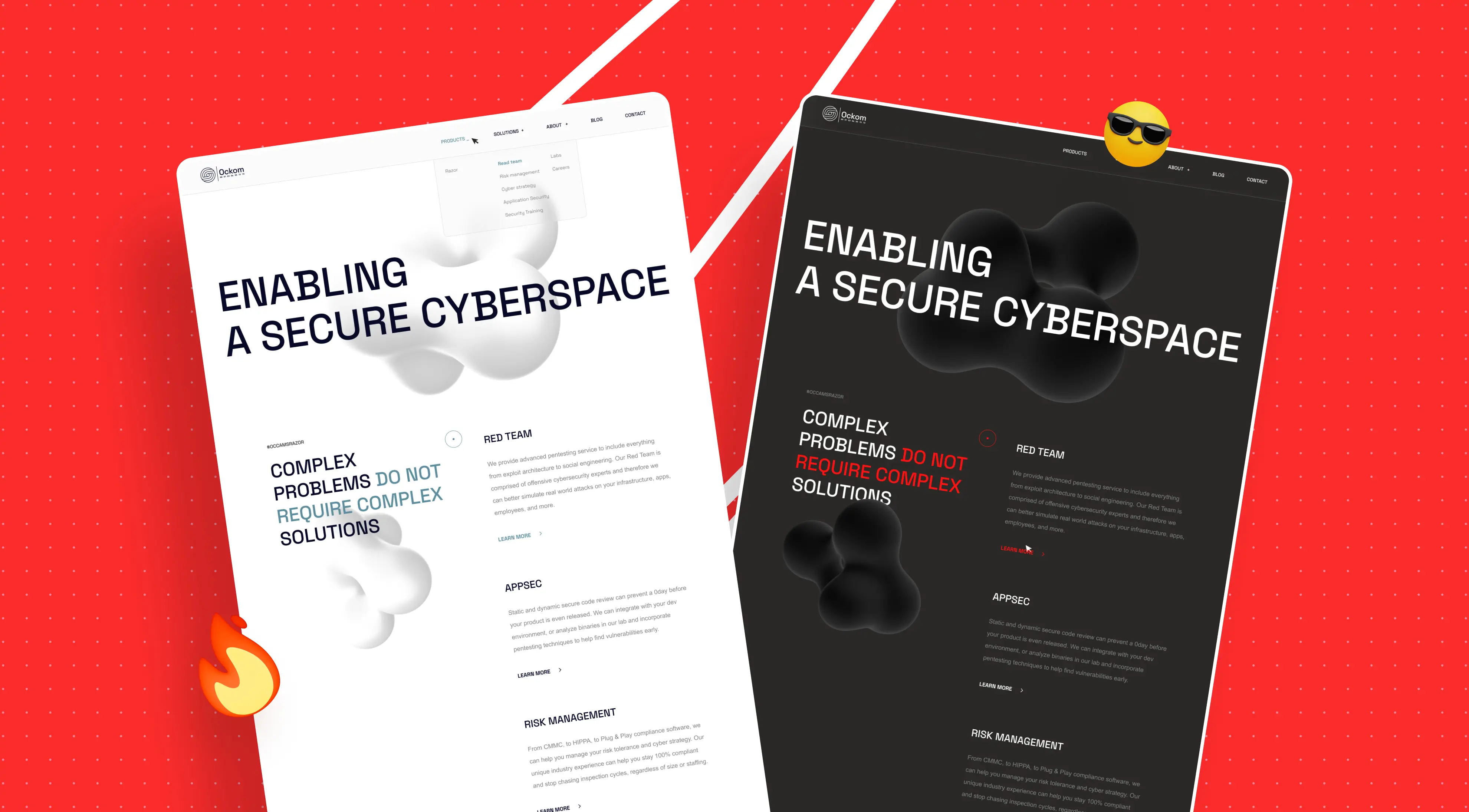
01. Ockom — Glass Layers
Ockom is a cybersecurity company. In a mature, noisy market, it was vital for them to declare themselves a tech-forward brand and boost recognition on industry platforms. The team came to us for a public launch with character.
Request
A multi-page corporate site with expressive visual metaphors, subtle 3D accents, and impeccable speed — a level that could contend for industry awards. We built the visual system from scratch (type pair, palette), gently refreshed the logo due to low source quality, and delivered the site.
The project isn’t publicly available now: the company shifted focus to product, but the case itself still brings in requests like “make it like Ockom.”
Initial inputs and process
Together with the employer, we set a calm work rhythm: no hard deadlines and trust in the expertise. We moved deliberately — “page → approval,” in a constant designer–developer loop. On every screen, we clarified animation behavior, the tact of transitions, and the sense of control on scroll. The employer supported a research approach — we tested hypotheses, dropped the unnecessary, and polished what mattered.
For the team, this was our first truly systematic foray into 3D on the web, so processes grew in parallel: we built an internal tool for object positioning, set up a pipeline for model optimization, and noticeably sped up the site.
Concept and visual language
At the start, we proposed three directions: strict without excess; a version with moderate 3D; and an “over-the-top” one. We chose the middle — a multi-page site with 3D as an accent, not an end in itself. The color theme evolved from light to dark: on a black‑gray background, spatial depth emerged, and volumetric shapes and “glass” layers became more expressive.
Metaphors that guide the user
The architecture was built around idea pages: each has its own 3D metaphor tied to the section’s meaning. Where it was about threats, we dropped the “spiky ball” and used a bacteriophage — it reads stronger and hooks associative thinking. For strategy — chess; for protection — a medieval shield; for training — a laptop.
These objects don’t just “sit” in the hero; they accompany the user down the page: moving with the scroll, changing angle, sometimes going behind “frosted glass,” gently yielding to text, and then bringing attention back to the point. On About and Contact, we kept the motif but shifted it to the background — a calm “metaball” behind glass sustains the rhythm without overloading content. The blog was connected via Medium.
.webp)
Rhythm and transitions
The inter-page transition is a “digital rain” of red characters, a nod to The Matrix. It doesn’t “mask” long loading — we tuned performance so navigation feels instantaneous. To maintain engagement on long screens, we added interactive “particles” (a DNA chain and a point cloud) that react to the cursor; on shorter pages, we didn’t overuse them.
Engineering: how 3D became lightweight
The project started with “heavy” 3D models built in a very “consumer” program: pages loaded painfully slowly — a UX risk. We re-prepped all models in 3ds Max, achieving a dramatic weight reduction (by tens of times and more) without losing visual quality — the site “took off” in speed.
Another nontrivial task was precise positioning: 3D lives on a separate layer and can’t “push” text around. We wrote an internal mini-tool: on a live page, a developer shifted and rotated the object in real time, saved the best positions, and then transferred the trajectories to code. That’s why it feels like 3D was “wired into” the layout from the start.
.webp)
Tech stack
The site was built on Webflow with custom JavaScript. For 3D, we used WebGL and Three.js; models were optimized in 3ds Max. Plus our own utility for interactive 3D placement across screens.
Result: Turning 3D Storytelling into Industry Recognition
In 2021, the site looked “unlike the rest,” strengthened the employer’s reputation, and made noise in the niche. We still get requests like “make it like Ockom.”
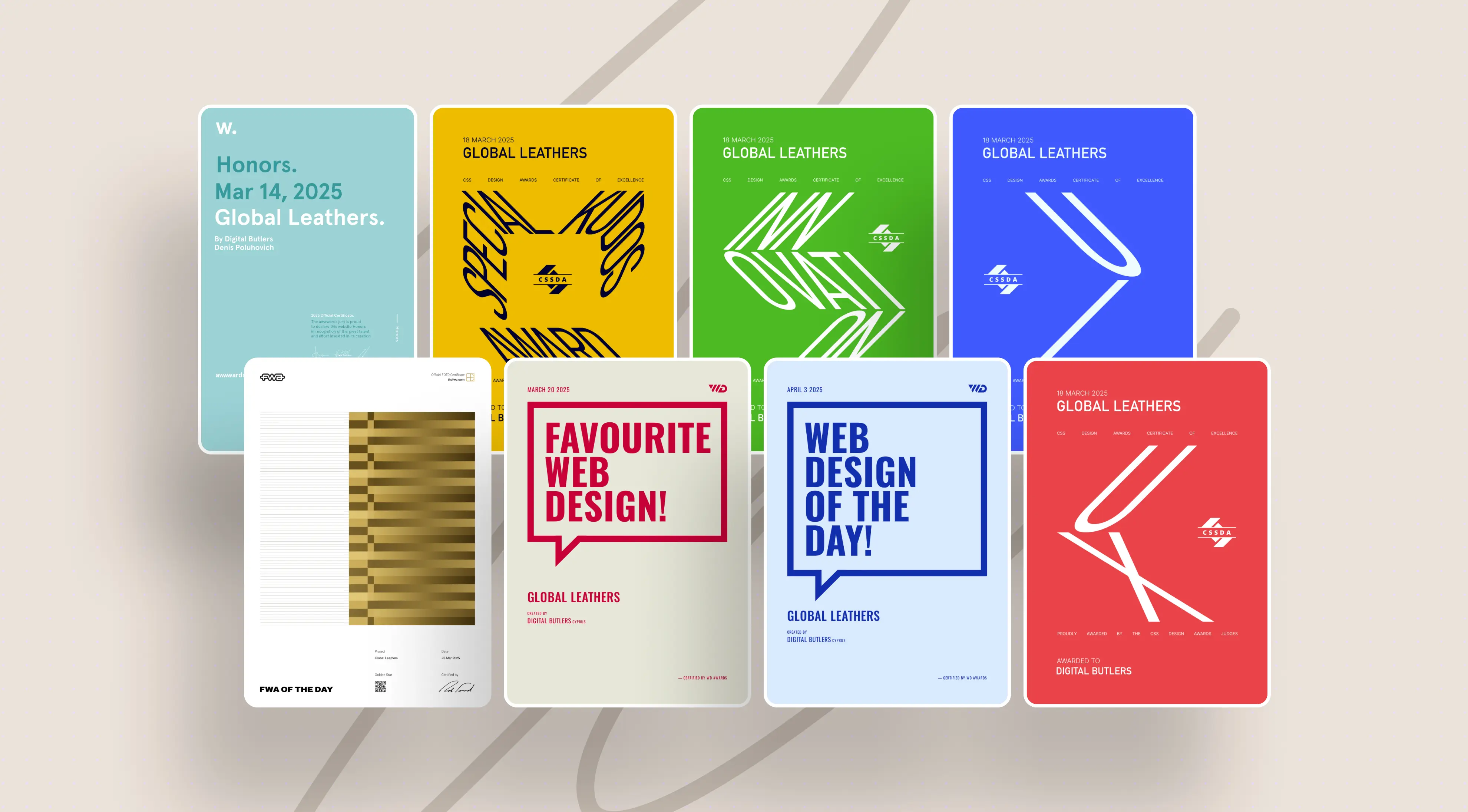
On the site itself, the Awwwards Honorable Mention badge is pinned on the left — we intentionally left it visible as an honest quality marker.
Awards
What this project taught us
3D is a tool, not an attraction: it should convey meaning and “sit” in the content.
Performance is part of design. Lightweight models and precise engineering deliver the “wow” without annoying loaders.
The “ideal” employer trusts in expertise, has no fuss, and shares a desire to produce the best solution in the category.
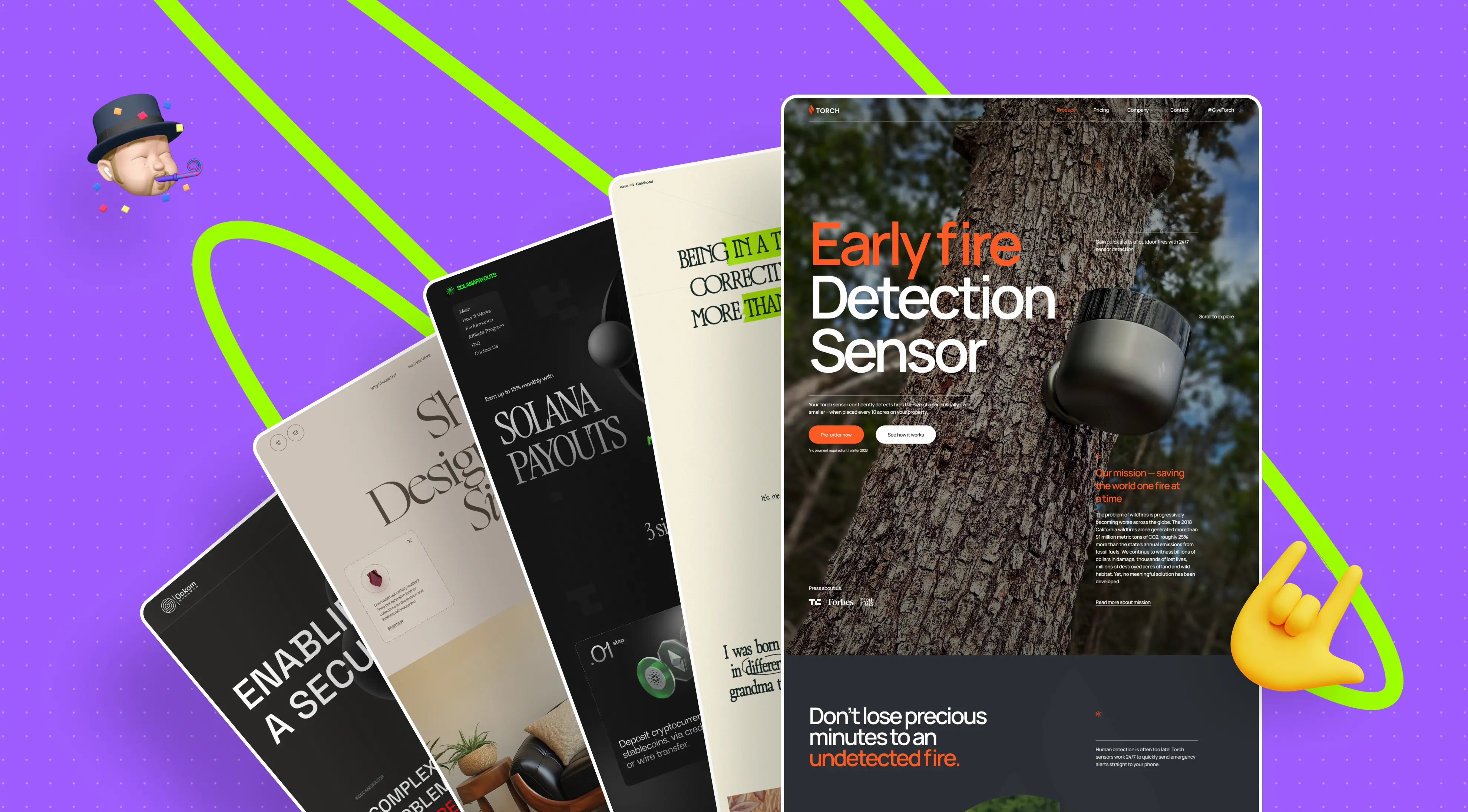
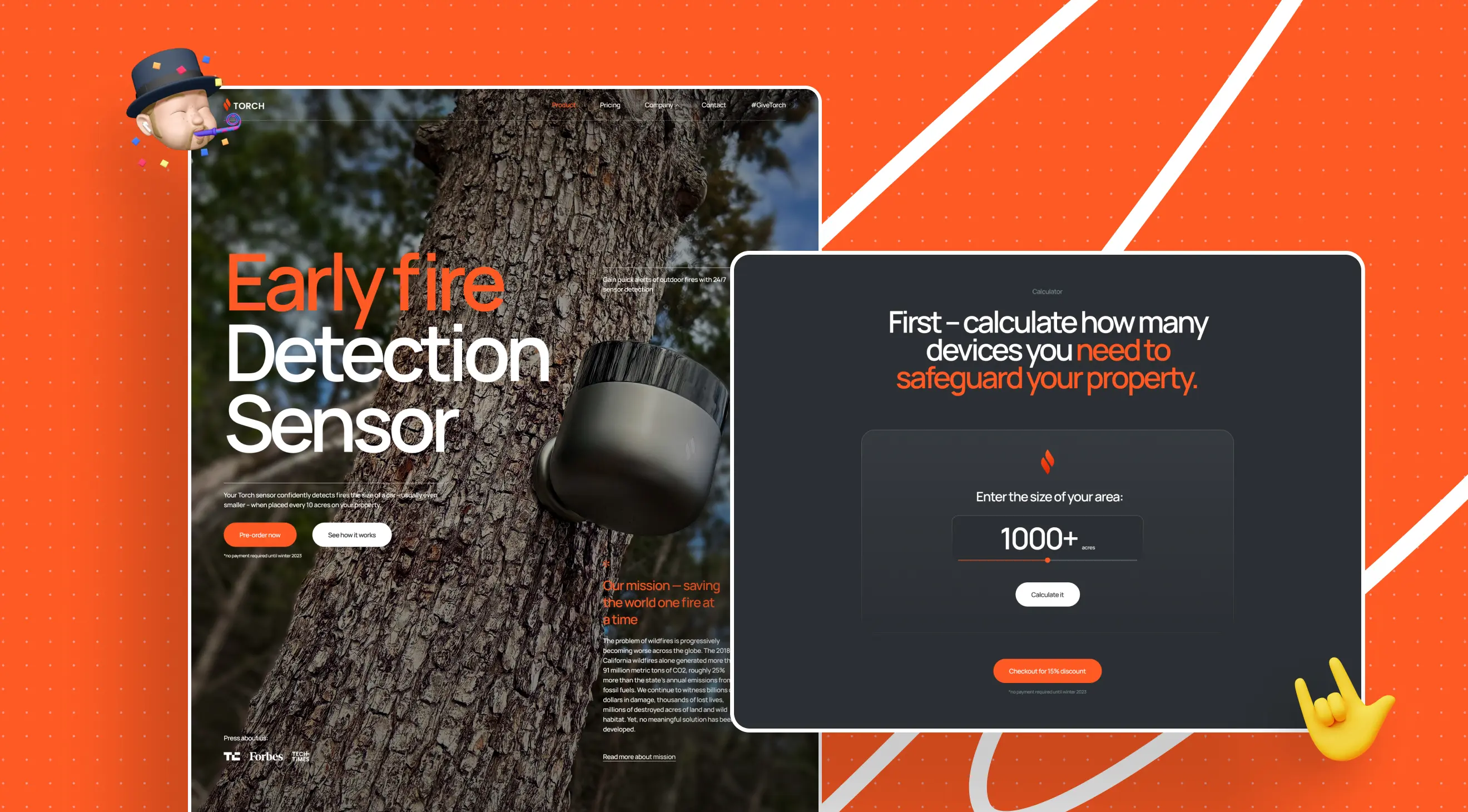
02. Torch — Preorder Launch
A hardware startup creating early wildfire detection sensors. The team was preparing the device’s public launch and sought a partner for a cohesive digital experience and reliable engineering for potential traffic spikes. They came to us for that.
Request
“We need a site that will blow up the niche — exactly by the hour of the product announcement.” The employer had prearranged mailings with top media and platforms: publications would go live on a specific day and time, and preorders had to open on the site.
By moment X, everything had to work flawlessly, including the calculator for sensor estimates and preorders.
Initial inputs and process
Starting point — a one-page template. By release, we needed multiple full pages, product sections, and a payment flow. Approvals ran in the format “page → call” (1.5–2 hours), with meticulous fixing of animations and microstates. The employer kept their stance, but entrusted final decisions to us as experts — that increased pace.
At the peak — a crunch week of night shifts: the team balanced between ideal quality and speed, and at times developers took on design decisions. The last fixes shipped seconds before the mailings started — the release happened “to the second.” In the review, the employer specifically noted our polish to “ideal” and overnight work.
Concept and visual language
We started with two directions: a neat “photo-first” approach without 3D, and a more complex one with 3D interactions and “live” product screens. We kicked off with the simple, but quickly moved to the second, with 3D as the interface’s backbone. At the time, it was the most animated site in our practice: at points, layout was built “around” 3D, not “on top.”
The employer’s strong content set the visual base: high-quality renders and product photography. The palette was derived from the renders; the accent color — orange (signal, “warning”), stable on dark and light.
Key scenes and interactivity
The task was to “sell the idea,” so we built storytelling around proof of value — via explicit, user-driven scenes.
Comparison with alternatives. An animated block where a wildfire “grows” on scroll, and different technologies trigger step by step. The employer’s sensor detects the source earlier than others; you can move on only after finishing the scene, which keeps attention until the key insight.
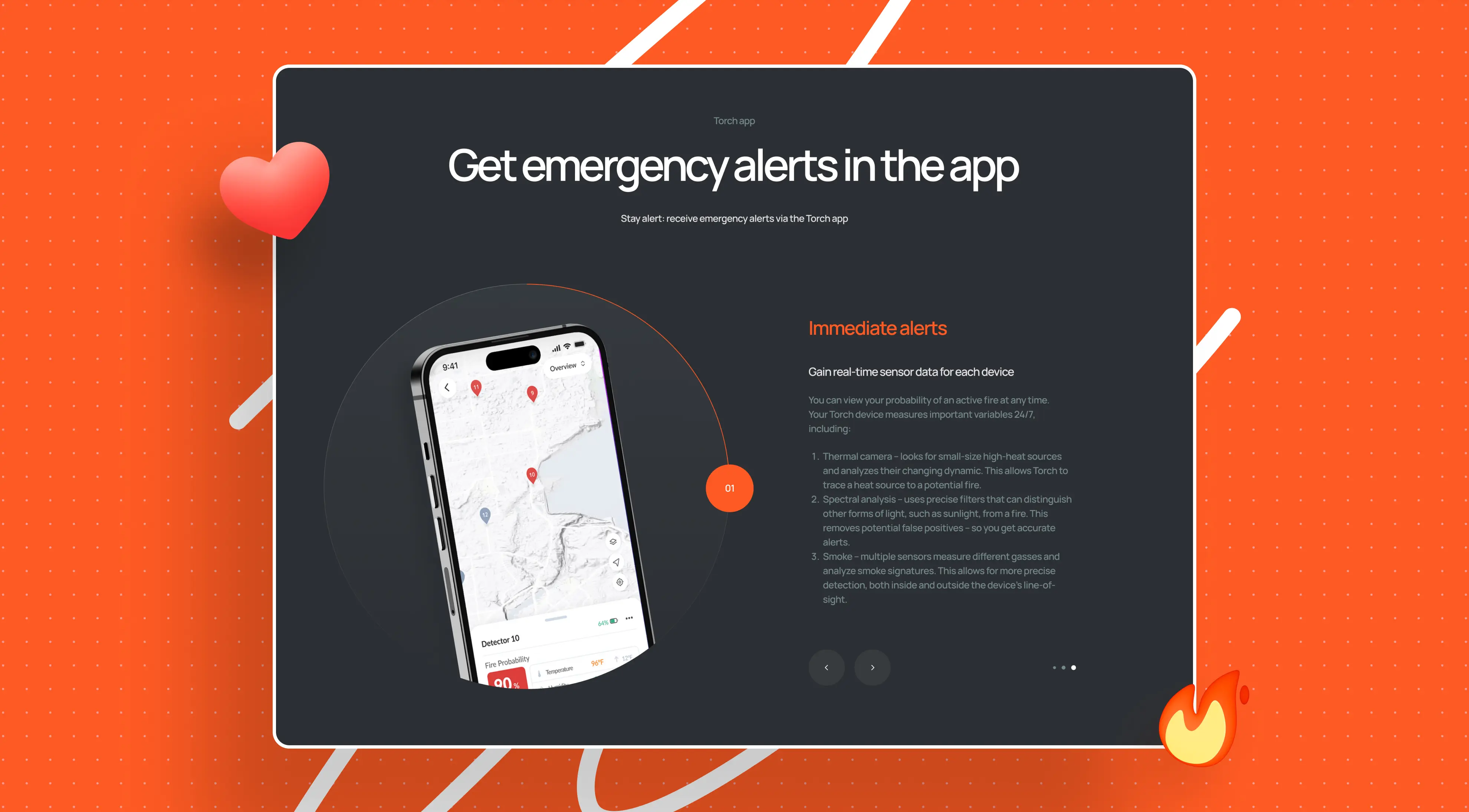
Product 3D page. An interactive model “tracks” the cursor and reveals device components by section (camera, solar panel, mic, sensors, etc.) and their role in scenarios.
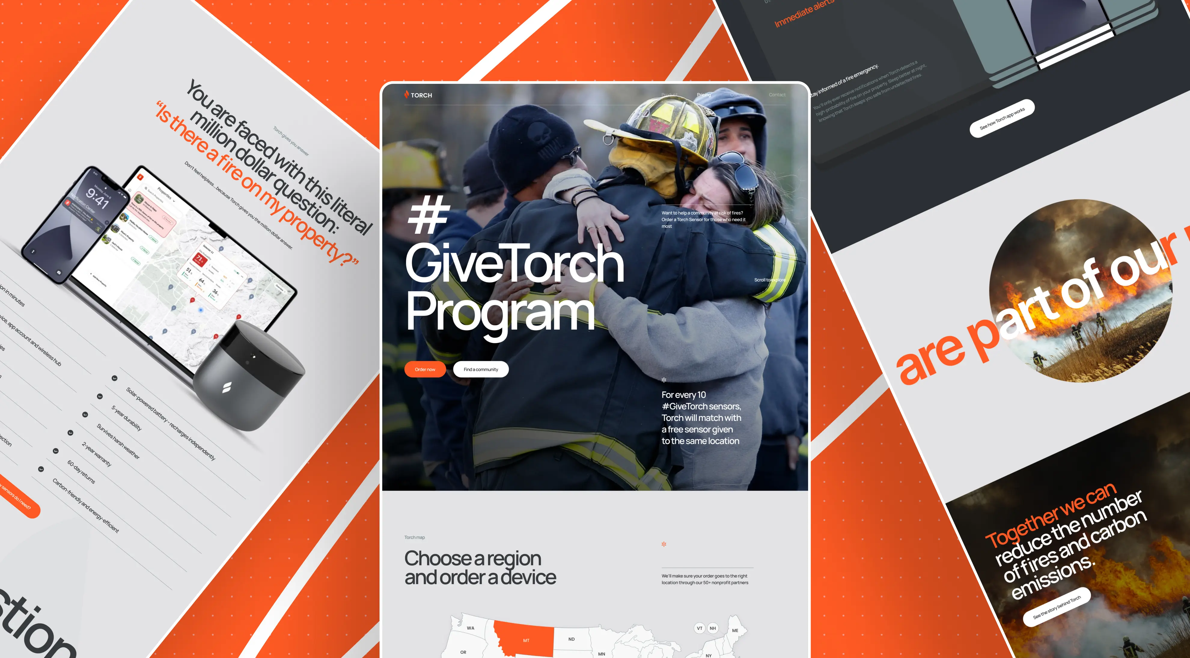
Charity flow. A donation form and a map with statistics by states/counties: you can select a region and donate a device to “hot” zones.
.webp)
Rhythm and transitions
Each section is an animation but subordinate to meaning: it guides the eye, highlights advantages, and keeps a sense of control. Special attention to scroll sync: we eliminated “jitter” and the “hand — trackpad—screen” break, bringing smoothness to an intuitive level.
Engineering: how 3D became fast
3D ran in real time on Three.js (WebGL). To keep smoothness even on mass-market devices, we offloaded heavy computations to Web Workers and OffscreenCanvas — our first external project with that combo. In parallel, we optimized scenes and textures. In one release, we first embedded video inside a 3D scene and synced it with scroll stages.
Tech stack
The site was built on Webflow with custom JavaScript. 3D — Three.js; models were built/refined in Blender, textures in Photoshop. For UI/animations — GSAP, Swiper, and other lightweight libraries. The payment flow was integrated for preorders. Version control — Git + GitHub: by default, we store the code in-house, and on request, hand over all sources and documentation.
Result: Launching to the Second with Preorders on Day One
On day one, 30 sensor preorders — for a fundamentally new product, that confirmed demand. The site went live exactly on time and withstood peak loads.
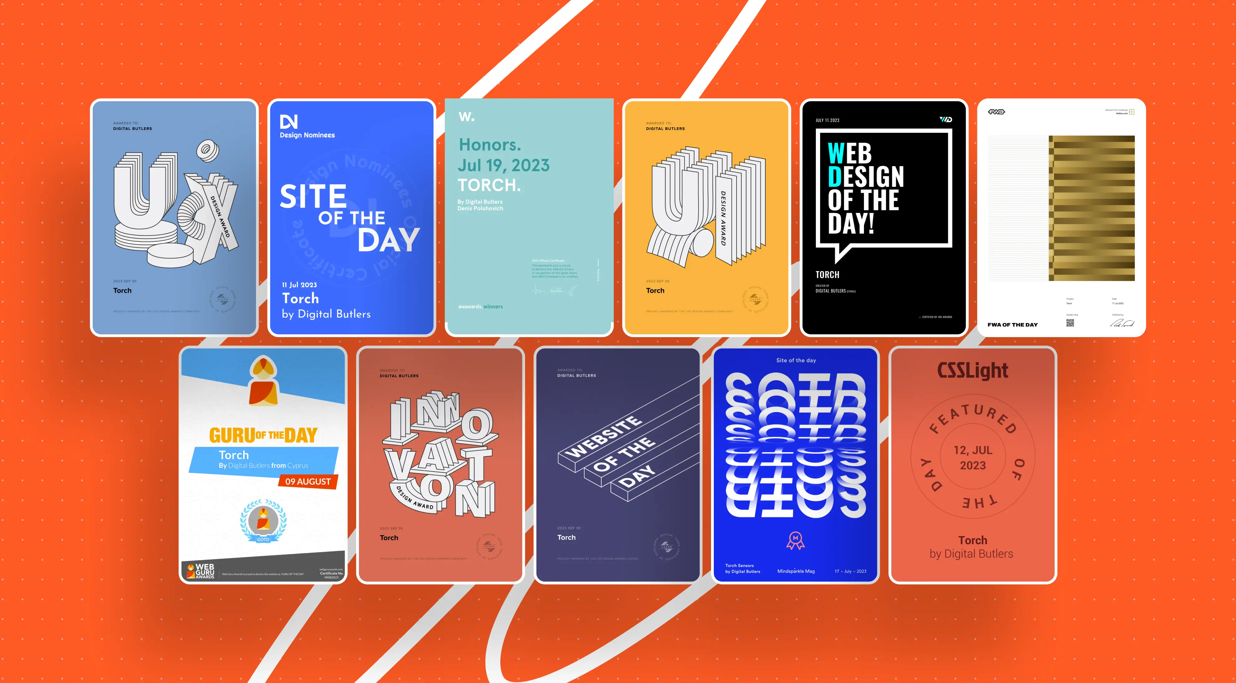
The project became a starting point for a broader ecosystem (platform). An Honorable Mention badge is placed on the site.
Awards
What this project taught us
Trust in expertise is a results multiplier: when the team has the final say, pace and boldness rise.
When both sides are equally “fired up” by the task, unity is born, and the best result in the niche follows.
3D is the content’s skeleton, not decoration: when visuals lead the story, animation serves meaning.
A hard deadline is an engineering discipline: minute-by-minute planning, automated deploys, buffers on critical paths.
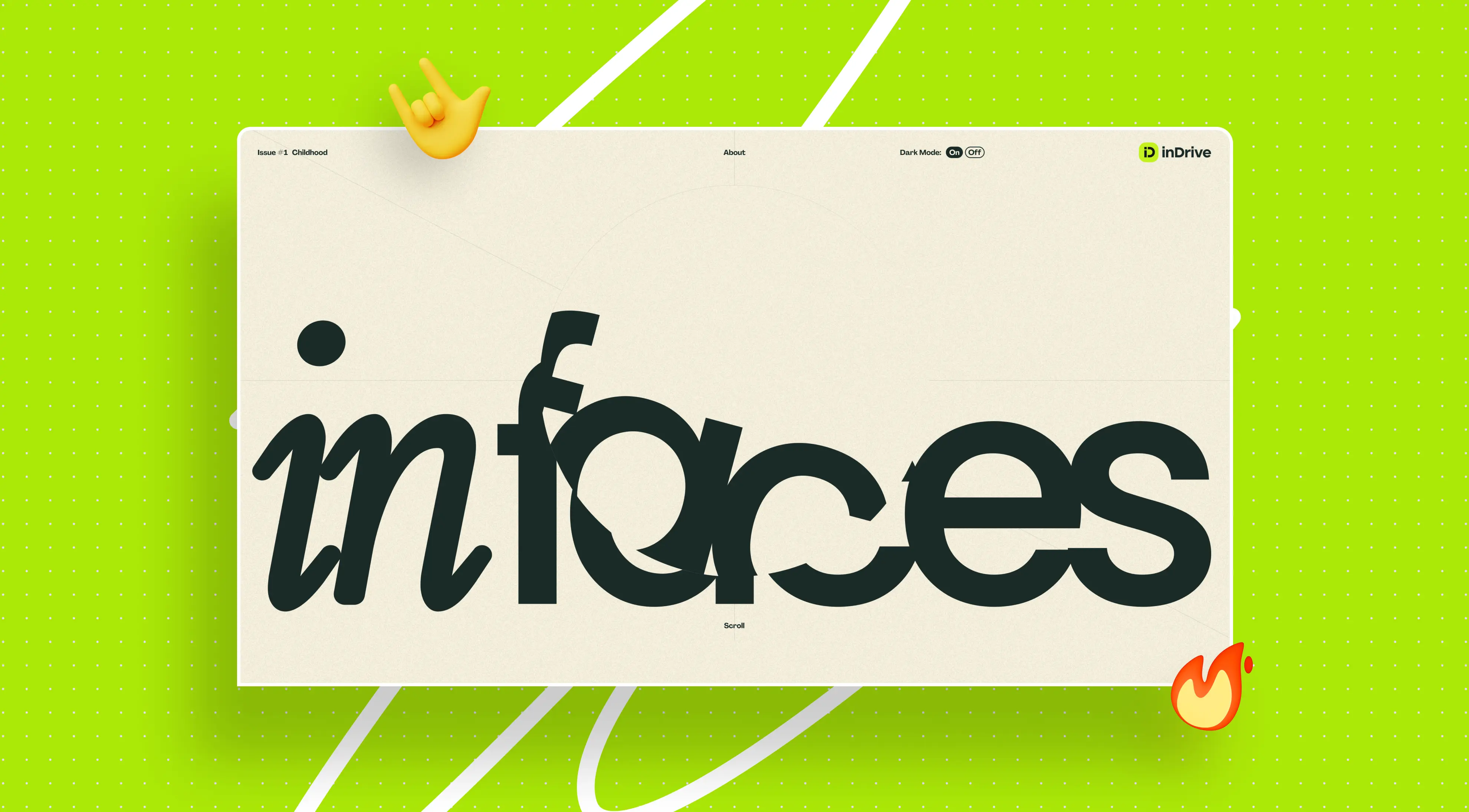
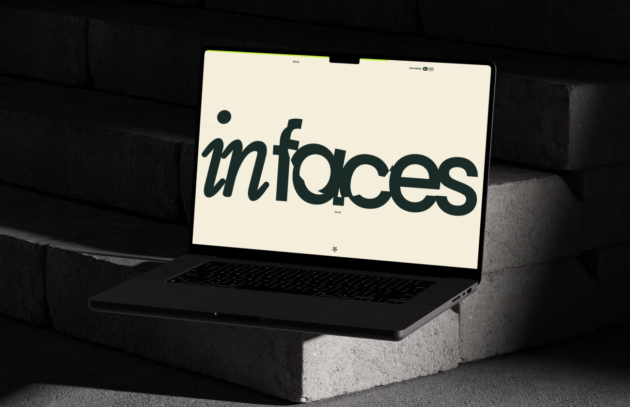
03. inFaces — Personal Stories
InDrive is one of the most notable global ride services built on fair pricing. At the scale of hundreds of cities, keeping a shared internal culture became harder. The employer turned to us for a solution that would bring a human dimension back to internal communications — a single space for living stories and mutual recognition.
Request
Build stronger ties inside an international company: give people from different countries and cultures a tool where only names and personal stories are heard — without job titles and hierarchies. The platform had to be accessible to all employees and set the tone for warm, human communication.
Initial inputs and process
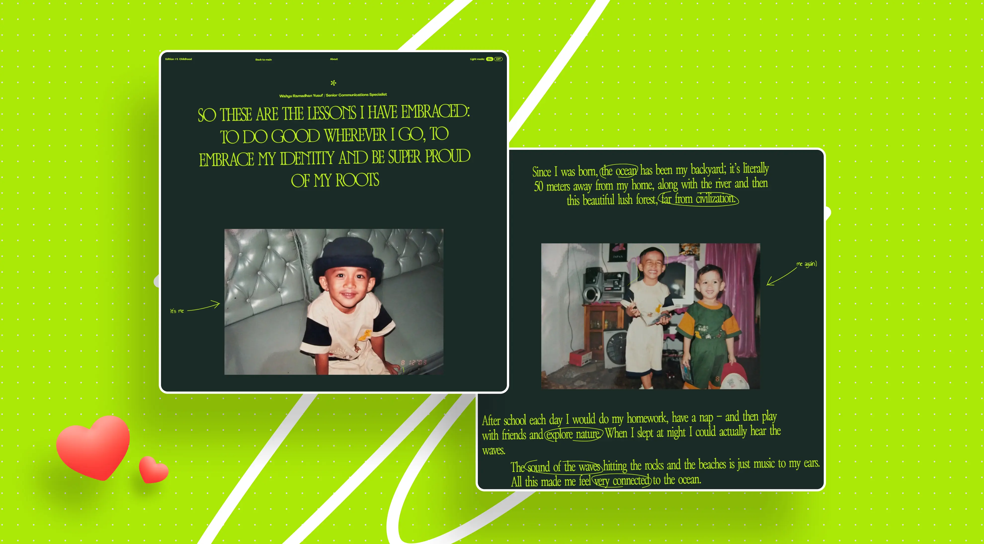
We chose a hybrid format: an immersive web page with a magazine treatment and a print issue with the same mood. The first issue was united by the theme “Childhood” — one focus gave a cohesive rhythm and depth to each story. We worked in Figma, prototyped quickly, and refined details on calls; at the final stage, we ran UAT with the team to test scenarios with real users. We paid special attention to accessibility and gentle navigation so entry into the project felt seamless on any device.
Concept and visual language
The backbone idea is respect for the diversity of experience. We leaned on the brand’s colors but amplified the atmosphere with typography and magazine composition. The interface’s primary language is English, while participants read poetic fragments in their native languages; texts in the original were supported with custom typography to preserve rhythm and sound.
The visual strikes a balance between restraint and warmth: personal photography, large quotes, whitespace, and delicate accents.
.webp)
Key decisions and interactivity
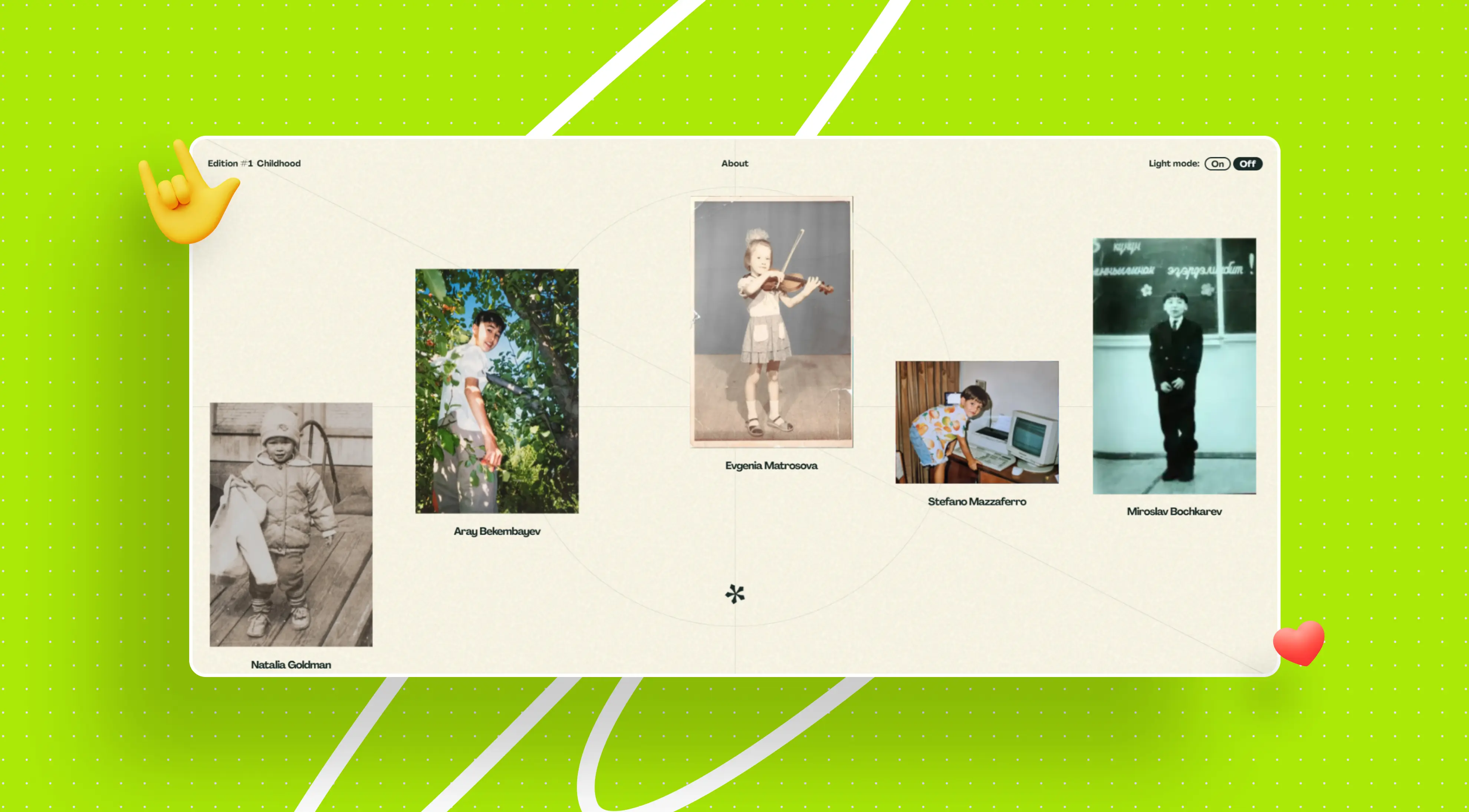
The heart of the project is an interactive gallery of eleven stories. Each has its own page where images and text reveal as you scroll, as if the reader is flipping a magazine spread. We deliberately removed any titles: just a name and a story. Navigation leads gently, without arguing with the content, and the micro-movement of the interface keeps attention without distracting from the author’s voice.
Rhythm and transitions
The narrative is built as a calm, long read: blocks appear sequentially, maintaining intrigue, and transitions between stories preserve the feeling of a single edition. Smooth scrolling and the pace of content reveal create an “immersion” effect without animation overload.
Engineering
We translated the design into responsive HTML/CSS/JS with stable behavior across all current browsers. On the server side, we set up secure storage for text and images and served content via API, so pages opened without visible delays. For quality and speed control, we used monitoring based on Waf Log — tracking load metrics, behavior, and uptime to identify bottlenecks in advance. Before release, we ran a complete testing cycle: functionality, usability, security; then UAT with the employer’s team.
Tech stack
The project was designed and built with a lean, intentional stack: Figma for prototyping and collaboration, Adobe Illustrator for graphics and illustrative elements, and Waf Log for monitoring. In development — responsive HTML/CSS/JavaScript, our own APIs, and a content database. This setup delivered the needed quality without unnecessary complexity.
Result: Personal Stories Strengthening Global Culture
We launched an interactive gallery of 11 personal stories, accessible to all employees. The project strengthened the sense of belonging in the global team: through the human voice, photography, and poetry, it helped people see themselves in one another.
The interface stayed invisible, and performance remained stable on all devices, supporting a high level of engagement.
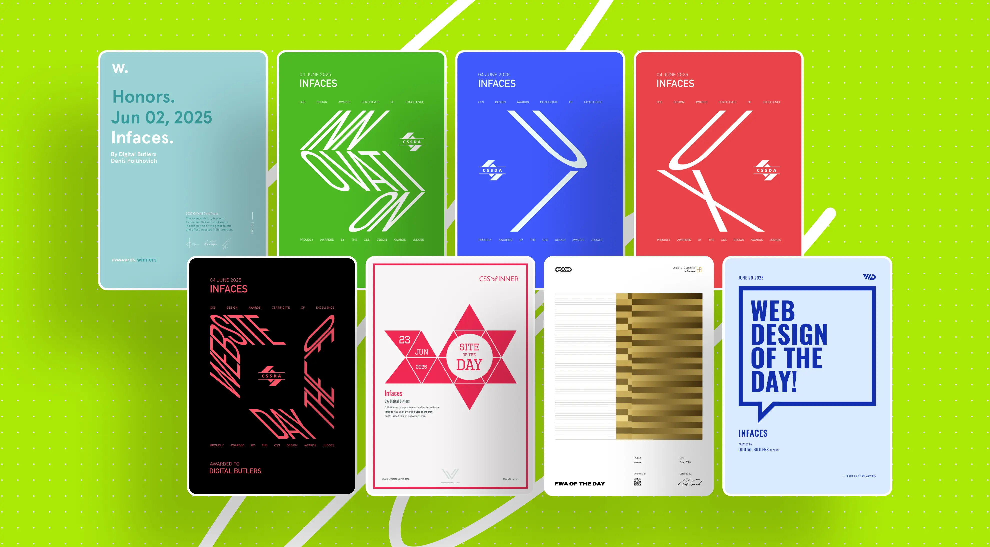
Awards
What this project taught us
Personal stories are a powerful tool of cultural integration: they build trust and lead to dialogue.
Intentional minimalism in the stack improves quality: fewer tools — more focus on the user experience.
Tactful rhythm and clean typography make the interface “transparent,” keeping people and their voices in the foreground.
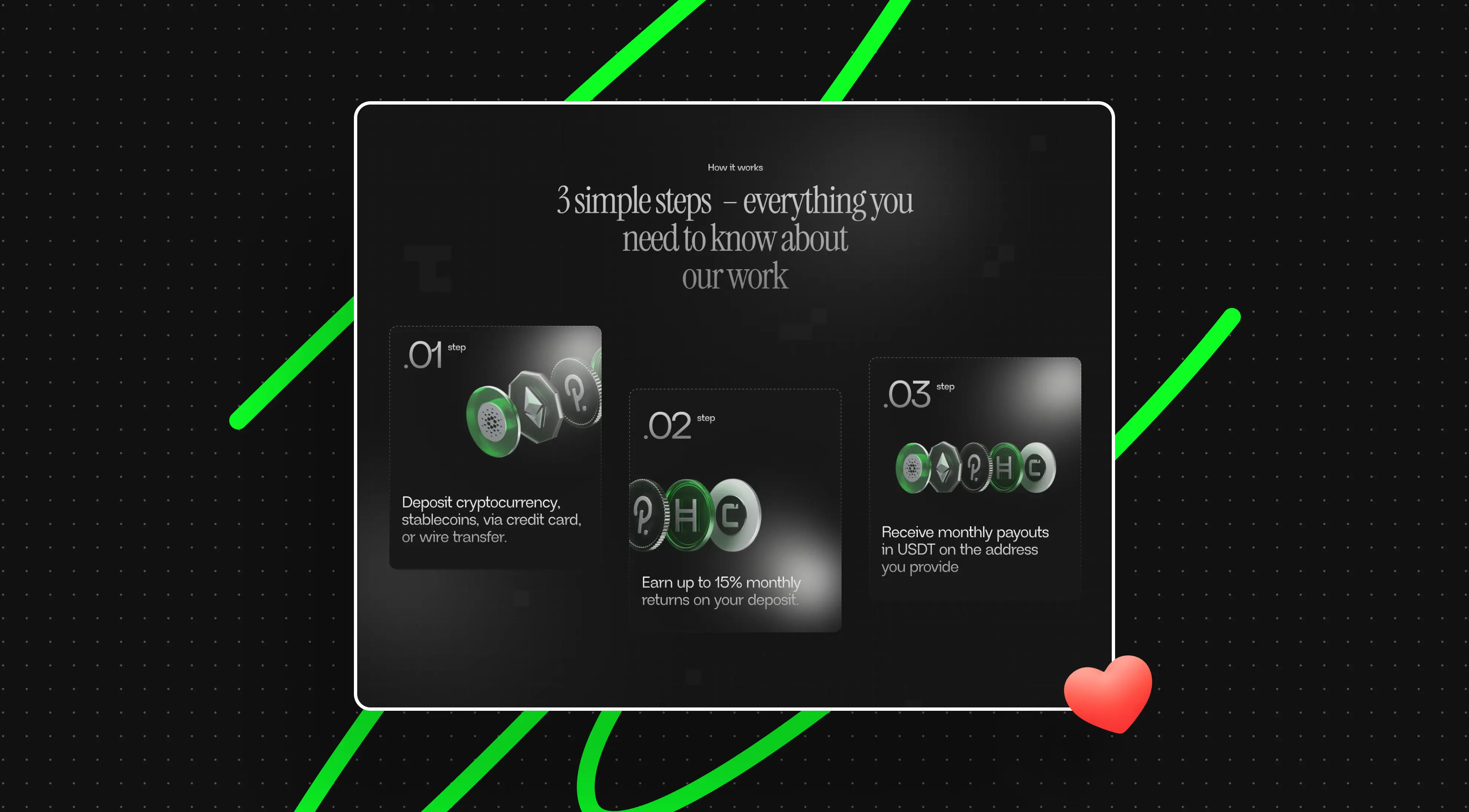
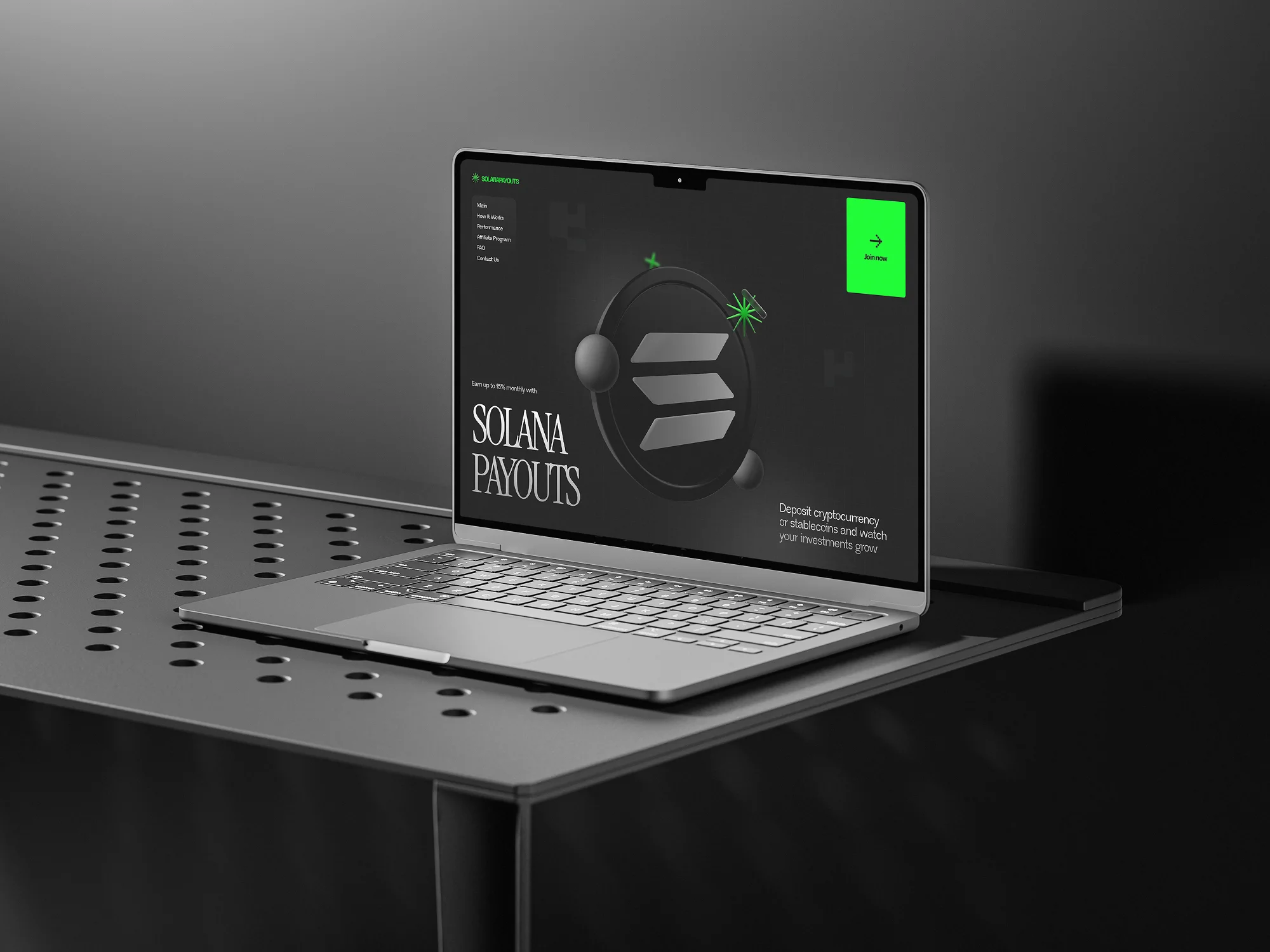
04. Solana Payouts — Live 3D Platform
Solana Payouts is a landing page for a crypto platform in the Solana ecosystem, where visual boldness meets performance discipline. The project received Site of the Day status on several platforms and showed how well-designed animation directly impacts conversion.
Request
The employer had no brand identity, no brand book, no palette — just structure and copy. We had to keep attention in every section and deliver key messages without losing focus, launch fast on Webflow, and set up communication for lead generation to an investor audience.
.webp)
Initial inputs and process
We started from zero: assembled a palette, typography, and animation patterns, showed several concepts, and reasonably quickly locked the direction — the employer hardly intervened, and the mood board passed without edits. Design took about 88 hours. After release, by agreement, we prepared a separate competition version — we strengthened motion direction and interactivity (another ~186 hours) while the core production build remained primary for the business.
Concept and visual language
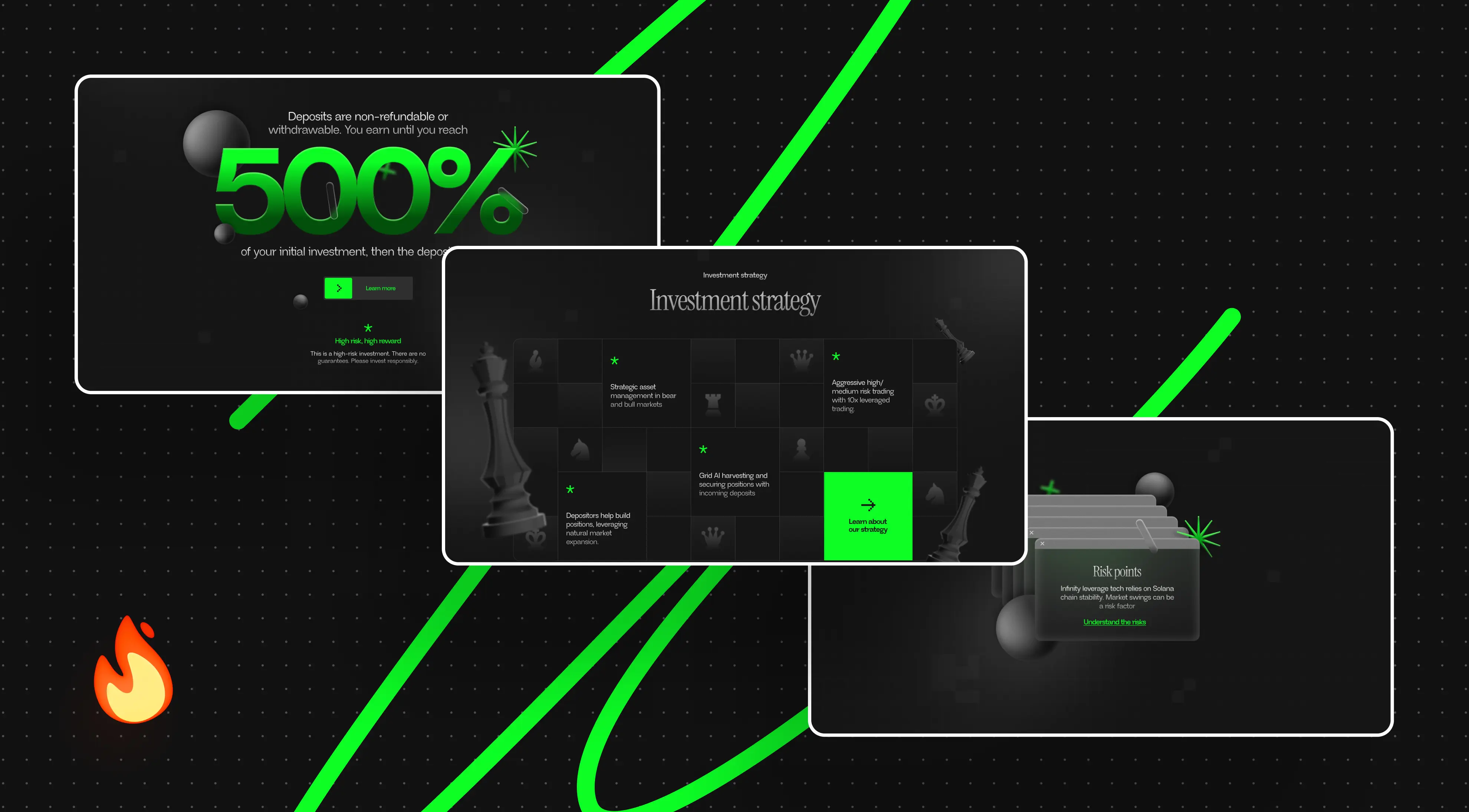
A serif in crypto was a conscious way to stand out among lookalike grotesques. We built a language out of simple forms — stars, “glass bits,” capsules, and spheres — and achieved a sense of volume with light and shadow. A chessboard grid suggested a strategy metaphor: squares tie meaning blocks together, and “pieces” help explain product logic. Large numbers carry hierarchy and rare color pops on a dark background, with more air around the CTA.
Risks are shown tactfully via familiar “windows” in the spirit of old system dialogs. There was no logo — we assembled a concise mark from a star and the Solana Payouts wordmark.
Key decisions and interactivity
The hero works like a stage: from darkness and grid to background shapes, then to the “coin” and copy. The cursor turns into a soft “flashlight” and adds depth, and decorative elements periodically disappear and reappear to keep the canvas “alive.” In the offering section, the user literally “hangs” inside the block: cards slide in at different tempos and sidestep one another, the headline locks in place.
The key number 500% intentionally “dives” between layers, amplifying a 2.5D illusion. Historical charts, initially two separate sections, we “stitched” into a single scroll scene: behavior is tied to scroll speed, and the “flashlight” hints at points of focus. The pop-up behaves like a stage prop — the “envelope” responds to the cursor and closes with a character. The final footer drives over the content and ends the story with a separate episode.
Rhythm and transitions
The narrative builds on repetition and evolution of motifs: what appears early returns later in a more complex role. Sections “stick” where attention needs to be held; transitions lock onto unified curves and speeds. Most of the effort went into polishing microtimings — from capsule inertia to the “flashlight’s” response and text behavior — so everything moves in one tempo and remains stable at different scroll speeds.
Engineering
The project was built on Webflow with custom HTML/CSS/JS. Motion orchestration was implemented with GSAP and ScrollTrigger: scroll scenes, pinned sections, and precise sync of entrances and exits. In dense episodes, we staged progressive loading and tracked frame stability to avoid freezes. The chart cluster was the most labor-intensive: merging two sections into one scroll scene took about a week and a half, with many dependencies and nuances at fast or slow scroll.
We maintain two builds: production — with simple entrances, separate charts, a standard pop-up, and a classic footer; competition — with a staged hero, “flashlight,” “hanging” cards, layered 500%, a single chart scene, an envelope pop-up, and a footer-as-scene.
.webp)
Tech stack
Figma for design and collaboration; Webflow with custom HTML/CSS/JS for build; GSAP and ScrollTrigger for animation; in 3D episodes — WebGL/Three.js; in production, we used Blender and Adobe After Effects.
Result: Motion‑Driven Design Converting Leads and Trust
In the first month, the site brought about 2,000 leads via Telegram and other channels. Bold typography, a unified micro-animation language, and the chess metaphor helped the project stand out among crypto sites.
Both versions live without compromise: production solves for speed and conversion, the award-winning build showcases motion direction and engineering precision.
Awards
.webp)
What this project taught us
Animation is not decor but a language on par with type and color: better, shorter, and precise than longer and static. Three-dimensionality should “live” and respond to the user; where it’s excessive, honest pseudo-depth works cleaner. Early design–dev pairing plus systematic polishing of microtimings gives exponential quality growth; trust from the employer and freedom to decide help assemble a system capable of winning “sites of the day.”
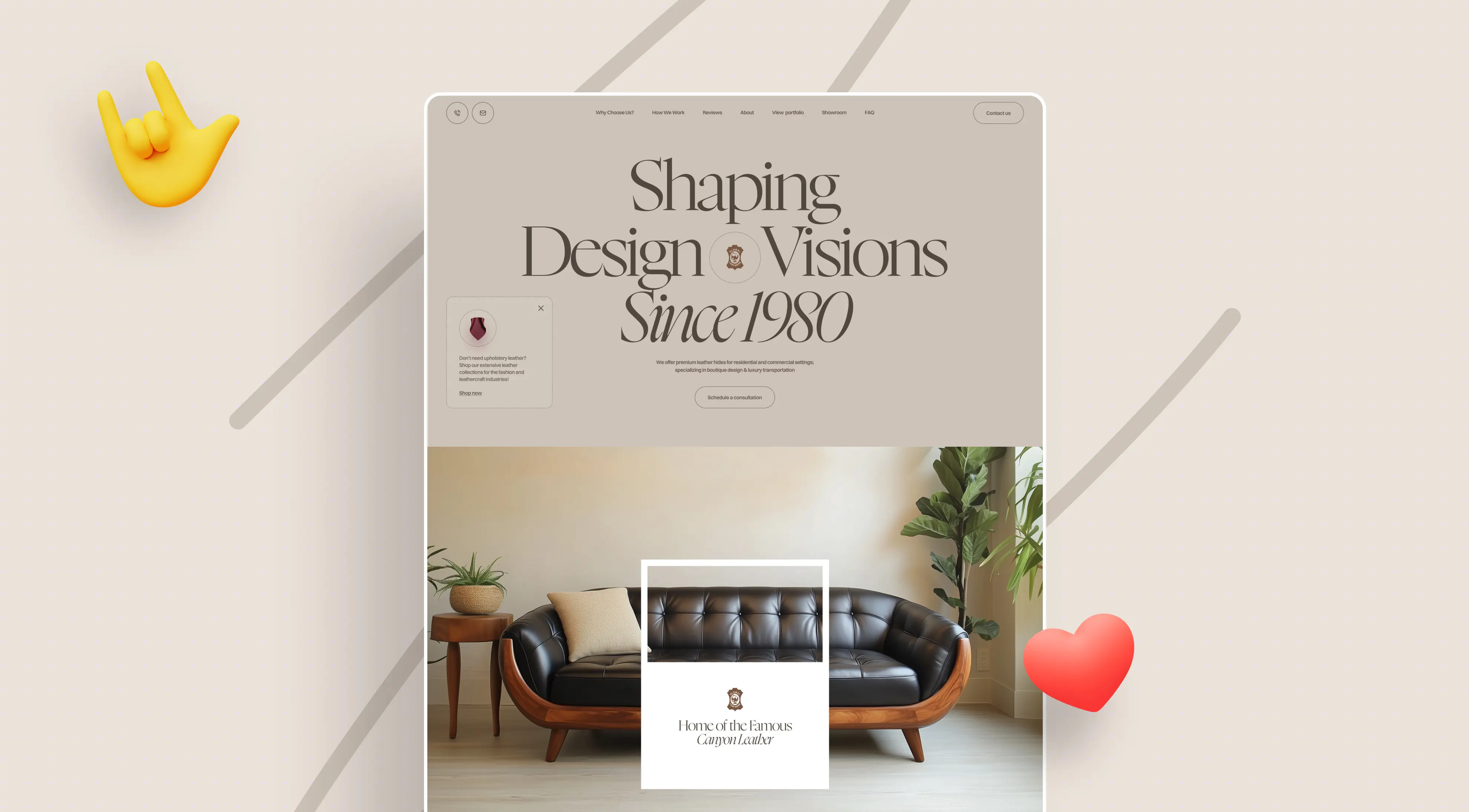
05. Global Leathers — Premium Landing
Global Leathers is a family leather manufacturer from New York. The employer’s outdated catalog site stopped generating inquiries; the core audience is interior designers and furniture makers. They need a quick orientation on materials and service. The new digital entry should feel premium and speak in a simple, confident voice. To reduce choice friction in a broad assortment, we built in a brief educational layer.
Request
Build a one-page landing to replace the catalog and roll it out on a tight timeline while keeping the current logo. The scenario — keep attention along the way and gently lead to “request a leather consultation,” all within a light interface that helps users orient quickly in the assortment.
Initial inputs and process
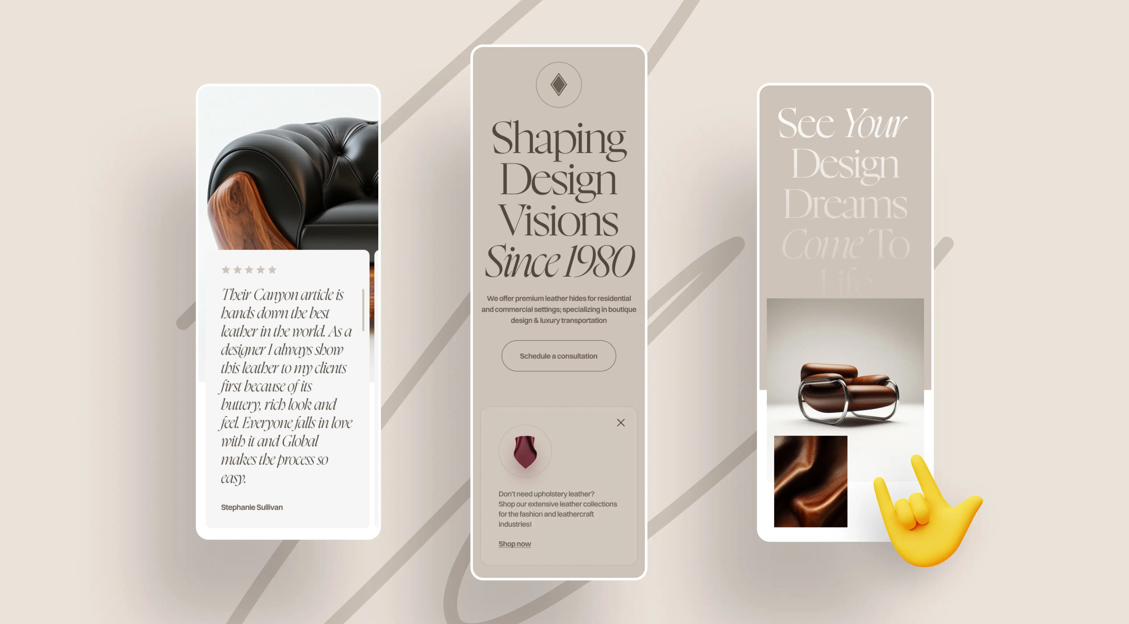
We analyzed the current assets and audience goals and deliberately chose not to “re-stitch” the whole site. We assembled a new high-conversion landing and structured it via Jobs-to-be-Done and personas: first values and expertise, then assortment and use cases, then service and a clear call to action. We prepared the prototype in Figma based on the Untitled UI library.
It’s a one-pager with a rich yet light storyline; we trimmed some planned blocks during approvals to preserve rhythm and runtime. After release, we built a separate competition version; colleagues handled some final blocks and production-version fixes.
.webp)
Concept and visual language
The visual language is “quiet luxury”: plenty of whitespace, large headlines, an impeccable grid, and calm, deep coffee tones. A serif–sans duo balances heritage and modernity: the serif conveys the status and classic nature of the material, the grotesque holds interface rigor and functionality. The employer didn’t have current photography of implemented projects, so we immediately prepared shooting guidelines to ensure future images would slot naturally into the typography and palette.
.webp)
Key decisions and interactivity
The hero immediately sets a clear path and the prompt to “request a leather consultation.” In the production version, we kept soft text transitions, parallax accents, an animated cursor, an interactive slider, dropdown menus, and galleries; logo animation was added via Lottie. We proposed a higher animation level, but the employer declined due to budget — we kept only what supports rhythm without overloading the page.
In the competition version, we evened out the visuals: generated images of leather goods and swatches, added a large “interlude” with a leather mask and a small gallery, updated the slider structure, strengthened typography, and reworked the footer. Color and some block placements remained — the rest was brought to a cohesive direction.
Rhythm and transitions
The rhythm relies on economical, aligned transitions at unified speeds. We deliberately trimmed some blocks to avoid scattering attention and polished microtimings to a comfortable “quiet” motion: parallax, gentle text reveals, and neat cursor reactions. A separate focus was on animation stability at different scroll speeds and on responsive breakpoints.
Engineering
The landing was built on Webflow with custom HTML/CSS/JS for interactivity. In the production version, tuned lightweight effects to preserve performance, plus a neat Lottie logo animation. During build, we paid special attention to responsive layouts: mobile versions needed additional polish to keep effects stable.
Tech stack
Figma (prototype, design), Untitled UI library, Webflow, custom HTML/CSS/JS, Lottie. For the competition version — preparing and aligning visuals (generated images).
.webp)
Result: Quiet Luxury Landing That Turns Interest into Sales
The landing refreshed the employer’s digital image: neat premium feel, a clear path, and the “request a leather consultation” prompt right on the hero. The page is already used in promo activities; a detailed metrics readout is planned later. From the employer’s review: “Digital Butlers created a visually appealing, user-friendly site that received high marks from the audience and boosted engagement, lead volume, and conversion for the employer.
The team met deadlines, responded quickly to feedback, and proactively and expertly made necessary adjustments.”
Awards
What this project taught us
On a limited budget, a focused landing is more effective than a complete catalog redesign. The quality of source content is critical to a premium feel; animations on responsive breakpoints demand discipline and multi-round QA when there are no source photos, strict typography, a well-thought-out palette, and, if needed, aligned visuals for competition submission help.
How we work
The idea leads the visuals: metaphors and scenarios tied to the business goal, not “for beauty’s sake.”
3D is a language of meaning, not an attraction: our own tools, precise accents.
Performance is part of design: speed budgets, scene optimization, WebGL/Workers/OffscreenCanvas, CDN.
Predictable process: “page → approval,” UAT, monitoring, documentation, and source handoff.
For public releases and NDA projects, we choose a case format that doesn’t expose confidential information.
Conclusion
Award‑winning websites aren’t built on visuals alone — they combine strong ideas, meaningful animation, and performance engineering into a seamless whole.
From cybersecurity and hardware launches to crypto platforms, international ecosystems, and premium brands, these cases show how design becomes a language of trust, speed becomes a marker of quality, and innovation turns into real business impact.
For us at Digital Butlers, success means more than collecting Awwwards or FWA badges — it means creating digital experiences that move audiences, generate leads, and set new standards in their industries.
Awards
About Digital Butlers
We’re Digital Butlers — a design-led team of 27 senior specialists building digital products since 2016. By choosing us, you’re getting results that are way different from what you already have — with the same commitment to your goals that Alfred has for Batman.
If you need a website, web service, or mobile app that pays off, reach out to us — we do it well.
Digital Butlers — a mature team with mature processes that deliver consistent results.
“They’ve always had our best interest at heart. Loyal. Reliable. Follow-through”
Thanks to Digital Butlers' efforts, the website received positive feedback from the client's advisors and investors and the 3D models ran smoothly with no glitches or loading issues. The team was responsive, communicative, and detail-oriented. Their dedication to the project was impressive.
Location

USA
CA
Project length
Jan. 2023 - Ongoing
Location
.webp)


Quality:
5.0
Schedule:
4.5
Cost:
5.0
Would Refer:
5.0
“They provide out-of-the-box solutions and go outside their comfort zone to try new things.”
The engagement with Digital Butlers has exceeded the client’s expectations. They’ve contributed to an increase in website leads and continue to dedicate a talented, driven team. They communicate via WhatsApp and Google Meet and manage engineering progress through GitLab.
Location

USA
Project length
Jan. - Aug. 2021
Location
CO, USA
Project length
Jan. - Aug. 2021

Quality:
4.5
Schedule:
5.0
Cost:
4.5
Would Refer:
5.0
"Digital Butlers stood out for their clear understanding of our requests."
Digital Butlers stood out for their clear understanding of our requests, delivering a high level of web design that aligned perfectly with our brand vision. Their approach ensured that the website was not only visually appealing but also user-friendly and easy to manage internally after the project was completed.
Location
USA
NY
Project length
Aug. - Oct. 2024
Location
NY, USA
Project length
Aug. - Oct. 2024
Quality:
5.0
Schedule:
5.0
Cost:
5.0
Would Refer:
5.0
"The site was not only visually appealing, but also technically robust and fast-loading."
The site was not only visually appealing, but also technically robust and fast-loading.
Overall, Digital Butlers met our expectations with their professionalism, creativity, and technical expertise. Yeah, the project had a biting price but when you want to have such a quality level I don't think that it is possible to get a "cheap" solution.
Location

Czech Republic
Project length
May - July 2024
Location

CZ
Project length
June - July 2024
Quality:
5.0
Schedule:
5.0
Cost:
5.0
Would Refer:
5.0
"They find effective solutions for various complexities and demonstrate high responsiveness and involvement.
They find effective solutions for various complexities and demonstrate high responsiveness and involvement.
The Digital Butlers team consistently performs tasks very promptly, never misses deadlines, and maintains high-quality standards.
Location
Location

Kazakhstan
Project length
Aug. 2023 - Ongoing
Quality:
5.0
Schedule:
5.0
Cost:
5.0
Would Refer:
5.0


Let's discuss your project.
My name is Alex and I am your potential Digital Butler


.webp)