


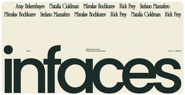
Infaces
A storytelling platform designed to help a 5,000+ employee global company reconnect distributed teams and strengthen cultural cohesion by turning personal narratives into shared identity.


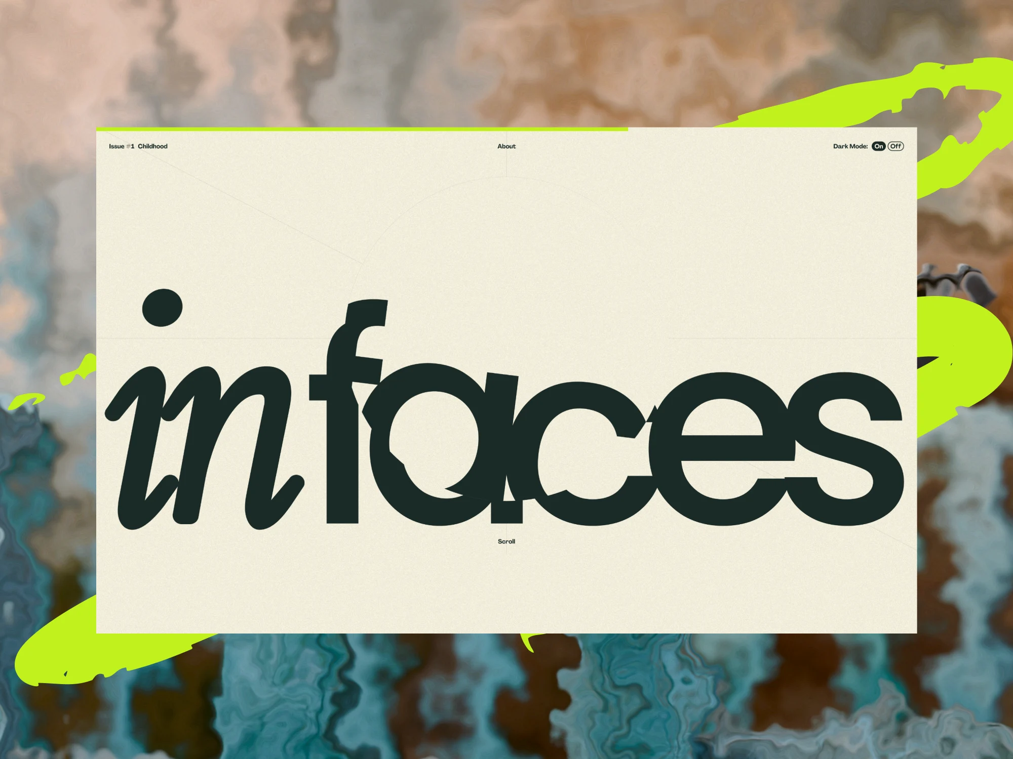
Sometimes a team receives a project that cannot be measured by familiar metrics. inFaces is exactly such a case—it grew not from a task about interface, but from a desire to bring the human dimension back into a world usually driven by numbers and processes. At Digital Butlers, we joined it as inDrive’s partners in emotional design: we created a digital space where the employee recognizes themselves, not just the logo. This text is the project through the eyes of a designer who tried to turn technology into feeling — written by the designer who worked on it.
Business Challenge
As inDrive expanded globally, nurturing a cohesive internal culture across diverse languages, backgrounds, and geographic locations became increasingly challenging. The company sought to strengthen personal connections across its global team—emphasizing equality with a platform free of hierarchy, where everyone would appear not as “titles,” but as people with stories to tell.
The project’s paradox emerged quickly: eleven employees contributed stories of vastly different lengths, formats, and assets. Some were filled with text and poetry. Others had mostly imagery—or no childhood photos at all. At the same time, deadlines were strict and the principle of equal representation could never be compromised.
From brief to emotion
inFaces was born not as a standard digital project. The first letter from inDrive sounded almost human: “We want employees to see each other not by job titles, but by their stories.” There was something almost vulnerable in that. In a corporate setting, such words are unusual—they’re not about metrics or KPIs. It was a request for attention. We understood: this wasn’t about a new interface. It was about memory—about how design can learn to remember, how visual choices can awaken inner feelings.
inDrive was growing fast then, bringing in people from many countries. Online communication simplified processes but took away warmth. At Digital Butlers, we often meet digital barriers, but this brief struck a nerve—it was about the person who fades behind an avatar.
During the first call, we just listened. The employer spoke not about a website, but about how to bring trust back into teams scattered across continents. “We want an atmosphere where everyone recognizes themselves in another.” That phrase set our direction.
We decided the project couldn’t look like a presentation. It had to feel: each page like a breath, each photo a dried imprint of time. Childhood pictures, letters, school notebooks intertwined with corporate colors and type. “This isn’t about interface, but about how to make technology sensual,” I explained to myself and the team.
The first sketches were drawn almost blindly. We didn’t know how many heroes there would be, what their stories would be, or how personal they might get. But we knew this: the form must serve the content, not impose itself.There was a sense of something unprecedented—as if we were building not a corporate project, but something human, simple, and rare.
Context and challenge. Employer brand without hierarchies
The project was conceived as an exploration of human scale inside large structures. inDrive was looking for a new way to speak with employees—not through slogans but through shared memory. Our task was complex: to create a warm, informal space where childhood stories sounded equally, without ranks or titles. Everyone an equal part of a larger portrait.
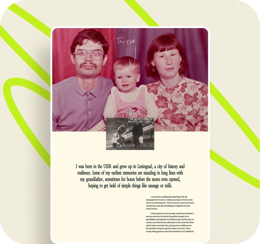
Officially, it was phrased dryly: “The goal is to show the diversity of life experience and values of employees worldwide.” In practice, it was about translating the language of humanity into digital space. To show a geography of memory, not the architecture of a corporation. A youth club in Yakutsk, a grandmother’s garden in Tula, a first concert in Mexico—all fragments coming together into one organism.
The deadline—just six weeks. We needed to synchronize web and print versions, stay consistent with inDrive’s brand guide, and not lose the warmth of live storytelling. We saw how for inDrive this project became part of an employer‑branding strategy—to reveal the real faces of the team. For us, it was an experiment in empathy design.
“Each protagonist should look not like a boss, but like a human being with a story,” I repeated during internal reviews. We drew inspiration from opposites: corporate logic demanded unity, emotional logic individuality. So we searched for a delicate balance.
Concept & Vision
- Celebrating Diversity. Stories were meant to highlight the richness of individual lives—making visible the variety that powers inDrive as a company.
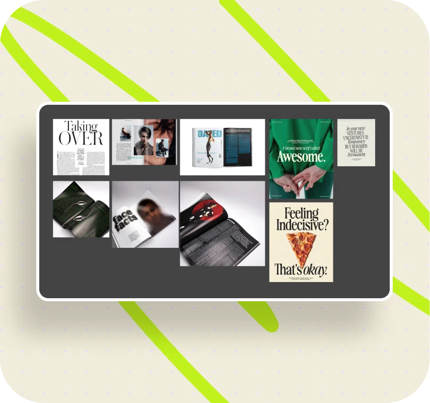
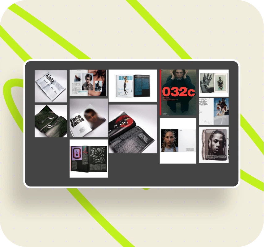
- Multichannel Storytelling. From the start, inFaces was designed as both a digital platform and a print zine, merging scrolling rhythm with editorial permanence.
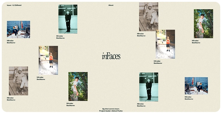
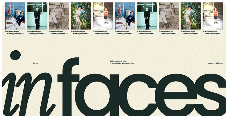
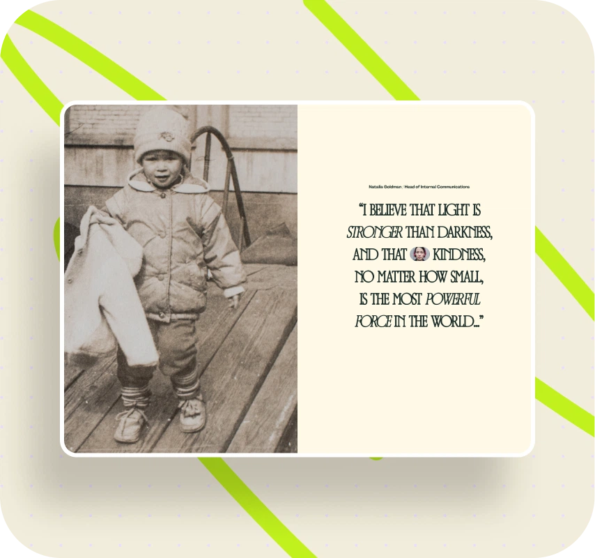
- Thematic Focus. The first edition centered on Childhood, a universally intimate theme that allowed cultural nuance to shine: basketball in Soviet gyms, family heirlooms in Leningrad, Kazakh poetry carried since youth.
- Engaging Scroll Experience. Stories unfold gradually as if resurfacing from memory—blur‑in animations reveal fragments step by step, while a subtle dynamic grain evokes analog photography. Together, these effects formed a cinematic metaphor for recollection.
- Visual Identity. Atmosphere was critical. The iconic inDrive green was used only as a subtle highlight. Typography was inverted: Poppins rose to expressive headlines while Agrandir softened into body text. Some titles leaned one degree off axis—tiny imperfections reminiscent of misaligned print.
- Storytelling Layer. Each story concluded with a poetic epilogue in the author’s original language, typeset with care. These personal verses—from Abai to Mandelstam—added depth and cultural authenticity, letting employees connect with the formative worlds of their colleagues.
- Human Touch. Hand‑drawn doodles—arrows, suns, hearts—floated across the layouts, lowering formality without diminishing the seriousness of lived memories.
Birth of a visual language
When a task feels almost philosophical, the first thing you look for is not a font but a feeling. inFaces had to speak the language of memory—spontaneous, uneven, slightly worn by time.
There was no brief for style. We asked ourselves: what would memories look like if they could be laid out? The moodboard formed quickly: Kinfolk gave breath and calm, 032c added nerve and courage, Dazed brought visual roughness. Corporate references felt too sterile. A hybrid was born—visual precision plus micro‑imperfections. “A bit of bookishness, a bit of imperfection,” we wrote on the whiteboard.
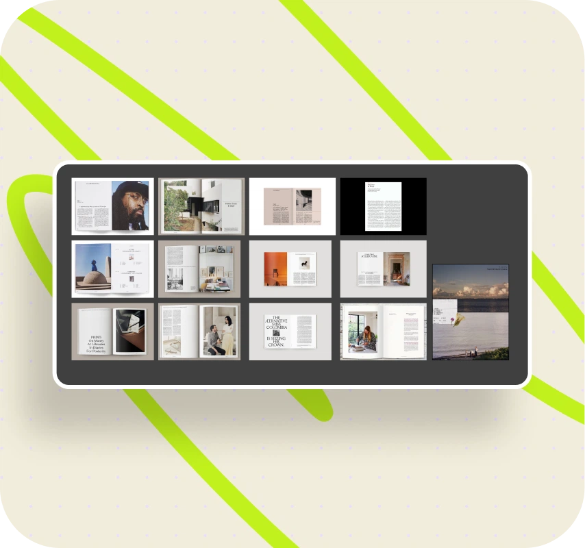
Film artifacts became the language of nostalgia: paper edges, dried leaves, fingerprint marks. Everything usually cleaned in production we decided to keep. Not illustrations, but memory triggers. One designer even brought an old film camera: “I want to manually burn a frame for the background texture.” We laughed—and it became a rule: don’t avoid living mistakes. Typography—minimalist, but with breathing space. We enlarged letter spacing, lowered headlines slightly below baseline. The text slid downward like an old print—slightly uneven, yet alive.
The color palette stayed within inDrive’s system but softened: green became pastel, backgrounds shifted to warm gray‑olive. At the first review the employer said, “The site seems to smell like album dust.” “I wanted the site to remember along with its heroes.” That’s when the project found its voice.

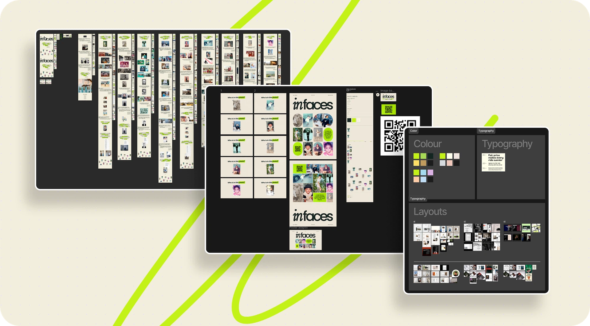
Design Tools & Process
To bring this atmosphere to life, we structured work around three core tools:
- Figma: Used for prototyping and modular system design—establishing both a 1‑2‑3 photo grid system and text rhythm (headlines, pulls, diagonals). Enabled continuous collaboration with inDrive stakeholders.
- Adobe Illustrator: To craft vector sketches and doodles—purposefully primitive, echoing childlike marks to highlight identity.
- Waf Log: Designed for monitoring performance globally, ensuring stability of load and uptime during heavy usage.
- The modular architecture solved the imbalance problem: varied stories flowed through consistent grids. Photo blocks could appear as one large image, or split into two or three. Text blocks flexibly adjusted length without breaking alignment. This system allowed editors to freely add, remove, or edit content without compromising design consistency.
From chaos to system
When the first stories arrived, it became clear how hard it would be to maintain visual unity. Each hero had a different set of photos, a different text length and rhythm. Manual assembly of each page meant endless corrections. We searched for a formula that would let memory look structured. The answer was a 1‑2‑3 modular grid: 1 ↔ 2 ↔ 3 — photos and text alternating to create flow without templates. Three base modules could combine freely, giving hundreds of variations. Even if a designer changed, harmony remained.
We defined minimal rules—indent ratios, text bounds, block density—and then let layouts breathe. The site began to resemble a family album composing itself to match the story’s tone. To add humanity we inserted micro‑flaws: a slight headline tilt, a whisper of surface noise, tiny animation drift. Sometimes a photo shifted by half a pixel on load—and the accident looked intentional. Each story sounded separate yet shared one rhythm. The system didn’t crush emotion—it gave it structure. Technically precise, emotionally alive. We joked: “A machine that knows how to be nostalgic.”
Inside the process
Meanwhile, the stories kept coming. inDrive sent us employees’ letters: someone wrote five paragraphs about childhood near the northern gates, another three lines about the taste of jam. Editors gently trimmed texts without touching voices. We had one rule: no formal tone, only living speech. If someone wrote “nothing fancy,” we left it that way.
Figma files were constantly “breathing”: new comments, screenshots, markups appeared. We even highlighted emotions—green for “inspiring,” orange for “uncertain.” The prototype turned into an emotional map of the process. Each call with inDrive felt like a small interview. We listened as the team spoke of friends, travels, home traditions.
Sometimes design talk shifted suddenly to personal stories: “That happened to me too!”—and the screens filled with smiles. Time was short, but no one hurried. A strange feeling—to work quickly yet without rushing. The project itself set the pace, asking for attention to detail. Synchronizing print and digital versions became a separate game. Colors perfect on‑screen lost life in CMYK. We adjusted shades manually, the photographer warmed the lights and shadows. It felt almost like studio work—holding a memory in your hands.
Main page: a metaphor of coordinates
When internal pages found their voice, one question remained—how to show it all at once. We needed a face for the project—the main page. The first option—a plain portrait grid—felt meaningless, too corporate. We searched for another logic. I took imaginary coordinates: on axis X the northernmost childhoods, on axis Y the southern ones, and began placing points. Suddenly everything came alive—a map of memory. Each story a point, each point a place of power. Drawing a diagonal, I saw lines connecting continents. Geometry turned emotional.
We shaped that map into a central circle—a symbol of intersecting destinies, a small Venn diagram where each story blends with another. “I realized I was not drawing an interface but a map of empathy.” The circle’s micro‑movement became the site’s breath. The animation was nearly invisible: gentle rotation responding to the cursor. Just a few degrees—and the whole screen felt alive. “This is probably the quietest animation we’ve ever made,” I laughed, “but it’s what makes the page alive.” The main page became a visual metaphor of equality. No story higher than another, no beginning to the circle. Not a showcase but a reminder of human connection—for which it all began.
Technical Implementation
A meticulous pipeline translated design into a robust, adaptable product:
- Front‑end development: HTML/CSS/JS with responsive layouts, smooth animations, image lazy‑loading, and cross‑browser consistency.
- Back‑end integration: Database and APIs for dynamic content delivery; robust architecture designed for multimedia storytelling.
- QA: Multiple test cycles—functionality, usability, accessibility, performance—closing with UAT sessions alongside inDrive stakeholders.
Reflection: doubts, discoveries, exhale
Every project teaches something personal. Here, for the first time, we felt how quickly mood becomes design. Some days the grid wouldn’t fit and we argued about pixels. Other days, talk drifted into memories of our own childhoods. Those shifts, though random, kept the right tone.
The project stayed warm as long as we ourselves stayed emotionally involved. Closer to the finish we felt uneasy: was it too personal? Would people find it hard to look into such a mirror? The answer came at the test launch. One inDrive employee said, “For the first time I see a company that can speak about me not as a worker, but as a person.” Those words erased every doubt. The project turned out to be not about the past but about the present—proof that within any corporate structure there’s room for humanity.
Project Insights
- Cultural connection. Employees encountered colleagues through formative stories, not job titles.
- Design as empathy. Blur, grids, type inversions, doodles—each design device carried symbolic weight, not mere aesthetics.
- Scalable foundation. Modular architecture supports future themes beyond childhood.
- Digital + print longevity. With its structure, inFaces can live as both web platform and print zine, becoming a long‑term cultural artifact.
- Employer branding impact. inFaces strengthened inDrive’s reputation as a human‑first employer—cultivating trust, engagement, and a unique cultural environment.
Balancing Atmosphere & Function
The hardest challenge wasn’t code—it was atmosphere. Every detail, from blur animations to doodles to coordinate axes, was calibrated to evoke memory, warmth and equality. The platform had to feel less like a corporate tool and more like a cultural artifact. This emphasis on emotional UX was the true core of success.
Atmosphere as a result
inFaces didn’t end loudly. The launch was quiet—a link in a group chat, a few emojis, a handful of hearts. We opened the site and simply watched. On the screen—people who showed themselves differently for the first time: not employees, but carriers of personal worlds.
For inDrive, it became a way to strengthen culture without slogans. For us at Digital Butlers—a lesson: design can be not only about function but about attentiveness. We built not a landing page, but a digital environment for sincerity, where visuals follow the emotional rhythm of stories. Each screen seems to listen. “inFaces proved that the best technology is attentiveness to the human being,” I wrote after the final review.
The project kept living: printed magazine, internal issues, new stories. It became a flexible system into which memory can keep expanding.Now, looking back, I understand: it’s a rare case when a site truly became an atmosphere—not a metaphor, but a form of communication where digital and human found one rhythm.
Results
The final product went beyond a website. inFaces became a storytelling platform, a memory archive, and a cultural artifact. It united employees across the globe equally, translated seamlessly between digital and print, and proved that design and technology can strengthen culture when combined with human storytelling.
For inDrive, it became a touchstone of connection and an instrument of employer branding.For Digital Butlers, it demonstrated how a boutique agency can merge technical craft with emotional atmosphere—building not just platforms, but bridges between people.

Conclusion
When the final screen fell into place, we opened the site with no edits—just to see. Faces, stories, childhood photos appeared on the monitor—and at that moment we realized we had built not a visual system. We had woven a space where the company and its people could finally see each other for real.
For inDrive, it was a quiet but significant gesture: to show that a brand is not only a product, but a living community. For us, at Digital Butlers, inFaces became a chance to remember why we design at all. This project is not about pixels or branding—it’s about the human ability to see and be seen, even through a screen.
Sometimes design is architecture of meaning; sometimes interface. Here, it became connection—between continents, voices, memories. We gave the system breath, and it still breathes.inFaces is the project that taught us that design, too, has memory.
Awards
CSSDA
CSSDA
WD Awards
FWA
CSS WInner
CSSDA
CSSDA
Awwwards
Awwwards
About Digital Butlers
We’re Digital Butlers — a design-led team of 27 senior specialists building digital products since 2016. By choosing us, you’re getting results that are way different from what you already have — with the same commitment to your goals that Alfred has for Batman.
If you need a website, web service, or mobile app that pays off, reach out to us — we do it well.
Digital Butlers — a mature team with mature processes that deliver consistent results.


Let's discuss your project.
My name is Alex and I am your potential Digital Butler


.webp)
