Elvetico
A calm, trust-focused medical website for Elvetico that clarified the patient journey, added multilingual WordPress management, and prepared a complex multi-path booking experience.




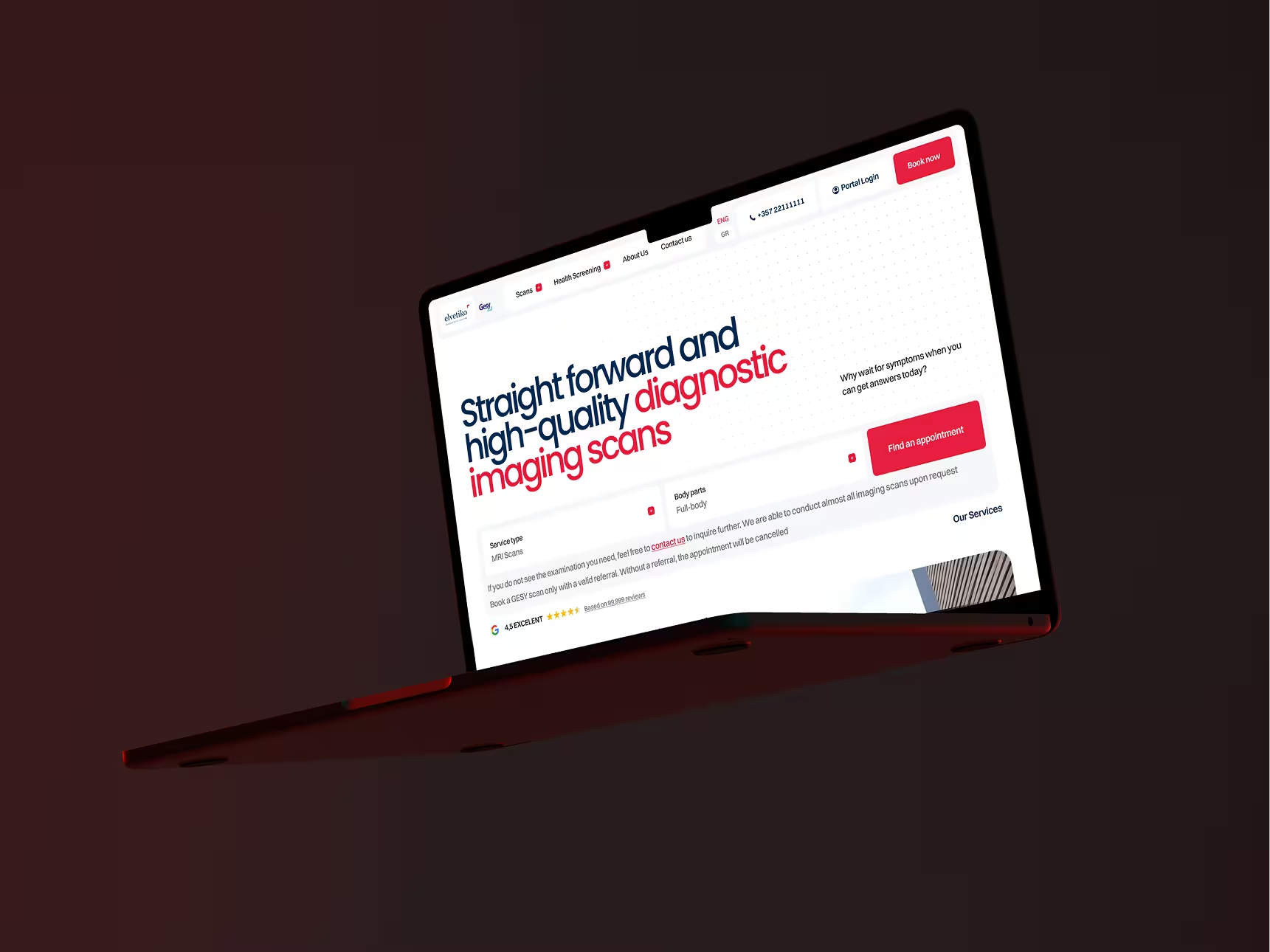
Elvetico is a diagnostic center in Cyprus offering a wide range of examinations, including MRI, CT, mammography, ultrasound, dental diagnostics, and screening packages for different patient groups. The center has a strong Google rating of 4.9, and for us, this project was about much more than redesigning a website. It was about building a digital system that better reflected the quality of the medical care behind it.
The employer came to us looking to refresh an outdated website, migrate the project to WordPress, and improve the user experience. The brief also included a clear business goal: increase website conversion by roughly 30 to 40 percent. In addition to the redesign, the project included a more complex layer: a booking flow tied to an external backend and a patient account area.
For projects like this, a new visual layer alone is not enough. The digital environment has to be rebuilt in a way that feels clear to users, manageable for the employer's team, and flexible enough to support future growth.
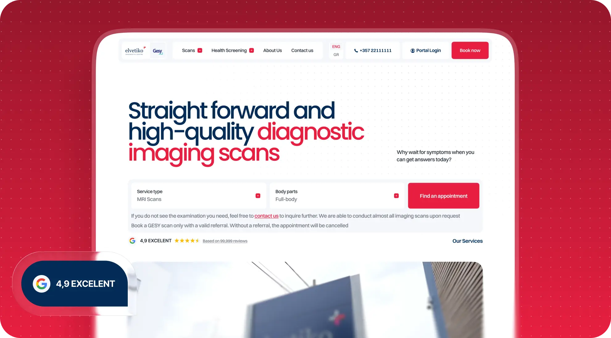
Elvetico had a strong medical service. Its website was falling behind
Elvetico had a strong reputation, a broad service offering, and a high level of trust from patients. But the old website no longer reflected that quality.
The issue was not just that it looked outdated. Navigation was clunky, the language switch was not easy to spot, and for a center with a meaningful share of English speaking customers, that was a serious problem. When someone is looking for a medical service, especially in another country, they need to quickly understand what examinations are available, how the center works, and what the next step should be: contact the clinic or book an appointment.
At a certain point, redesign stops being about aesthetics. It becomes about effectiveness: does the website help users move through the journey calmly and confidently, or does it create extra friction at a moment when they may already be feeling anxious?
What the employer got: a stronger digital foundation that better matched the level of the medical center and the expectations of its audience.
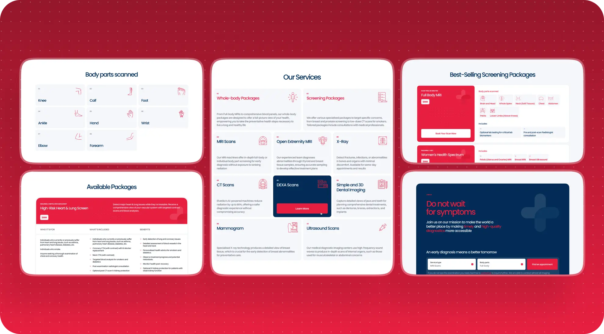
Clarity came first in the user experience
Before the work began, we relied on audience research shaped by the JTBD approach. The focus was on users between 40 and 60, including international patients, for whom the website needed to serve as a clear entry point into a medical service.
A website for people who need clarity and confidence
For this audience, visual effects matter far less than a sense of clarity and control. Users need to quickly understand which examinations are available, how to choose the right service, how to provide the necessary information, how to contact the center, and how to move toward booking without unnecessary confusion.
There was also an important layer to the project context: some users contact the center while they are not physically in Cyprus. That meant the website needed to do more than inform. In some ways, it had to stand in for an in person interaction by helping people navigate, make a decision, and take the next step without extra calls or follow up questions.
That is why the project was built not around decorative design, but around clear user logic.
What the employer got: a website that helps people find their way through the service offering faster and reduces friction on the path to contact or booking.
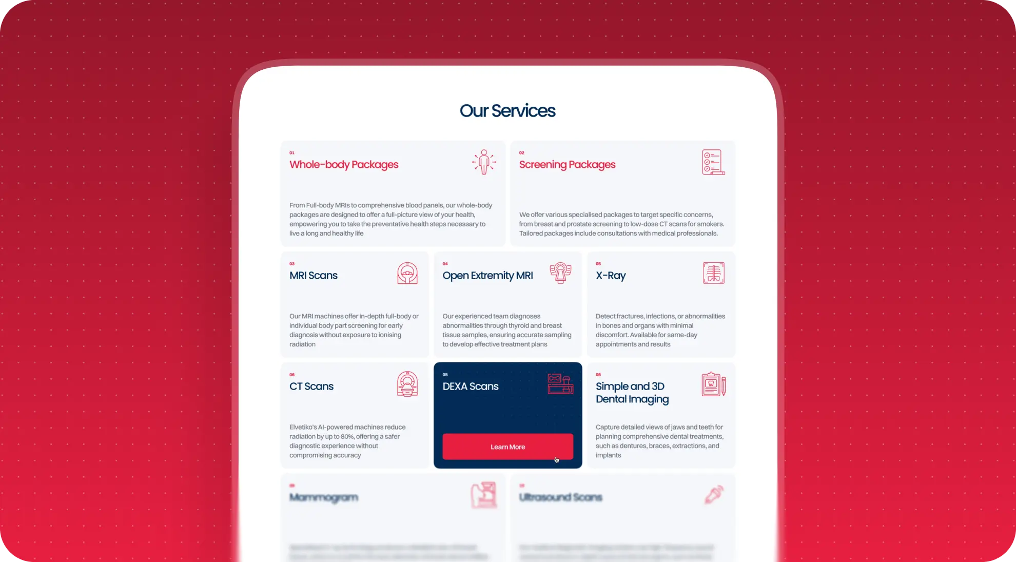
In healthcare, design should reassure, not impress
From a design perspective, this was not a project in the "make it as experimental as possible" category. The goal was different: create a modern, clean, user friendly website for a medical center that feels easy to navigate and easy to use when looking for information.
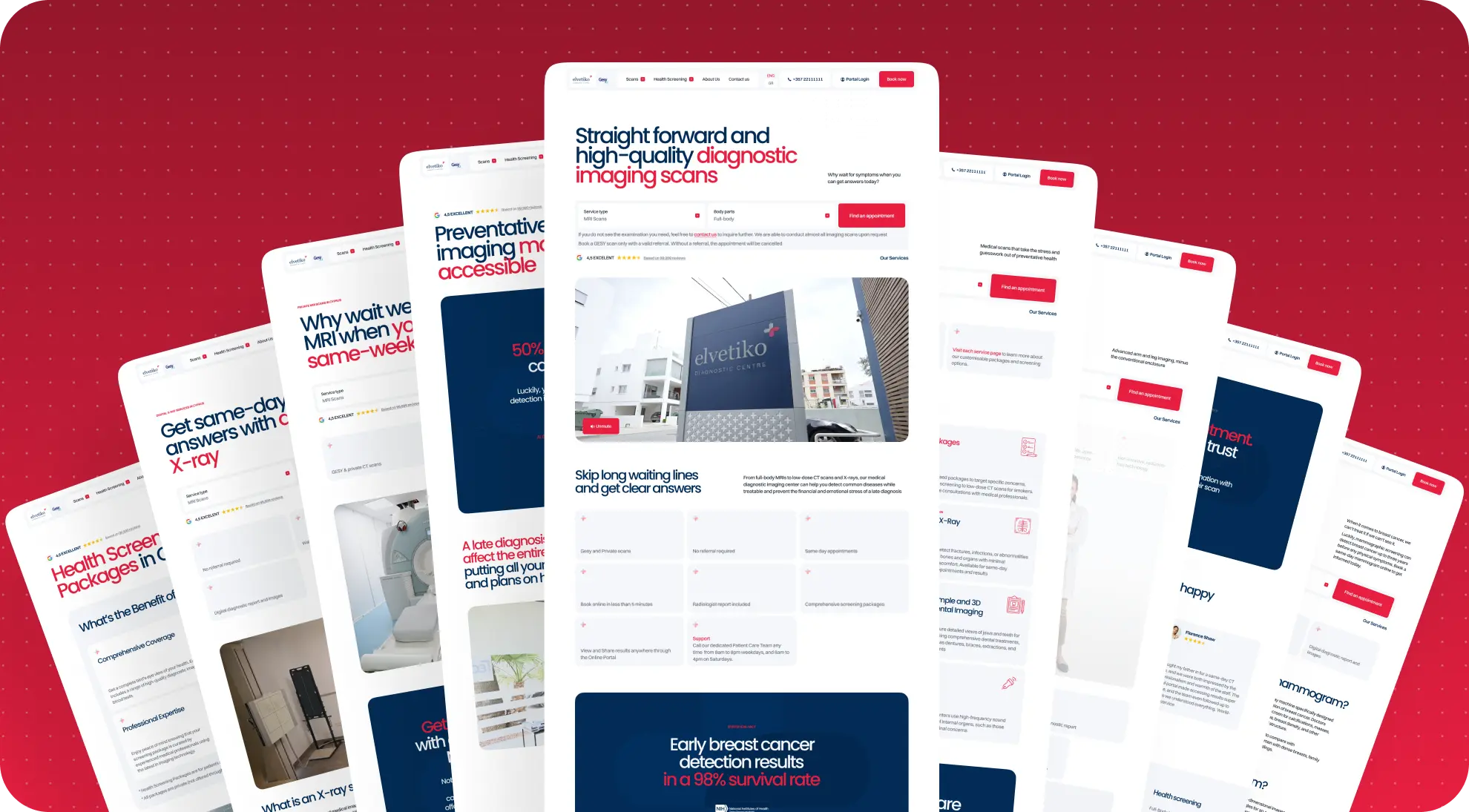
We fully refreshed the visual layer of the website while staying within the brand guidelines. But the priority was never simply to make it look attractive. It was to build a calm, confident system that helps users move toward action more easily: understand a service, contact the center, or proceed to booking.
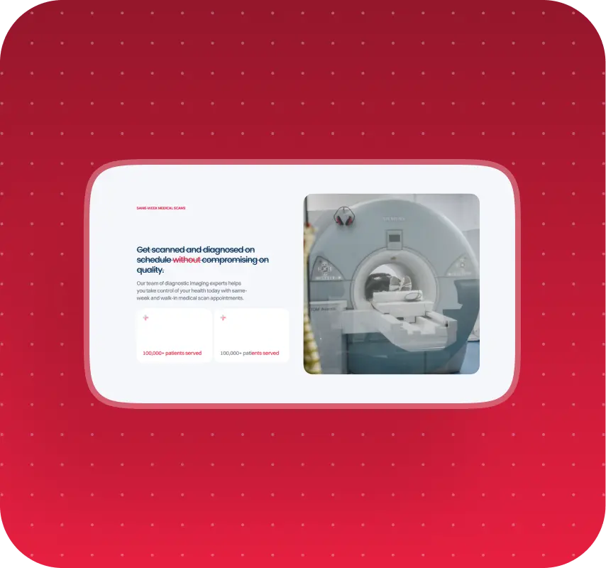
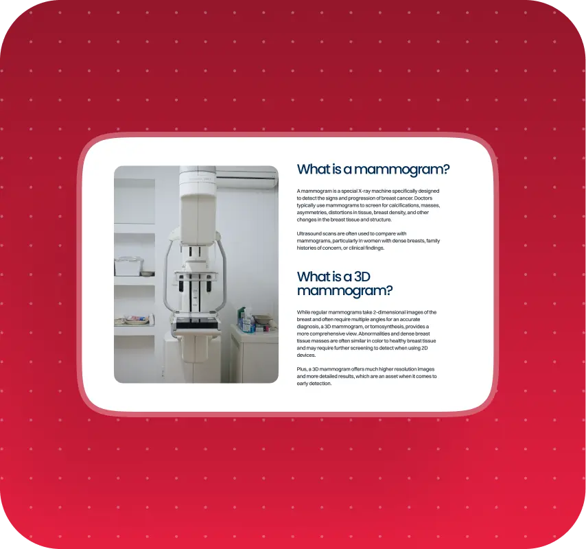
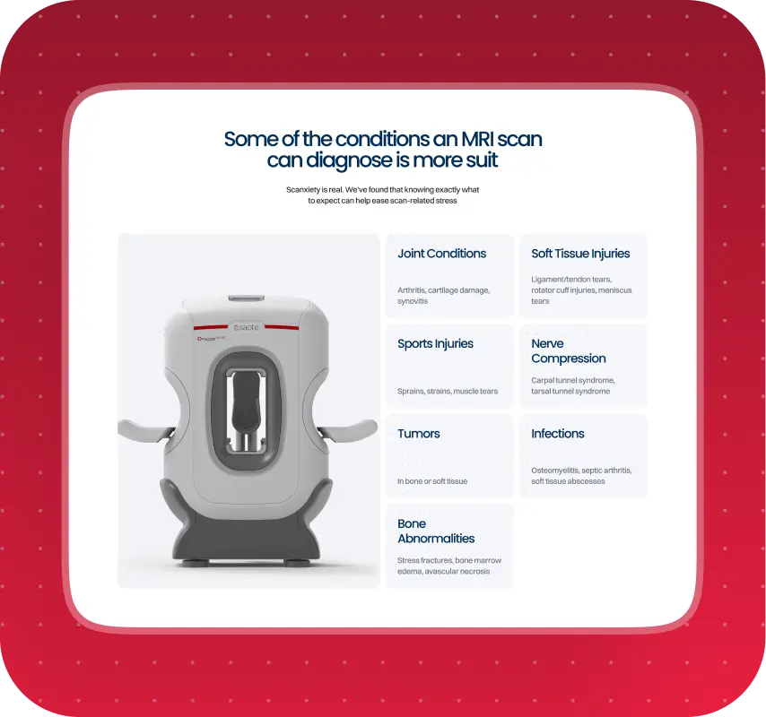
The photo and video materials provided by the employer also played an important role. The website used images and videos of the equipment, including the MRI scanner. In a medical project, that kind of content helps build trust. The service feels less abstract, and the center itself becomes easier for patients to understand and imagine.
In interfaces like this, good design is not a visual performance. It is a way to reduce tension and make a complex subject feel more approachable.
What the employer got: a modern visual language that reinforced trust in the center and made the website easier to use.
Not just a new website, but a system the team could manage
One of the project's key goals was moving the website to WordPress. For the employer, this mattered not only as a technical decision, but as a move toward a system that would be easier to manage.
An admin panel the team could use on their own
We set up the website so the Elvetico team could manage content independently and not rely on developers for every small update. Inside the admin panel, the team can:
- create new pages
- edit text
- update photos and videos
- change FAQs
- edit prices
We also added:
- a multilingual plugin
- an accessibility plugin
- a cookie plugin
The website was built with a structured system so the team could reuse templates, scale the architecture, and avoid depending on one off technical fixes. For a corporate medical website, that is especially important. The system needs to be thoughtfully built at launch, but it also needs to stay practical as the site evolves.
What the employer got: a flexible WordPress website the team can manage internally without constant reliance on outside development support.
The hardest part started when it was time to build booking
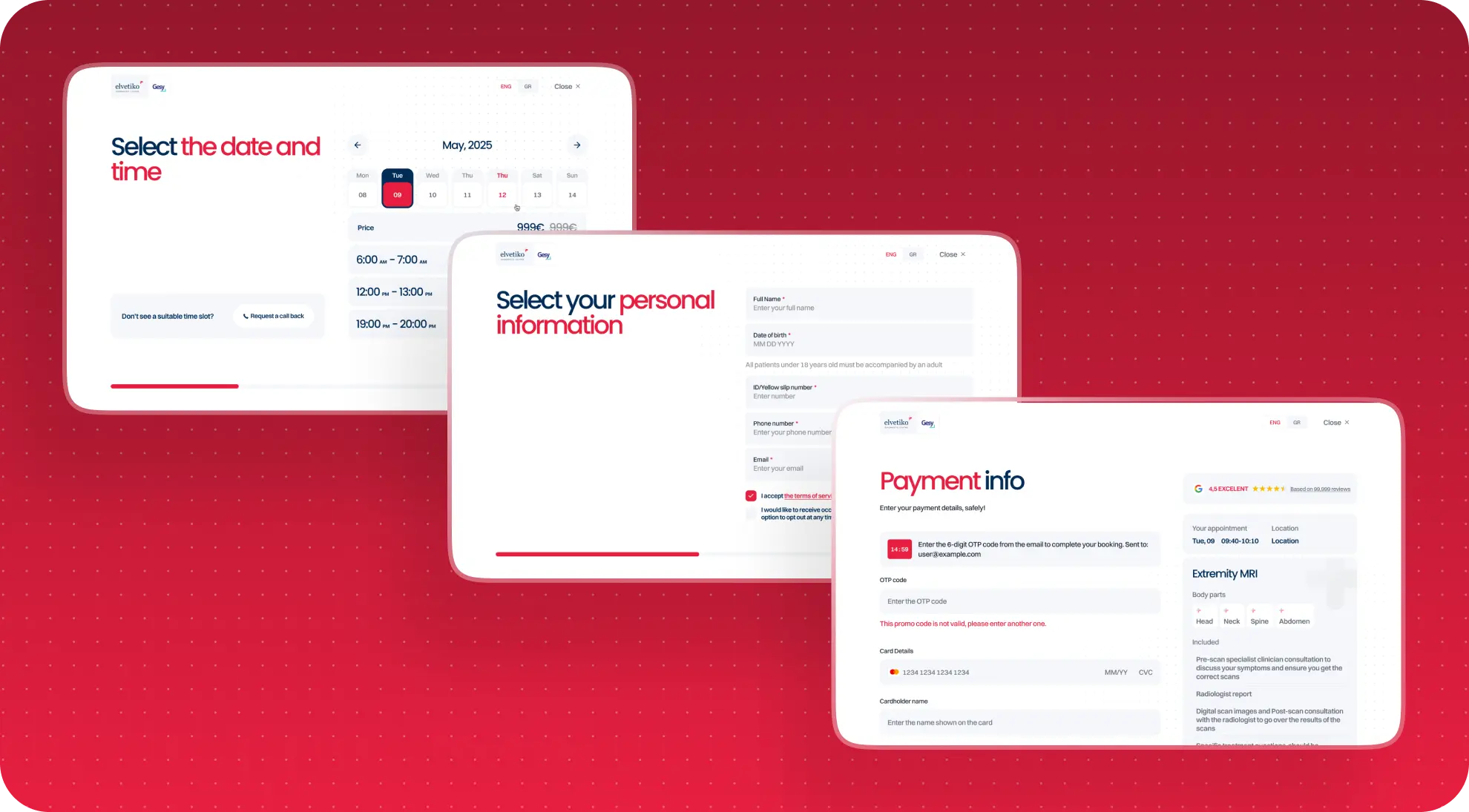
One of the key ideas behind the project was that the website should do more than present services. It should help users move through the process of choosing an examination and booking it through a dedicated booking flow.
Not just a booking form, but a multi path system
This was not a typical form. The logic included several branches and depended on different conditions:
- type of service
- insurance or private pay scenario
- whether the user had a referral
- time selection
- personal data entry
- additional medical questions
- prepayment
When the logic has to be untangled first
In practice, this was a full multi step system in which the interface depended directly on business logic, data, and correct backend processing. Some scenarios had to be reviewed and documented separately, literally step by step, just to define how the user should move forward. By internal estimates, analyzing one of these flows alone took around 20 hours.
At that point, the project stopped being "a website with a booking form" and became a digital service with multiple decision paths.
What the employer got: well considered interface logic for a complex booking scenario and a foundation for developing this part of the product further.
A good interface cannot save a product from backend issues
On our side, the design, frontend, and part of the backend setup within WordPress were completed. But the booking flow could not fully function based on our work alone.
What happened during integration
A separate external team was responsible for the backend and API integration and was developing the connected portal and booking system. In practice, that meant the final functionality of the user journey depended on how accurately the external team passed data, handled business logic, returned responses, and synchronized with the website's interface layer.
This is where the main challenge of the project emerged.
The team had to come back to testing repeatedly, walk through the entire multi step scenario from the beginning, document which data was missing, and identify the exact point where the logic stopped working correctly. These were not isolated checks. They were long working sessions in which we had to show, step by step, where the disconnect between frontend and backend was happening.
In practical terms, that meant long calls, repeated testing, and detailed reviews of each step: what data failed to arrive, what response should have come back, and where exactly the user journey broke down.
This type of complexity is rarely visible from the outside, but it often determines the real outcome of a digital product. Even when the interface and frontend are ready, a project can still get blocked by the part of the system that sits outside your direct control.
What the employer got: on the website side, a fully prepared frontend and interface foundation; on the process side, a clear understanding of exactly where the integration needed more work.
To keep the launch on track, we simplified the path
When it became clear that the full booking flow would not be ready in time for launch, we proposed an interim scenario to the employer.
Launching on time mattered more than waiting for the perfect setup
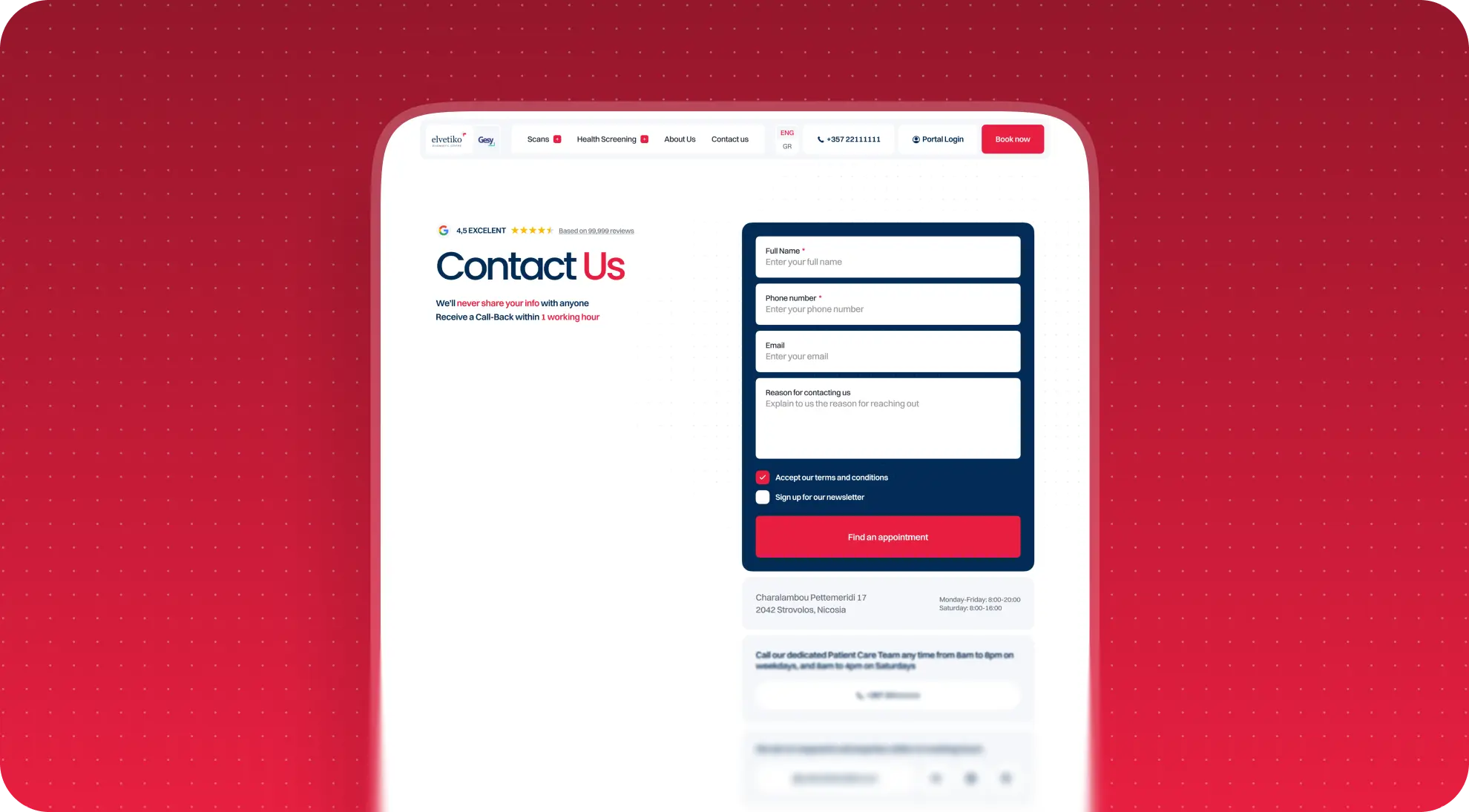
The idea was not to hold back the entire website launch because of one technically dependent integration, even though it was a critical part of the experience. Instead of full online booking, we proposed a temporary simplification of the user path: direct people to contact the center so they could reach the Elvetico team directly and arrange an appointment manually.
This made it possible to preserve what mattered most:
- the new website
- the new structure
- a modern user experience
- an on time launch
This approach allowed the employer to avoid freezing the entire project because of one unfinished part of the system and start using the new website as a working tool right away.
In complex projects, maturity often looks exactly like this. It is not about forcing an unfinished part of the system through at any cost. It is about proposing a workable setup that allows the business to keep moving forward now.
What the employer got: the ability to launch the new website on schedule and use it as a working tool even before the booking system was fully ready.
What this project taught us
Elvetico became an important case for us not only as a healthcare project, but also as an experience in working with a complex integration architecture.
It reinforced a few things for us:
- if the logic is complex and not fully documented, you need to plan dedicated time to work through it
- if the backend belongs to an external team, testing time and communication overhead need to be accounted for in advance
- when responsibility is split, it is especially important to define areas of ownership before the project begins
- complex integrations require deeper upfront evaluation than they may seem to at first
For our team, this was an important experience that influenced not only how we estimate future projects, but also our internal approach to flow documentation, testing, and collaboration with external developers. After Elvetico, we became more precise in allocating time for complex logic and stricter about defining responsibility boundaries in projects where a critical part of the system sits with an external team.
What this gave the team: a more accurate approach to assessing integration risks and a stricter framework for projects where critical logic depends on multiple parties.
Results for Elvetico
After the launch of the new website, Elvetico received:
- a modern website instead of an outdated version
- a clearer structure for users
- a multilingual system
- a WordPress admin panel with broad content management capabilities
- accessibility and cookie solutions
- prepared interface logic for a complex booking scenario
- a foundation for further scaling of the digital product
The employer can now:
- present the center as a modern medical service
- maintain and update a significant share of the content internally
- work with audiences in multiple languages
- continue developing the website without feeling like it was built on a fragile foundation
- return to the full booking logic if needed using the already prepared frontend foundation
Conclusion
The Elvetico project began as a website redesign for a diagnostic center in Cyprus, but in reality it turned into a much broader task. It brought together a rethinking of the digital experience, multilingual support, a manageable WordPress architecture, and complex booking logic tied to an external integration.
That is exactly why this case matters to us. It shows not only how we build modern corporate websites, but also how we approach projects where the interface is only one part of a much more complex system. When a website is connected to a real service, a user journey, and several technical stakeholders, system thinking, transparency, and the ability to make mature launch decisions become especially important.
In Elvetico's case, the result was not just a new website, but a stronger digital foundation for a medical service that is already supporting the employer's brand and remains ready for future growth.
Awards
About Digital Butlers
We’re Digital Butlers — a design-led team of 27 senior specialists building digital products since 2016. By choosing us, you’re getting results that are way different from what you already have — with the same commitment to your goals that Alfred has for Batman.
If you need a website, web service, or mobile app that pays off, reach out to us — we do it well.
Digital Butlers — a mature team with mature processes that deliver consistent results.


Let’s discuss your next website.
My name is Alex, and I’ll help you define the right next step.




.webp)